
New Sens, Kings, Sharks Third Leaks!
/The leaks just keep coming. The big news tonight is that I can now provide you guys with pictures of the actual jerseys that were leaked during Icethetics Live Chats over the past several days. And I know you're excited about that.
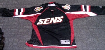
We'll start with the Ottawa Senators. A new photo I have of a replica more clearly depicts the text on the front as well as the striping on the sleeves. You can also make out the tie-up collar.
Next, the Los Angeles Kings, whose leak was the most difficult to discern details from. This photo clearly shows the prominence of silver in the sweater design, especially the new logo.
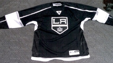
It's obvious the Kings had their Gretzky (and for that matter Melrose) days in mind when when putting this one together.
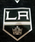 In the image to the right you get a close-up of the new crest. Silver is all over it, trimming the banner as well as the LA. You can even find some in the crown.
Surprisingly, the silver really helps to keep this jersey from looking boring. I think it would've looked very flat just in white. Wait until you see the Kings on the ice with all the bright arena lights reflecting off the silver. They're going to look good.
If you can't make it out well in the picture above, there's silver piping running the length of the sleeve from the collar to the wrist. It's broken up however by a broad white stripe that wraps around the elbow. That stripe is trimmed in silver. And the thin stripe at the base of the jersey appears to be silver as well.
Overall, I think the Kings really got one right. It looks nothing like what they're wearing now, but it totally looks like the L.A. Kings.
Finally, let's have a look at the San Jose Sharks.
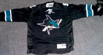
It's a little plain if you ask me. But that's no different from their previous black third jersey. I will say that I'm a huge fan of the full-body shark on the front. That's what needs to be on the regular jerseys. In this picture you can see the teal, white-trimmed stripes around the elbows and the lack of striping at the base.
Another thing to note is the absence of vertical piping that some of us thought we saw. Can't say for sure it's not on the back since we can't see it, but I highly doubt they'd do it on the back and not the front. Symmetry seems to be a common theme on these new sweaters.
The last thing I want to show you is the shoulder patch of this Sharks jersey. There was some question as to whether the SJ-fin logo was in black and white or color. Now it appears we have our definitive answer.
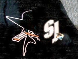
The SJ is in white and the fin is in color. Glad to see that logo make it onto the uniform. And in case you're confused by what you're seeing, the sleeve has been folded over the front of the jersey in this picture which is why you see the full shark logo.
I'll have the unwatermarked images in the Third Jersey Central galleries at some point in the next few days. And don't bother asking where these pictures came from. You know I'm not going to say. But when have I ever failed you?
So that's it. You've seen them all; pictures of all 18 NHL third jerseys. I'm glad to have been of service to you guys all this time — scratching that jersey itch. And I plan to continue doing so. I'll have complete coverage of each official unveiling through the Bruins next week. Technically, we still have six teams to go.
By the way, I'm still waiting on confirmation that the Coyotes are doing their unveiling during their game on Saturday. Look for more information on that right here tomorrow morning.