
CHL Third Jersey Fever, Part 1
/We have to be nearing some kind of record: New posts EVERY DAY since Sept. 15. And some of those days have seen multiple posts. I can't remember the last time Icethetics was this busy. But there's no sense in slowing down now. I promised a look at some CHL third jerseys before the week was out. Unfortunately, there are too many for a single post.
We'll begin with the Western Hockey League. The season kicked off a couple weeks ago and already we've got several new sweaters hitting the ice.
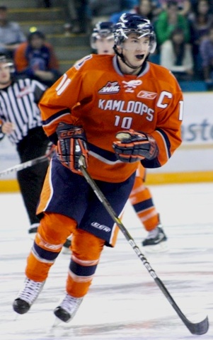 Kamloops Blazers 3rd jersey
 The Kamloops Blazers have added a blazing orange blazer. It's not the color but the front of this jersey that is its downfall.
I hate to start on a bad note because last time I discussed Canadian Hockey League uniforms on this blog, it was with great acclaim. I said the NHL should take a page out of their book. But it looks more like the Blazers have taken a page out of the Dallas Stars' book. And the Stars' book is terrible!
The dawn of the Age of Reebok ushered orange out of the NHL. But prior to that, only the Islanders and Flyers used it for their third jerseys. Philadelphia then brought it back in 2008 as an alternate. Only now is it finally a regularly-used color again.
So despite the terrible lack of any sort of crest design for Kamloops, you won't find a more colorful hockey league and that by itself should be applauded.

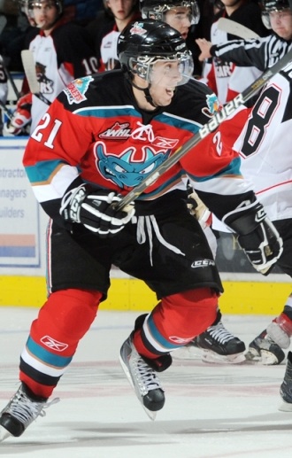 Kelowna Rockets 3rd jerseySpeaking of colorful, the Kelowna Rockets have barely worn their regular home and road sweaters this season.
On Sept. 25, the Rockets debuted a new red third jersey with silly-looking dragon face on the front of it. Say what you will about it, but how many teams have ever used this color combination? Certainly none in the NHL and the closest one I can think of is the Detroit Vipers in the old IHL.
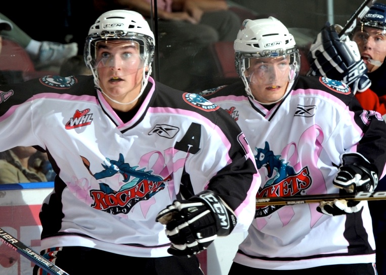
But that's not all. The Rockets also wore their pink-ribbon jersey recently for (I'm hoping) Breast Cancer Awareness Night. To save space, I'm linking to it rather than displaying. Plus, you've seen one pink jersey, you've seen them all.
Rather ironically, their home and road sweaters are black and white. Still, the fact that they're willing to take advantage of their color scheme, even if only on a third jersey, is good enough for me. More NHL teams need to get a little creative.

 Kootenay Ice 3rd jerseyThe Kootenay Ice have a new blue third jersey in the pipeline.
And here's another example of an awful NHL fad creeping into the CHL. Stop with the mismatch nameplates. Philly did it first with their third jerseys to replicate a past design quirk. That's all right. Now stop.
Setting that aside, this is an otherwise perfectly nice hockey sweater with great colors and a slick design that manages to also feel retro.
In a web release, the team credits the jersey design to Jack Santos of Visible Means Design in Sherwood Park, Alberta.

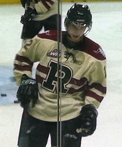 Red Deer Rebels 3rd jerseyI recently mentioned the unveiling of the Red Deer Rebels third jersey. Now we can see it on a player in full gear.
The photos I have were sent in by Jorden Clarke. One thing he did point out was the poor visibility of the black numbers on the maroon stripes on the back. That's kind of a shame and easy to fix.
Despite that, however, I still believe this to be among the best new hockey sweaters in the world this season. I just wish they could get the WHL logo off the front.
This jersey made its debut last week on Oct. 2. My thanks to Jorden for these photos from the pre-game skate.

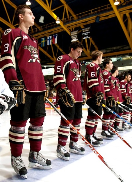 Chiliwack Bruins' 3rd jerseyAlso making its first appearance that night was the Chilliwack Bruins' new third jersey.
This is an instance where I think the team would be better suited to just adopt their third jersey as the new standard. As Reebok-ified as the sleeve striping may be, it's still a great looking uniform as a whole.
I don't even think changing the logo would be a bad thing. Not every team called the "Bruins" has to have a spoked letter as their primary mark. (Yes, that's you too Providence.)
By the way, most of the uncredited game photos in today's post, this one included, and many more can be found at WHL.ca and their online photo gallery. Also this next one...

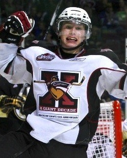 Vancouver Giants' anniversary jerseyThe Vancouver Giants are celebrating their 10th anniversary with a special jersey.
The most notable feature of the sweater is the 10th anniversary logo placed front and center. The ECHL's Florida Everblades did something similar for their decennial in 2007-08. But they actually put the 10th year logo on the home and road jerseys all year.
For the Giants, they've just taken their standard white jersey and swapped out the crests. Might've expected a little more creativity from these guys so it's a tad disappointing.
Maybe we'll get something better from them next season. Last thing today then I'll leave you alone...

 Lethbridge Hurricanes' 3rd jerseyAccording to blogger Scott Wasilewski, this is the Lethbridge Hurricanes third jersey.
This photo appears to have been taken on a store shelf last Friday and I haven't seen anything on the team's website about an alternate sweater, so maybe you guys could help shed some light on this particular subject.
It looks like a frightening fusion between the Washington Capitals and Carolina Hurricanes. Scott isn't sure if he likes it. I'm pretty sure I don't. And heck, while we're talking about bad Lethbridge jerseys, they've announced plans for Pink in the Rink Night on Nov. 19-20.
More new sweaters from the OHL and QMJHL this weekend. Also new stuff in the AHL and ECHL as well. Check back for updates.
There is now a follow-up to this post: CHL Third Jersey Fever, Part 2. It features the Tri-City Americans and Edmonton Oil Kings from the WHL, Halifax Mooseheads from the Q, and the OHL's St. Mike's Majors and Soo Greyhounds.