
The Week in Unis and Logos
/Good evening all! I appreciate your patience these past several days while I was away. Spent the week on the awe-inspiring Oasis of the Seas, on a cruise through the Eastern Caribbean. If you ever have the opportunity, I highly recommend it.
In that time, I was completely out of the hockey loop, freeing myself entirely from the chains of my computer. I didn't even know the Blackhawks won the Stanley Cup until we docked in Fort Lauderdale early this morning. Anyway, that being said, I'm relying mostly on your emails — and forgive me if I don't mention you by name if you sent in a tip as there were so many I lost track.
Leafs to reveal new captain, uniforms
 Obviously the biggest news of the night is coming out of Toronto.
The Toronto Maple Leafs have set a press conference for Monday, in which they are expected to introduce Dion Phaneuf as the new team captain, but more importantly, unveil new home and road sweater designs.
Both TSN and The Hockey News corroborate this. For more on what the redesigned jerseys will look like, we turn to fellow jersey-hound Howard Berger — never at a loss to provide the early info we all desire. Turns out, the day before I left for my trip last week, he provided another detail-filled blog post.
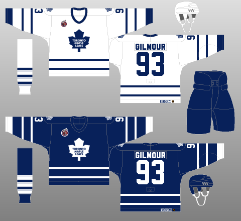 Maple Leafs jerseys, 1992-97Here are some of the bullet-points of his story, alongside a sample from our friends at the Hockey Uniform Database:
- New home/road unis comparable to 1990s Gilmour-era sweaters
- Both feature current primary logo, 11-point maple leaf introduced in 1970
- Both incorporate new lace-up collar instead of V-neck
- Dual horizontal stripes return to sleeves/waist
- Outlined number font goes away in favor of solid color block numbers
- 90s-era shoulder patches (veined leaf) return
- Third jersey will remain unchanged for 2010-11
At last, the Leafs' Reebok Edge jerseys will have some character! Berger's write-up contains no new details on the rumored third jersey redesign said to happen for 2011-12.
And for what it's worth, LeafsHQ has combined all of this new information into a couple of handy bits of concept art.
Official: Ducks to get thirds in 2010-11
 The Anaheim Ducks have officially confirmed plans to launch a brand new alternate jersey during the upcoming 2010-11 season, according to the Orange County Register.
The Register quotes Ducks senior VP and chief marketing officer Bob Wagner in an article published yesterday:
General manager Bob Murray, coach Randy Carlyle, president and CEO Tim Ryan and Wagner were involved in the new design. Ducks players were also consulted, which was a major source of input.
"They're the most excited about it, which makes me feel we’ve completed 'mission accomplished,'" Wagner said. "I’ve gotten a lot of positives."
Wagner could not reveal any details about the new look but he was confident it will be received well. Said Wagner, "I think the fans will really embrace it based on the fact that there is meaning to it."
The only clue as to the new jersey's design: Wagner says "there is meaning to it." Whatever that means. Anyway, it's official confirmation from the team on previous rumors and that's always a plus.
Devils move AHL affiliate, unveil new logo
 In what should be the final major change going into the 2010-11 AHL season, the Lowell Devils have been relocated and renamed the Albany Devils as of Thursday.
The logo (left) was unveiled on the team's new website. It continues the tradition of the New Jersey Devils and Lowell Devils logos, by creating a subtle letterform out of an abstract devilish shape.
At least they didn't just arch the word "Albany" above the NJ logo like they did in Trenton (ECHL). But this makes me wonder if they could do it with any letter of the alphabet, or if they've just gotten lucky with NJ, L and A. Surely, they can do it with the T.
Oh, and don't forget about the U in the Utica Devils logo from back in the day.
New logo tourney starts Monday!
As promised, the next logo tournament will kick off on Monday morning. In a poll that ran in the sidebar for two weeks, 50% of you preferred an NHL secondary/shoulder logo competition so that is what we're doing. Sometime on Sunday I'll post the format. This one is going to be a little more complex than the previous tourneys we've done. For one thing, we'll be starting with 45 individual logos, the most yet!
Meantime, I'm going to get back to relaxing as my vacation doesn't end until Tuesday and I have a lot to clear off the TiVo. As always, feel free to email me with anything I've missed.