
Review: New Star Rising, Part 2
/
Apparently I have a lot to say about the new look of the Dallas Stars. So I had to break my review out into multiple parts to keep it from running on too long. Tonight, you get Part 2 which focuses on the unveiling event itself. I had planned to include my uniform review here as well but as you'll see, it goes on quite a bit.
The uniform review will definitely go up Monday, which is better anyway since that's the day of the week when Icethetics readership is highest. Again, sorry for the delay but you will finally get that review tomorrow! For now, here's my take on the event.
The Invitation
I was thrilled to get the invitation from the Stars in early May. Icethetics, while graced with a decent following, isn't exactly a big deal as far as I'm concerned. What it is a big deal is an NHL team rebranding itself. So it was very exciting to get the opportunity to see the unveiling in person.
Icethetics in Dallas
It takes about four hours to fly from Seattle to Dallas. So I spent eight hours traveling for a one-hour event. That's how much I love this stuff. And apart from some reader donations, this trip was on my dime. The Stars invited me but they did not fund my trip. I'm grateful to them for letting me come, but I don't want you to think that's colored my judgment as far as this review goes.
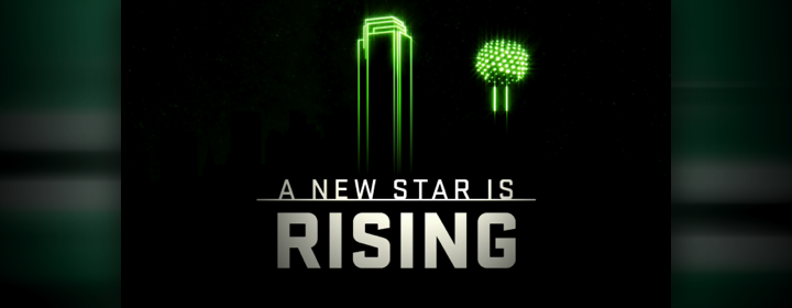
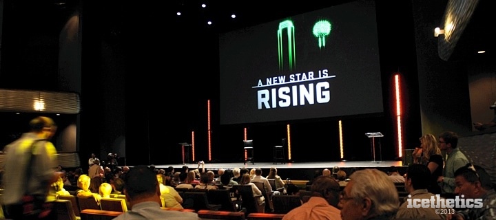
The event, titled "A New Star is Rising," was held at the Winspear Opera House, part of the AT&T Performing Arts Center in downtown Dallas. It was a state of the franchise type of occasion with the unveiling of the new branding scheduled as the main event. Because of that it was saved until the end — which annoyed those following along with my coverage on Twitter. Nobody wants to wait for anything anymore.
As I got settled in to my seat on the far right side of the venue with the other media members, I briefly met a couple of people, including Mark Stepneski who writes for the Stars' website as well as the Stars Inside Edge blog. He mentioned that he'd already seen the new uniforms. Since he works for the team, he'd already received artwork so he could update his blog. His reaction was very positive.
The program opened with a video clip that began by telling us, "it's a new day for the Dallas Stars." It was basically a highlight reel of the club's history, including scenes from its 1999 Stanley Cup championship. It also included one last look at the Stars' existing logo treatment.
We also got treated to some clips of the old North Stars — wearing green (hint, hint). But the video was really just meant to get everyone psyched up for the night's festivities. It worked because even though I'm not a Stars fan I was still pretty thrilled to see what all was in store.
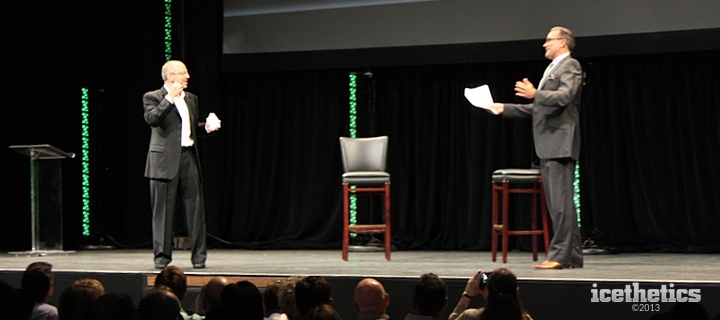 Ralph Strangis and Daryl Reaugh take the stage
From there, the Stars broadcasting duo of Ralph Strangis and Daryl Reaugh ("Razor") took the stage. They were energetic and fun all night. They began their presentation by talking about how great the fans are in Dallas. Attendance increase, high season ticket renewal rate and so forth.
Then came the big sell on why you should become or continue being a season ticket holder. It really sounded like this is an exciting time to be a Stars fan, honestly. But then I would be happy just to have an NHL team in my city. Speaking of which, the guys announced the Stars would be headed out of town for a couple of preseason games in Oklahoma City and San Antonio. Does anyone want to play an exhibition game in Seattle?
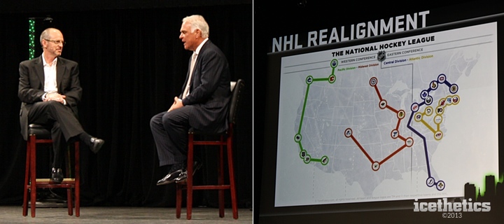 Ralph Strangis with Stars President & CEO Jim Lites and the NHL's new realignment map
Next, Ralph brought out Stars president and CEO Jim Lites. He explained a lot of the changes the franchise is going through, including the realignment of the NHL, which will put the Stars in a division with other Central Time Zone opponents for the first time since 1998. They moved to accommodate the four expansion franchises that entered over three seasons in Nashville, Atlanta, Columbus and Minneapolis. Lites pointed out that arrangement was supposed to be temporary. It lasted 15 years.
The "Borrowed" Realignment Map
Lites talked about how happy he was to see this map that "the guys" put together. At this point, I started tweeting feverishly because it looked like for the first time we had the official names of new divisions, rather than A, B, C and D as they're currently known. The graphic labeled them Pacific, Midwest, Central and Atlantic.
But in fact, it wasn't official at all. If this map doesn't look familiar to you, it sure looked familiar to one guy who goes by the name Tom Fulery and runs a website which focuses on finding the best realignment plan for the NHL. Turns out he made the very map the Stars "borrowed" for this presentation. (At least they kept his credit intact at the bottom.)
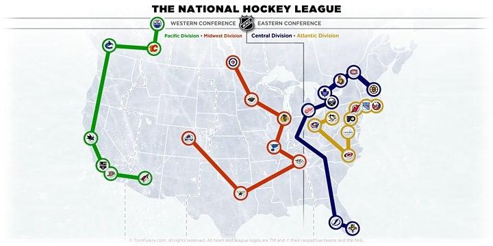 NHL Realignment map by TomFulery.com
In fairness, the map is accurate as far as how the teams will be arranged next season. The division names however, Tom just made up himself. Whether the NHL will use these or something similar is unknown as this point. But it was odd to see the Stars using someone else's map rather than their own or even the one released by the NHL itself.
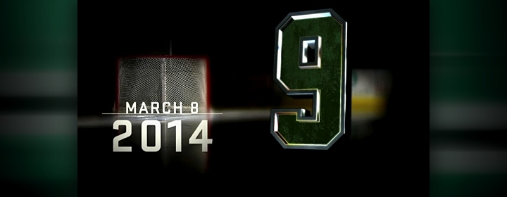
Next topic: Mike Modano. Strangis and Lites spent a good deal of time talking about Modano and how much a part of this franchise he is. Then Lites announced to the crowd that the Stars will permanently retire No. 9 on March 8, 2014. Naturally, Dallas will be hosting Minnesota that night.
That led into a Mike Modano tribute video which seemed to show every goal the man has ever scored in a Stars uniform. It felt long to me but the fans in the Winspear Opera House were eating it up. I'm sure I'd feel the same way watching a Marty St. Louis highlight reel.
Modano came on stage and talked with Strangis a while before tossing things over to Razor, who brought up GM Jim Nill to talk about the product on the ice. This is where I took some time to get caught up on tweeting a couple of photos and other details from what I'd seen so far. Twitter was still reeling from the news that there was finally a date for retiring Modano's jersey.
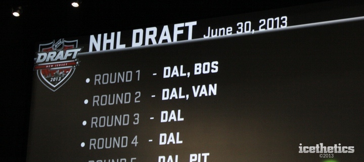 Another "borrowed" graphic in the presentation
Then something else caught my eye while Razor and Nill were talking about the Stars' position in the upcoming draft. Check out the logo in the upper left corner of this slide. That was a logo designed as a concept before the NHL released the official logo. Of course it showed up in many places around the web last winter, but you'd think an actual NHL franchise wouldn't have to turn to Google to find a logo.
 Stars owner Tom Gaglardi
And Now the Main Event...
It finally came time for the reason I made the journey to Dallas. Razor welcomed Stars owner Tom Gaglardi to the stage to talk at last about the new branding of his franchise. The pair chatted about Dallas' checkered uniform history, Gaglardi pondering the team had perhaps been a "victim of trends" in the past.
"There are some jerseys in our past that I think are really great," Gaglardi said, adding "some that maybe aren't quite as great."
"Can anybody think of one?" Razor joked, obviously referencing the "Mooterus" debacle of 2003.
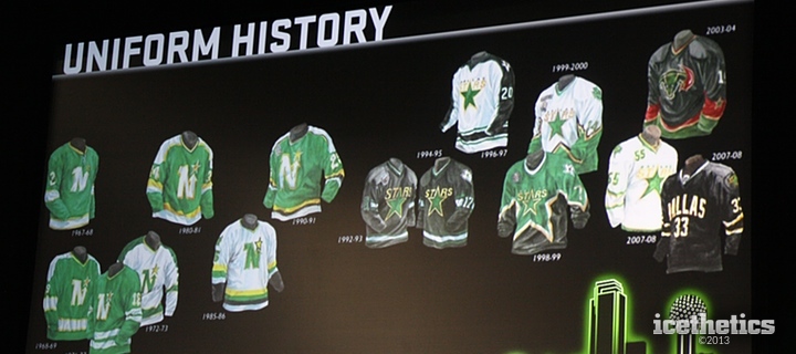
While the guys talked, on screen we were reminded of what this franchise has looked like in years past — even back to the days when they were the Minnesota North Stars. Look at all that green. (Pay no attention to that human anatomy lesson with a splash of red in the corner.)
Black is Not a Color
Perhaps my favorite part of the conversation came next. Razor asked Gaglardi what was important to him in the rebranding process. His response was so great it requires a big blockquote.
I think you have to make a decision if you want to be a black and white team. I think black is a great color in a lot of ways. You look tough. I think you can look intimidating.
But I come from school of thought that black isn't really a color. And no one really gets to own black. Even more than that, we had a logo that was never really a made-in-Dallas logo.
We wore the Dallas wordmark across the chest and in hockey it's important to have your identity and who you are on the front of your jersey. It's the great thing about hockey jerseys. And I think we missed a huge opportunity to say who we were on our front.
The Rangers are the other team that don't wear their primary logo on their chest. But as an Original Six team... I don't think that really counts. We're the only team in the league that doesn't wear our logo on our chest and I don't think that's right.
Those are the words every Icethetics reader has ever wanted to hear. Black is not a color and a hockey jersey needs a logo on the front. Finally an NHL owner that positively gets it!
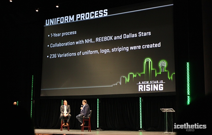
Finally, before the big reveal video, the Gaglardi talked about what led up to this night. He said the Stars logo "doesn't really stand up with the best logos in the NHL" and that the process to rebrand was "exhaustive." In fact, the whole thing took a year and involved 236 different variations. That's an enormous number!
Gaglardi also added:
It was a big endeavor because I think that we weren't necessarily, at the beginning, committed to a new logo. But for my part, I strongly felt that it was something that needed to be part of the process.
We had some of our key guys that had been with the organization, our top executive staff. We had internal and external design people. Reebok, the National Hockey League and some really smart people. I know I learned a lot through the process about what was important.
I really had no idea where we were going at the beginning in terms of what we do with color and whether the logo would change. The one thing that I believed strongly from the start was that we wanted to have— I mean, we're a Second Six franchise. Our roots trace back for a long time and we're one of the older franchises in the NHL, so I thought it was important to show that we're not a fly by night group.
A real hockey jersey with a classic appeal to it was something that this franchise really needed. I think when [the franchise] came to Dallas, that jersey in 1993 was a pretty traditional [design]. I think [it] might be the best jersey that the franchise ever had, in my personal opinion. But it was a black and white jersey. We wore black and we wore white.
All this setup was exciting because it was telling me for certain that the new sweaters would not simply be black and white anymore. That was a huge step for this club's identity as far as I'm concerned.
Gaglardi then mentioned that he received letters and emails from Stars fans across the continent which convinced him that green as the prominent color was the only way to go for his team. So glad he listened. That doesn't seem to be a priority with guys in his job these days.
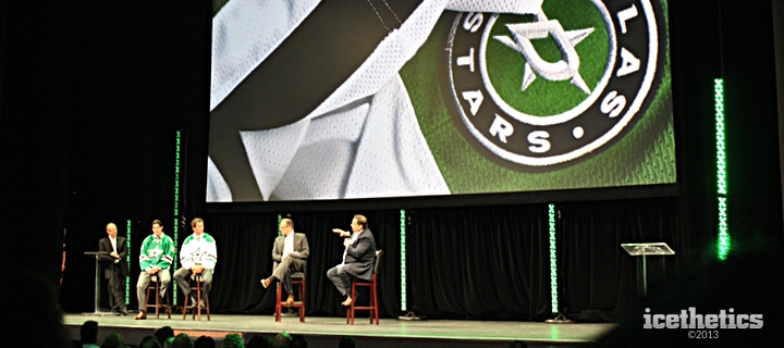
Next we got a short video that showed green overtaking the entire city of Dallas and ended with our first official look at the team's new primary logo. (See Part 1 of this review for my thoughts on the new marks.) In a nutshell, this is the ideal identity for this organization. But this logo leaked online two weeks before the event. What came next was something few in the building had ever seen before.
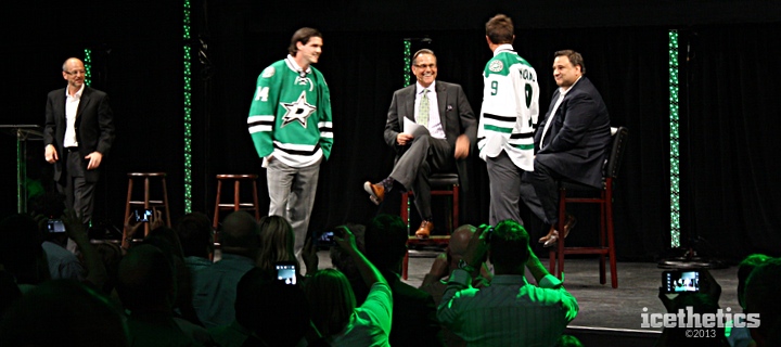
Jamie Benn and Mike Modano strutted onto the stage sporting the Stars' brand new green and white uniforms. Ralph rejoined the conversation and the five men chatted for a few moments about the new look as the crowd took it all in with cameras and camera phones pointed intently toward the front of the house. It was an exciting moment to be sure.
The conversation turned back to Razor and Gaglardi, who talked more on the process.
"Before we started anything," Gaglardi said, "we created a three-page brief which said all the things that we wanted out of the process." For what it's worth, Jason Walsh, the man who shepherded the rebranding effort, told me later that it was more like a 35-page brief.
Gaglardi continued: "I went back recently and read that brief and we nailed it. It's a logo that has classic and vintage aspects and yet it's modern and stands up to some of the best logos in sports. I've had several people looking at it — that I have a lot of trust and faith in — for months and really believed it's a real professional sports logo."
There's no question I have to agree with everything he said there. Gaglardi went on to discuss the new shade of green and how the Stars were now "owning" their own color for a change. This is the hallmark of some of the best sports franchises in the world, so you've got to admire Dallas for recognizing that.
The event wrapped up and the fans filed out of the auditorium. But up on stage, the Stars made Gaglardi, Benn and Modano available to talk to the media. I made my way up to grab some photos, which will be included in Part 3 — which you won't have to wait that long to read.
Afterward, the Stars set me up for a quick interview with Jason Walsh. I referenced some of that conversation in Part 1 of the review and will have more in Part 3. But it was really great to have the opportunity to speak with him about some of the design choices that were made.
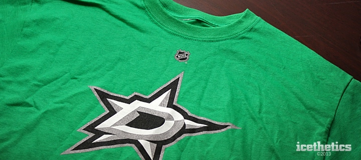
There was no way I could go home without grabbing a memento from my trip. I picked up this T-shirt and wore it on my flight home Wednesday. No one asked me about it. Perhaps I didn't run into any hardcore hockey jersey geeks at DFW, John Wayne Airport in Orange County, Calif. or Sea-Tac. But I liked getting it out into the world. It's really a great new look. And the green is just fantastic.
As I wrap things up here, I have to thank the Dallas Stars once again for inviting me, and by extension you guys, to join them and their fans on Tuesday for what was a very fun night. Be sure to check back Monday for my complete review of the Stars' new uniforms. Then I think we'll have put this subject to bed for a while.