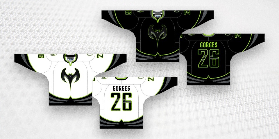
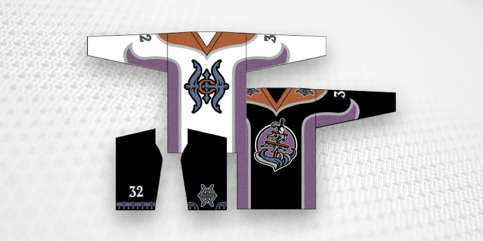
Manchester Monarchs scrap purple, swipe Kings jerseys
/Monarchs' home and road jerseys, 2014— // Photos from LA Kings Insider
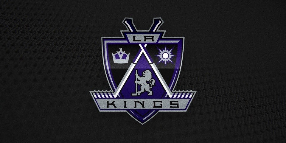
The AHL's Manchester Monarchs lost a piece of their identity Wednesday. They scrapped the purple and gold from their color scheme and unveiled new home and road jerseys identical to those of their NHL affiliate, the Los Angeles Kings.
Perhaps they're just trying to capitalize on the Kings' recent Stanley Cup championships, but this is nevertheless a depressing development for a club that once had a truly unique look.
“These jerseys tie us to our parent club, the Kings,” said [Monarchs president Darren] Abbott. “The Monarchs have so many players that have gone on to play for the Kings and have helped them win Stanley Cup championships in Los Angeles that we wanted to bring their identity into our uniforms.”
I'm of the opinion players shouldn't be wearing NHL jerseys until they make the NHL, but obviously Abbott disagrees.

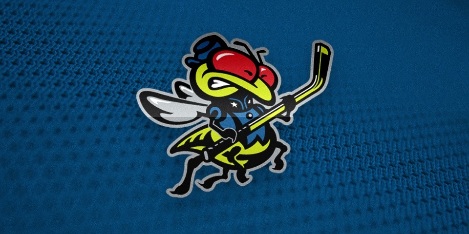
This is almost a literal representation of what I think when I see an AHLer wearing an NHL jersey.
If you live in New Hampshire, the new sweaters will be available very soon.
The jerseys were unveiled at a press conference held at the Verizon Wireless Arena on Wednesday that introduced head coach Mike Stothers to Manchester. Fans will be able to purchase the new jerseys at the Monarchs' annual Summer Fan Fest ... on Saturday, July 26.
For more photos from the unveiling, check out L.A. Kings Insider.
What do you think of the Monarchs switching to these jerseys? Be sure to vote in the poll.
Manchester Monarchs home and road jerseys, 2010—2014
FURTHER READING: Monarchs celebrate Kings' original 1996 third jersey · Feb 1, 2014