Orange dominates minor league special event jerseys

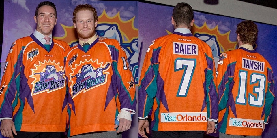
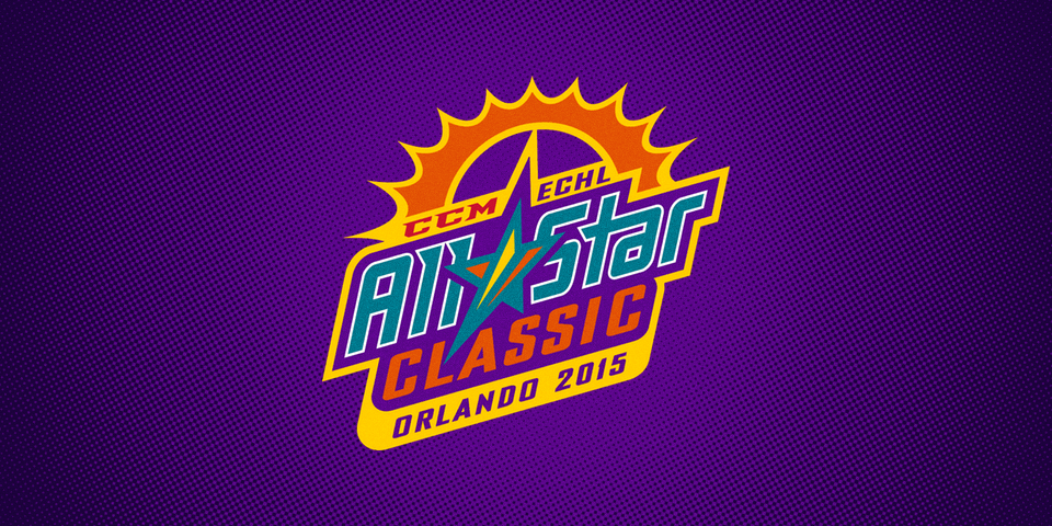
On Wednesday, the ECHL's Orlando Solar Bears unveiled the jersey they will wear when they host the 2015 ECHL All-Star Classic on Wed., Jan. 21. And they're very orange!

The jersey design is based on the team's existing primary uniforms with some colors swapped and some All-Star insignia added. The uniform is a little bright, but it's a nice homage to their home in Orange County.

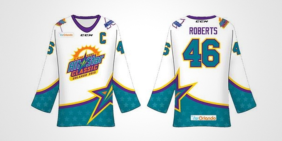
The Solar Bears' opponent — the ECHL All-Star Team — will wear a white uniform that was first revealed last December following a fan jersey design contest, won by Jordan Roberts.

Meanwhile in the AHL, the Syracuse Crunch will host a stadium game at the 49,000-seat Carrier Dome on Sat., Nov. 22. And this is the special jersey they plan to wear.

The sweater, revealed on Oct. 4, features orange trim in honor of Syracuse University, where the covered stadium is located — and basically the center of the universe for locals.

If you're thinking the jersey looks a lot like the monstrosity introduced in 2007 by the Edmonton Oilers — you're not wrong. It's the same template but with classic Oilers colors, essentially. And good lord, all that piping. You don't need me to tell you it's pretty weak.

The Comets will wear their standard white jerseys for the game.

Capitals, Canucks past prototype jerseys surface on ebay

Tonight, we're taking a look at a couple of purported Reebok Edge prototype jerseys thanks to one ebay seller with a rare stockpile. And they are fascinating!

Photos by manonthemoon12345 via ebay

A current auction listing from manonthemoon12345 features what's described as a "rare authentic" Washington Capitals prototype jersey. The date on the tag appears to read Nov. 16, 2005 and notes it is a second version.

Most intriguing about this jersey is the crest which bears more than a passing resemblance to the Caps' Weagle logo — which currently graces the shoulders of their primary uniforms. In this version, the U.S. Capitol dome silhouette in the negative space is much more pronounced.

The design of the jersey itself, on the other hand, is much closer to the final product that was finally implemented during the 2007-08 season.

Photos by manonthemoon12345 via ebay

Back in July, another listing from the same seller offered an alleged "rare authentic" Vancouver Canucks sweater. The tag was dated September 2006, a full year before the blue and green jerseys were introduced.

This one is just painful. So many bullets dodged. First, remember that Reebok template I railed against earlier this week? The one Pittsburgh, Ottawa and Tampa Bay all used in 2007. Looks like Reebok was trying to push it on Vancouver as well.

Second, it looks like the Canucks considered sticking with the 1997 color scheme. I call it a dodged bullet, but in truth it was a unique look. No other team before or since has used it. But green and blue are definitely more fitting.

The best thing this prototype had going for it was the lack of the word "VANCOUVER" arched across the upper chest. Everything else about it... yikes.

What do you think of these jerseys? Have you seen any other interesting NHL prototypes?

5 NHL teams that need new uniforms in 2015

With the reveal of the Lightning's third jersey two weeks ago, we have all of the primary sweaters for the 2014-15 season — though we're still waiting on some outdoor game designs. So is it too soon to start thinking about next year? I don't think so.

While several teams have made great strides in improving their uniforms in recent years — namely the Stars, Ducks and Blues — a handful are still in desperate need of overhauls. Here are my top five picks alongside some of my favorite concept art.


5 · Arizona Coyotes

THE PROBLEM

This might be a frequent refrain on this list, but the Coyotes' biggest jersey crime? Waist stripes. Where are they? They can make or break a hockey sweater. With them, you bring a classic, traditional feel to the look. Without them, it's like pajamas — or worse, a practice jersey.

When the Coyotes first introduced the brick-colored uniforms in 2003, they were near perfect and they weren't much different from how they look now. The key difference is that the waist striping was inexplicably removed by Reebok in 2007.

THE SOLUTION

The easy button here would be to simply put the waist stripes back. But I'm not sure that's the best play for the Coyotes. Two-color uniforms work best when you have a two-color logo — see Red Wings and Maple Leafs.

Leaving the sand and black out of the Arizona's sweaters creates a disconnect — especially noticeable this year with the loss of the black and sand third jersey. And this year, with the name change, would've been the perfect opportunity to make a bigger splash.

The current logo is fine as it is, but more of that native style art seen in the franchise's original logo might be a more appropriate symbol for the NHL's lone southwestern member. I'd love to see a mix between the two art styles in a future logo.

THE CONCEPTS

Justin Cox nearly nailed it with his submission from 2013. The throwback to the original Coyotes sweater design works well in these colors but the leaping coyote isn't an iconic enough crest and it doesn't stand out well on red.

Personally, I'm still partial to the original coyote head used on the old green third jersey in the late '90s. Nick Burton employs it well in his concept from 2012. Neither of these would be ideal in their current state, but they'd both be a step in the right direction.


4 · Vancouver Canucks

THE PROBLEM

The idea of seeing the Canucks change their uniforms again is worthy of an eye roll. This club has been through so many color schemes and logos over the years, a doctor might be inclined to diagnose them with an identity disorder of some kind. In fact, one might argue the reason they added VANCOUVER to the chest in 2007 was to remind themselves who they are.

That said, they need to stop plugging the dam and create a visual identity with some staying power. And if you ask me, the native-style whale breaking through the ice to form a C — while clever — doesn't get the job done. The corporate connections are well documented, but with Orca Bay long out of the picture, a change is overdue.

THE SOLUTION

The colors are great. Nothing says northwest like green and blue. Plus those were the Canuck's original colors and when you're looking for staying power, sometimes rewinding to the original vision is the best way to go.

In fact, just this weekend, the team launched an online video series about the return of Johnny Canuck. (I'm not really sure what it's all about so maybe Vancouverites can fill us in.) But the point is, he's a great icon for this franchise and the logos have already been created.

Keep the stick-in-the-rink shoulder patch. Keep the blue and green. Keep the existing jerseys if that makes life easier. But ditch the whale and the wordmark. And put Johnny Canuck in the spotlight. There's no good reason not to.

THE CONCEPTS

We've seen so many great designs that would be an improvement for Vancouver. If John Elbertson's use of the skating Johnny Canuck is not your cup of tea, perhaps you can appreciate Nevill Carney's take.

But I think the best all-around set came in 2013 from Rob Sulava, who values the simplified "V" logo and a green third jersey. Some combination of these three concepts could very well save the Canucks' foggy identity.


3 · Ottawa Senators

THE PROBLEM

Since launching their gorgeous fan-designed third jersey in 2011 and the lighter Heritage Classic version in 2014, the Senators have seemed to be on the right track. But the outdoor jersey isn't coming back this year and the third seems to have gotten a demotion based on its sporadic "Throwback Thursday" use this season.

On top of that, the primary home and road uniforms launched in 2007 essentially sucked the life out of this franchise's on-ice look. They shared a disturbingly unimaginative stripe-less template with two other teams and fully instituted a trendy faux-3D logo. These words do not describe a long-lasting visual brand identity.

THE SOLUTION

I won't say the Sens' solution is necessarily in their history. Their old jerseys weren't bad, but they weren't anything spectacular either. The heritage jerseys are all right, but pay tribute more to the city's hockey history than to this 22-year-old franchise.

As part of Ottawa's 2007 rebranding, the Senators created a modernized version of their 2D logo but it has since disappeared from their logo package. That's a real shame. That was a solid logo that could've survived for decades to come on the right sweater. Bring it back.

THE CONCEPTS

Using the logo I was talking about, Justin Wiltron created this year what I think is the ideal solution to the Senators' uniform problem. A great logo on great jerseys. But if you think a black jersey is in order, Brendan Anderson has you covered with his design from 2012.

The last concept in that group is from Dylan Nowak. I couldn't see it as a primary look, but it could certainly work as a retro style third.


2 · Colorado Avalanche

THE PROBLEM

Isn't it obvious? The Avalanche took a major tumble down a steep slope when Reebok shook things up in 2007. (Yes, I meant every one of those terrible puns.) In place of striping inspired by majestic Rocky Mountain peaks, we got sad apron string piping. It was a travesty.

We can argue all day whether the logo is any good, but I happen to be among those that think it's one of the greatest and most instantly recognizable in all of sports. But it's been slapped onto a jersey that doesn't deserve it.

THE SOLUTION

The most obvious fix would be to just go back to the pre-2007 sweater design. But for all its impressive technology, Reebok will tell you that's simply not an option. I get it. When you're redesigning 60 NHL sweaters all at once, sometimes you have to take what you can get.

Time and creativity were not luxuries then. But it's been seven years and we've seen Reebok step outside the box time and again — for better or worse. The point is, if the Avs really wanted those jerseys back, Reebok would find a way to make it happen.

Failing all that, let's at least dump the piping and reintroduce some classic horizontal stripes. It would work beautifully in Denver, no question about it.

THE CONCEPTS

I don't mean to keep featuring the same guy, but Justin Cox again has a brilliant solution for the Avalanche in a concept posted just last week. You don't even have to go all out with the mountain striping. The sleeve treatment does the job perfectly.

But if you're just looking for a classic fix with a more traditional taste, Bastian Schmülling is all over it. Come on, Colorado, this isn't that hard.


1 · Pittsburgh Penguins

THE PROBLEM

This should surprise no one. The Pittsburgh Penguins are by far and away the NHL franchise most critically in need of a complete uniform transformation. If the problem isn't obvious, allow me to direct your attention specifically to the baby puke stain passing for what's laughingly referred to as "Vegas gold" — a color so drab and in such utter contrast to the glowing extravagance that is Sin City that must have been named ironically.

Hey, I couldn't very well put them at No. 1 if I couldn't strongly articulate why, right?

It's not just the Vegas gold either — though that does and should take the brunt of my rancor. That awful Reebok Edge template shared by the Senators and, previously, Lightning has got to go. The Pens just introduced their third alternate jersey in six years and each one has been a huge improvement over the lousy primary jerseys.

This cannot be allowed to continue.

THE SOLUTION

Take your pick of third jerseys. In fact, with the latest one revealed last month, the Penguins could be on track to bring back their original gold for good. Pittsburgh gold. I love that this is a city where all the major sports franchises could share a common color palette. But I understand the Pens' tendency to avoid this as the Bruins will forever be the black and gold hockey team.

But blue has been a Penguins color from day one, so why not reincorporate it? While we're at it — and I know it's sacrilege to suggest but — the skating penguin could take a hike. Or at least get an update for the modern era. Though I don't feel as strongly about that as I do the colors.

THE CONCEPTS

Last year, Gary Punzak made some tweaks to the crest. It's not bad, but could use more work. His jerseys, however, are spot on. The striping goes a long way in keeping the look from being derivative of the Bruins.

And if you really want to go nuts, check out how Matt McElroy made blue jerseys work with the black and gold striping. It can be done. Fans may revolt at first, so it would take a commitment. But it would be well worth creating a unique style for the Penguins in the long run.


Dishonorable Mentions

If I'd made a longer list, a few other teams would've been included. For example, San Jose Sharks and Carolina Hurricanes both ruined their looks with new uniforms last year. I get the whole "less is more" argument. But that was absolutely the wrong play for these teams.

The Buffalo Sabres could stand to ditch the silver piping and bring back the royal blue. As the Islanders and Rangers prove, it stands out so much better on the ice. But then we'd have all three New York teams wearing the same color. So you see why I left them off the list.

I'm also tired of the wordmark on the Washington Capitals' jerseys. I understand the desire to be traditional and all, but it's not like the '70s and '80s Caps were really anything to write home about. Let's get the Weagle on the front of the sweater already!

And lastly, when are the Winnipeg Jets going to finally get a third jersey?


Twitter Poll

Earlier this afternoon, I asked you guys on Twitter which teams you thought were most in need of new uniforms. There were a ton of responses so I did a quick tally, and based on the relatively small sample it seems this is Twitter's top five:

  1. Colorado Avalanche
  2. Ottawa Senators
  3. Calgary Flames
  4. Florida Panthers
  5. Arizona Coyotes

At No. 6 would've been the Penguins. So we may have some differing opinions, but I think for the most part we're on the same page.

Even though I left the Flames off my list, I would like to see them go back to their original uniforms. The throwback third jersey was great. I don't know why they felt the need to replace it. But I'm not sure their existing primaries are among the world's worst.

As for the Panthers, I don't think they're in the desperate need phase yet. At least they have red jerseys again. But check back with me again in a year or two. I might feel differently.


So what do you think? Where do you agree or disagree?

The Washington Winter Classic logo that didn't make the cut

Here's something cool. A couple of Icethetics readers pointed me to the Dribbble account of graphic designer Andrew Sterlachini.

It turns out Andrew not only created the crest on the Washington Capitals' 2015 NHL Winter Classic jersey, but he designed at least one other logo that didn't make the cut.

You can see above the W intertwined with a shape that looks like a D on one side and a C on the other. As clever logos go, this is by far one of my new favorites. It's just a shame the Caps didn't see fit to use it in some way. (At least not yet.)

If you're on Dribbble, give Andrew a follow.

ECHL expands, adds CHL's seven franchises for 2014-15 season

Remember that major minor league shake-up we speculated on last month? It happened. And a lot faster than expected.

The ECHL announced today that it has accepted seven new members into the league effective immediately. They are the Allen Americans, Brampton Beast, Missouri Mavericks, Quad City Mallards, Rapid City Rush, Tulsa Oilers and Wichita Thunder.

If those names sound familiar, it's because all seven were members of the Central Hockey League until yesterday. The teams will begin play in the ECHL, which now has 28 teams, in the 2014-15 season.

I don't envy the people who will need to work out the logistics in the next 10 days. It's going to mean divisional realignments, changes to the Kelly Cup Playoffs format and a completely new game schedule.

The new schedule also means a lot of the specialty jersey dates currently in the Icethetics Calendar may need to be thrown out and replaced in the next couple weeks.

This news also requires the fifth — and hopefully final — revision of my NHL affiliation infographic (right).

Speaking of that, you might be wondering if any NHL teams now have affiliates who will be competing against each other in the upcoming season.

As it happens, the Tampa Bay Lightning have agreements with both the Florida Everblades and Brampton Beast. The deal with the Beast was a one-year term signed last August and I haven't seen a press release about a renewal. However, the Beast still use the Lightning logo in their website banner. Confused? Me too.

The Dallas Stars were previously affiliated with the Allen Americans, but a recent change in ownership put an end to that. The Stars are still tied to the Idaho Steelheads.

So what do you think of this major upheaval of minor league hockey in North America?


Image from Utica Comets via Facebook

By the way, since we're talking minor league hockey, I'd be remiss not to mention the unveiling of the 2015 AHL All-Star Classic logo today. The Utica Comets will be hosting on January 25, 2015.