Waiting For the Weagle

I've still got my fingers crossed for a blue "Weagle" third jersey for the Caps one of these days. This one from Justin Wiltron could do the job. What's the hold up?


UPDATE · Mar 15 · It was brought to my attention that today's concept was previously posted last summer. Oops! It was a simple oversight on my part. But to make up for it, I'm adding another Capitals concept for the day — just to make sure we have something new.

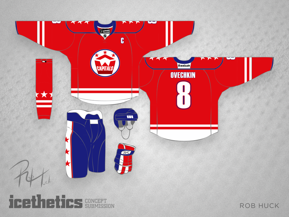
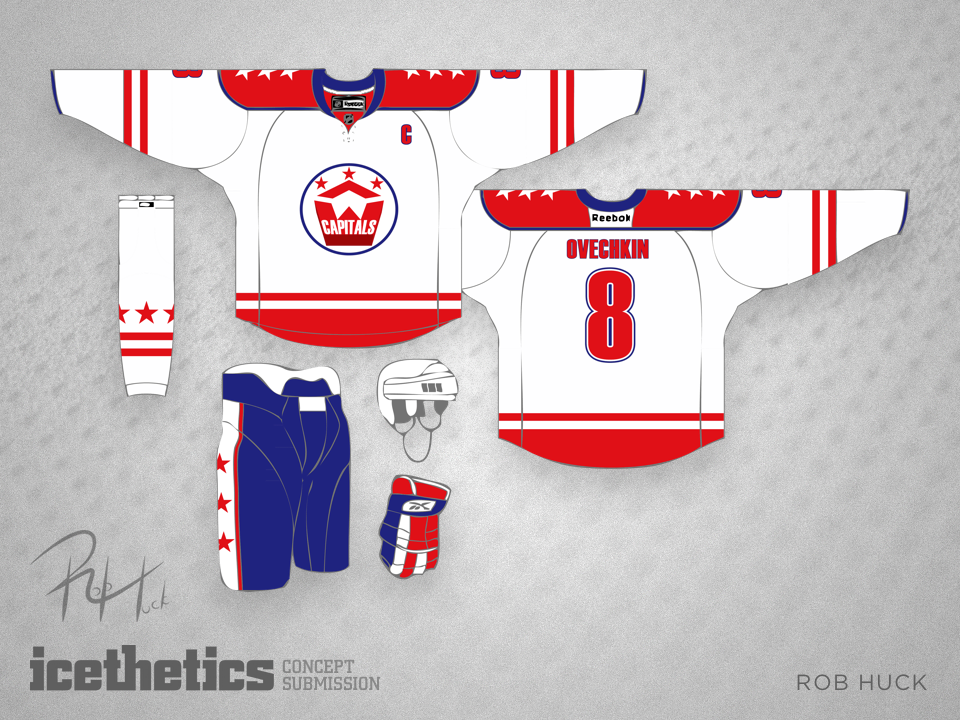
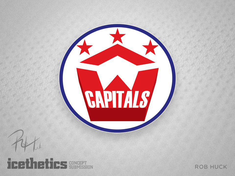
Rob Huck was inspired by The Pentagon when he redesigned the Capitals' logo and uniforms. What do you think?

0172: Inspired by the Shield

My job's easy today. Here's Rob Huck to tell you about his NHL All-Star uniforms:

As you can see, these All Star jerseys take their cue from the NHL logo. I used to admire the All Star jerseys back in the 1980s when the colours reflected that of the old league logo, and I would love to see that reflected again.

I was also inspired by two of the recent concepts posted on Icethetics. The first is the "sash" concept used in Colin May's recent submissions. I tweaked it a bit to turn the sash into a one-sided shoulder yoke, which happily enough also creates the illusion of a hockey stick on the shoulder. (A high-sticking minor of course, but a hockey stick nonetheless.)

Second, I challenged myself to eliminate the use of white in my concept in the manner of Brian Brideau's Boston Bees jerseys. Yes, we all know how much you love the colour black, and the silver in my jerseys seems a little bland, but I think I met this challenge. In addition, the concept could potentially incorporate any two colours quite easily if one were so inclined.