Traditional Ducks
/If the Anaheim Ducks ever need a set of traditional style uniforms that still fit with their existing branding, Tyler Gross has them covered — beautifully.
If the Anaheim Ducks ever need a set of traditional style uniforms that still fit with their existing branding, Tyler Gross has them covered — beautifully.
We know the Nordiques, had stayed in Quebec, they would've changed their logo and uniforms in 1996. But as we saw with many teams that were redesigned in the '90s, the Nords probably would've found their way back by now.
Jamie Robertson designed these jersey and wrote up an alternative history:
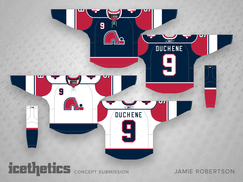
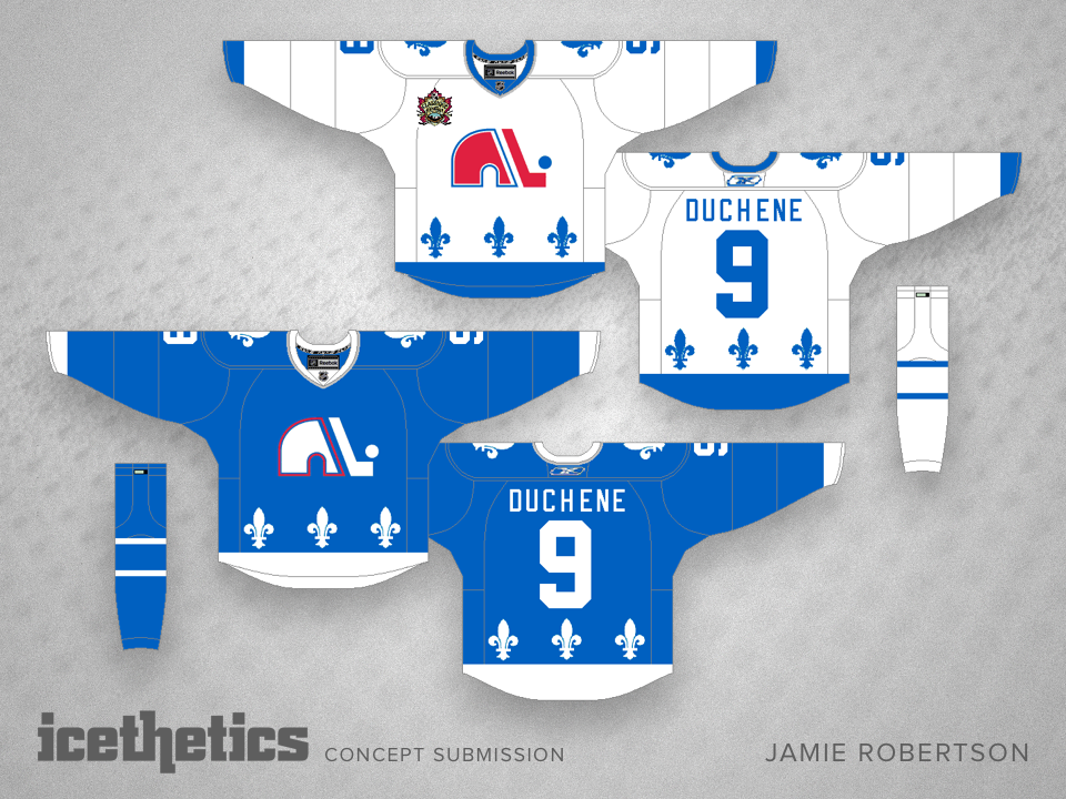
This is what the Nordiques would have looked like today if they had never moved to Colorado — but everything else that happened remained the same.
They would go on to wearing the wolf logo in 1996-97 and would wear them for only a few years. They would then bring back the igloo and stick logo with a different jersey and a darker colour scheme, much like the Islanders and the Oilers did at the time.
This is a set depicting them in the reebok edge era. The light blue as a third sticking with the trend of other teams and then the Heritage Classic jersey that they would wear in 2011 as their existence and rivalry with the Canadiens caused for the game to be held in Montreal's Molson Memorial Stadium.
If only, right?
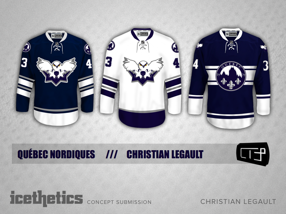
Today and tomorrow we're considering what the Quebec Nordiques might look like if they were still around. Here, Christian Legault takes a stab at redesigning the whole kit.
He writes:
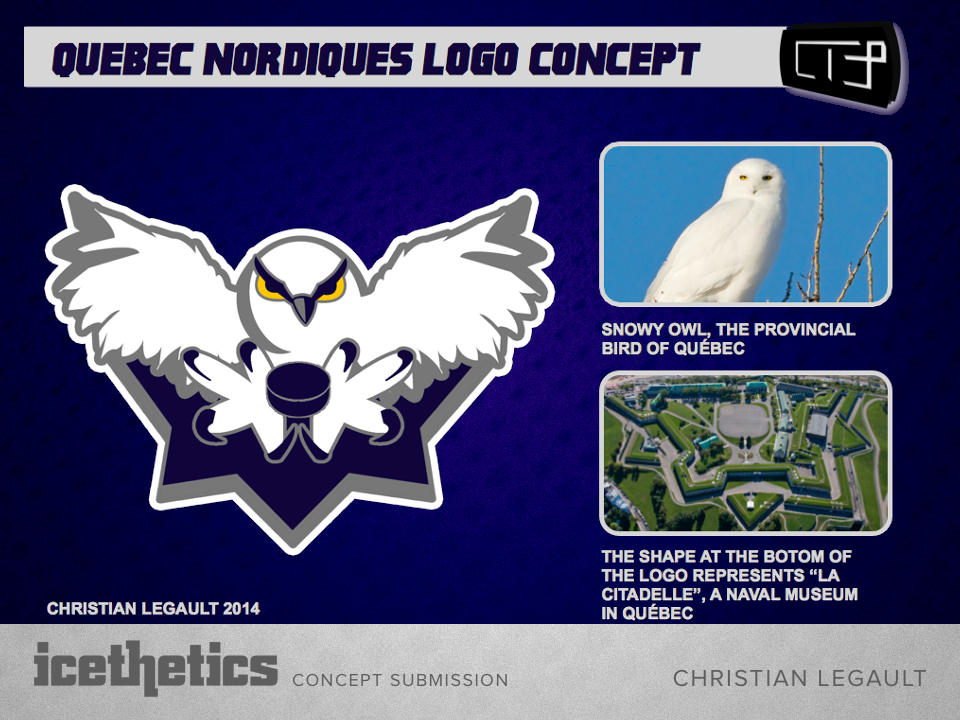
The logo is based on the provincial bird: the snowy owl. The shape under it is the shape of a fort found in Quebec called La Citadelle and the alternate logo is the Château Frontenac with three fleur de lys.
Check back tomorrow for a different look at the Nords.
I really think the Chicago Blackhawks should go back to having a third jersey. And I really think this concept by Dylan Wonka would be perfect.
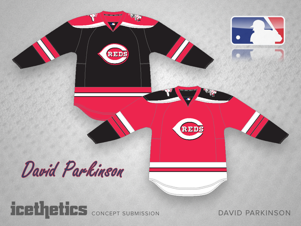
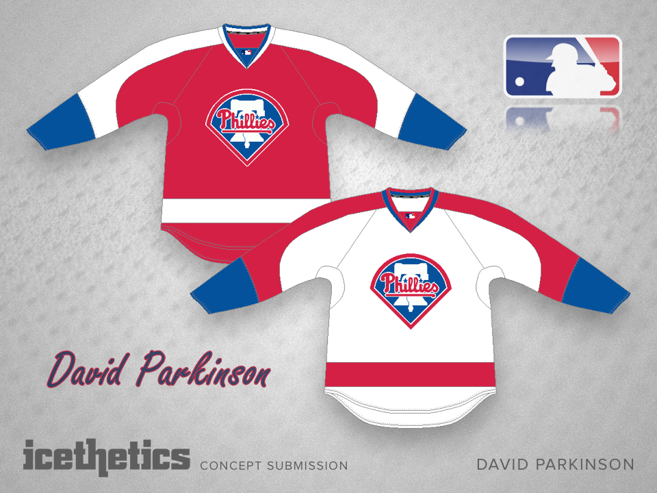
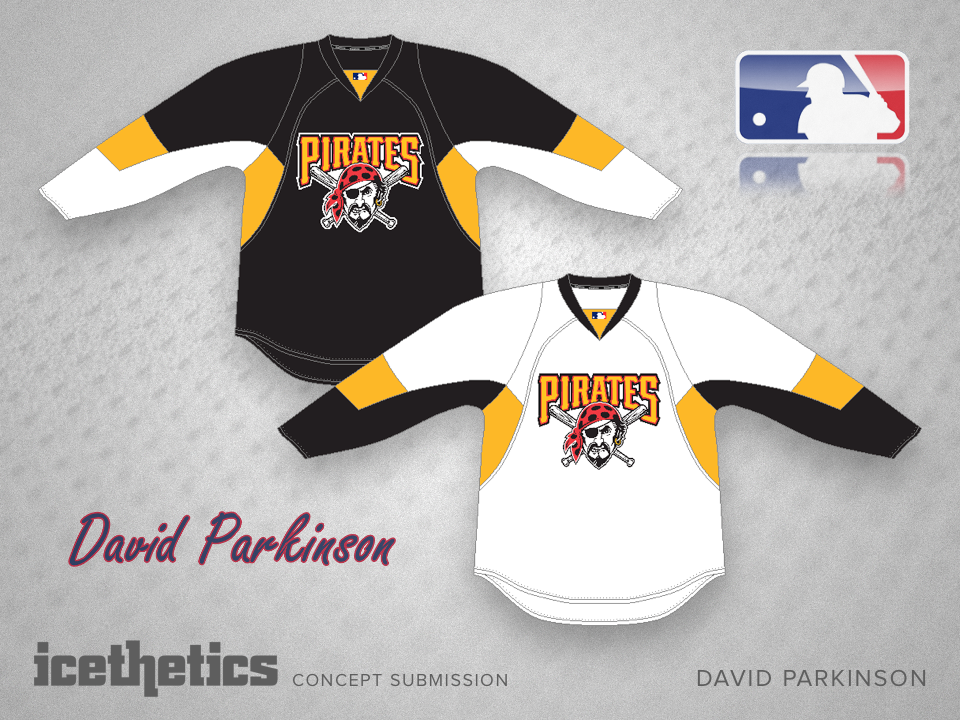
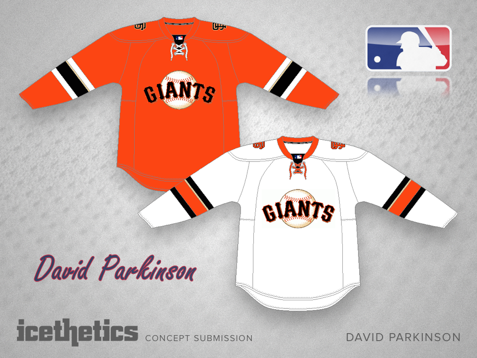
David Parkinson has been at work designing hockey sweaters for Major League Baseball teams — sweaters inspired by the local hockey franchises. Last week he tackled the American League. This week it's the National League.
(Click the above images to enlarge and view as a slideshow.)
If you're curious, here's a list of what teams David based his jerseys on:
David has more concepts like this for other sports. If you'd like to see them, let me know!