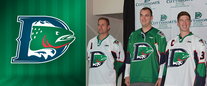
Denver Cutthroats Unveil Uniforms
On Monday, the CHL's Denver Cutthroats officially unveiled their jerseys. The expansion team gave us our first look at its logo back in May. To say I disliked it is putting it mildly. But I was very much a fan of the color scheme. Both opinions hold five months on.
With the jerseys, I'm torn. How can I hate a green hockey sweater? I love green hockey sweaters! But this an abomination. It's basically the generic Reebok Edge template employed by the Penguins, Senators and even Lightning for a few years. Worse than that, the jersey isn't even made by Reebok. It's made by SP Apparel but has the look of a cheap knockoff.
All right, you know I'm not a fan of the Cutthroats look, but they're actually putting NHL players on the ice this season — unlike, you know, the NHL itself. That's right, the team also used this jersey-unveiling press conference to introduce their newest member, ex-Av Kyle Quincey.
 Photo from Denver Cutthroats (Facebook)
What does it say that the Central Hockey League is the best Quincey can do right now? That's him, second from the left. This lockout needs to end now! Anyway, the unveiling of these jerseys was also the first time we really got to see the Cutthroats' secondary logo.
It's not bad if you can look past the crossed hockey sticks cliché. It incorporates elements of the city of Denver's official flag, which is actually a pretty nice flag (as city flags go, anyway).
To sum up, I love the colors, dislike the crest and hate the jerseys. The shoulder patch gets a pass. What do you guys think? Are we on the same page or am I being too harsh?
