FanFic Canucks Jerseys

Okay, people, we're down to less than a month before the tournament begins but that doesn't mean this site is useless until then. Everyday (hopefully), over the next several weeks I'll be posting information regarding new logos and uniforms. So keep checking back. You know you want to.
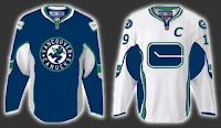
First, I have to start out by scolding myself for forgetting the name of the blog where I found this image. With regard to the coming announcement about new uniforms and logo adjustments, a Vancouver Canucks fan had a little fun with Photoshop.

Quite honestly, I don't hate the design they came up with. On the other hand, I'm fairly sure the final product won't be anything close to this. Plus, I've always been a fan of teams using different logos on their home and away jerseys. I want to say Atlanta was the first to do that when they entered the league, but Washington would've been pretty close. Currently, Ottawa does that as well. In the case of the Sens and Caps, though, the dark jerseys are former third jerseys that have been promoted.

Anyway, just wanted to share that tidbit with you tonight. Like I said, keep checking back for more every day.

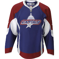
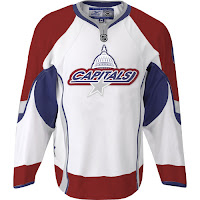
FanFic Caps Unis Making Rounds

a Cathode Rays & Power Plays cross-post from May 3, 2007

First off, of course they're fake. Everybody keeps posing the ridiculous question: Are these real? Are you for real?

As is evidenced by the web address where the images are located, the handiwork comes by way of a graphic artist — from Baltimore, Maryland. (Clearly either a Caps fan, or friends with one.) If he's just hosting it on his site, I'll be very surprised.

Anyway, the design mixes the old with the new in that it keeps the dull (instead of bright) colors and elements of both the old logo and the current one. Note the "Capitals" script with the dome element above it. The grey star beneath it is interesting but it doesn't work on the white jersey. As I've said, I've never been a fan of NHL logos wherein the team name is blatantly spelled out. That's not what a primary logo should be.

That's all for now. Remember, the Washington Capitals unveil their actual new logo and uniforms on June 22.

Retro Returning, Now For Canucks

a Cathode Rays & Power Plays cross-post from April 26, 2007

I know this news is a couple months old, but since I just posted about the Caps, I figured it was relevant.

The Vancouver Canucks will apparently be donning new threads come the fall as well. And just like Washington, the Canucks are planning a return to their original '70s colors of blue, green and white. No word on whether they'll be keeping the orca logo, going back to the original logo, or designing a completely new one all together.

Either way, we find out on August 1.

I found the original post at Canucks Hockey Blog.

You can catch a glimpse of Johnny Canuck painted on the side of Roberto Luongo's mask on nights when the local team wears its vintage blue, green and white uniforms. And the question begs: "Is the artwork on Luongo's mask a hint of things to come?"

The modern day Canucks' marketing machine has instructed its large army of merchandising retailers to stand by for an announcement on Aug. 1.

"Right now we're ordering next year's inventory blindly," says the owner of a sporting goods outlet in North Vancouver. "All we've been told is that the colours of the uniforms will be blue, green and white, but we don't know what the crest is going to look like. The current killer whale [or orca] jersey, as we understand it, will be kept in reserve and occasionally be used as a 'classic' uniform."


So far, I've learned of six teams that have definite plans to change their logos. I have a source in retail that would probably rather not be named. (Look at me trying to be all cryptic.) Aside from Vancouver and Washington, the other four teams that I know of which will see major- or minor-scale uniform and logo changes are the Boston Bruins, San Jose Sharks, Ottawa Senators, and thankfully, the Tampa Bay Lightning.

We'll follow along this summer and see what happens.

Caps Unveiling New Logo June 22

Now that the tournament blog is officially open for business, let's get to the business. We have our first bit of news by way of the Washington Capitals. They are the first team to announce plans for a new logo and uniforms. The Caps made the official announcement of their intentions on their official site — WashingtonCaps.com.


The Caps' official site had this graphic as their splash page during the week following the announcement.

Like the Sabres and Canucks, the Caps are planning a return to the colors they wore originally when they entered the league in 1974. What's with everybody going back to '70s colors? I know style is cyclical, but come on already. You can read the team's press release below.

Washington Capitals to Unveil New Uniforms at June 22 Draft Day Party

April 23, 2007

ARLINGTON, Va. — The Washington Capitals will unveil their new uniforms at a special Draft Day Party on Friday, June 22, held at the Kettler Capitals Iceplex in Arlington, Va. The event will be held in conjunction with the live broadcast on Versus of the first round of the 2007 NHL Entry Draft, which takes place that evening in Columbus, Ohio.

The new uniforms will mark a return to a red, white and blue color scheme — the colors the Capitals wore from their first season in 1974-75 through 1994-95. The Capitals are the first team in the NHL to announce their plans to unveil their new uniforms, which are produced by Reebok and feature the Rbk EDGE Uniform System technology that was introduced at the 2007 NHL All-Star Game in Dallas. The Capitals are the first team planning to have their new uniforms on hand at the NHL Entry Draft.

Further details about the event will be announced in the coming weeks.

Tournament Introduction

Welcome to the NHL Tournament of Logos!

The NHL season is coming to an end and that leaves scores of hockey fans everywhere with a very dull offseason ahead of them. Sure it's summertime and that means vacation and beaches and such. But that doesn't change the fact that there will be no hockey until September.

So to cure our pain, I've come up with a solution. The NHL Tournament of Logos is a fierce battle which pits team logos and nicknames against one another to determine who is the best. It's good, because with the Stanley Cup playoffs ending, we need an outlet for that competitive edge we've all got going.

Whether your team got eliminated too soon or went all the way, this tournament will be worth following. It's a whole new mini-season while we wait for 2007-08. Individual team schedules have been posted so you can follow along with your favorites. Just click on your team's name in the sidebar standings. Also posted are the rules and regulations of the tournament since every competition needs its edicts. And when the Stanley Cup Finals are over, that is when the fun begins. At the moment, Game 7 of the Finals is scheduled for June 11. But anything can happen. The schedule can change and the series may not even go to seven games. Regardless, the tournament will begin on June 12.

Basically, here's the way it works. The tournament will be played in a blog format. Each day, three or four matches will be "posted" here on the blog. A match features two teams in a one-on-one battle. Each team plays every team in its own conference. To find out more about how that works, check out the rules post. For now, just enjoy the rest of the playoffs and come back here when its all over.

Also, keep checking back here for updates as I plan to follow very carefully any logo or uniform related news and forward it on. As you know, next season will feature the introduction of the new Rbk EDGE uniforms and many teams will be redesigning logos and looks as well. And be sure to get in on the action and discuss your feelings by clicking on the comments of any post. We're looking forward to an awesome competition!