Okay, people, we're down to just a few weeks before the tournament begins but that doesn't mean this site is useless until then — as has been made obvious with the Hockey Fans & Photoshop series. But getting away from that briefly I wanted to take a trip down memory lane. Last year, all of us hockey fans waited and wondered about what we might see in terms of new logos and uniforms for the coming season.
Both the Buffalo Sabres and Anaheim Ducks — switching to a new moniker — got complete design makeovers. Brand new logos, even brand new colors! Some loved them and some hated them. Personally, I didn't like either new logo very much, but that's what we got. (That might give away a little bit about how the Tournament may go.)
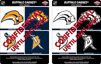 Anyway, this relic here seen to the right is that lovely "leaked" image we were all treated to while waiting to see what the new Sabres logo might look like. The team had previously announced a return to its traditional blue and gold colors and even promised to wear the old '70s uniform for a handful of games in the new season. But as for the primary logo — fans hated it! They called it the Buffaslug, mocking the creature's lack of legs.
The whole "Confidential Until Sept. 2006" made for a pretty interesting sell as well. Still, most people were sure it was a fake. The NHL would never go for such a lame logo. But wait, this is the NHL we're talking about.
Which brings us to our other topic of discussion. No longer a minion of the Disney Corporation, the team wanted to lose that last link going from Mighty Ducks of Anaheim to — quite simply — the Anaheim Ducks. And I liked the name change. What I didn't like was the new logo put forth.
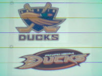 The fuzzy cell phone camera image you see to the left was apparently taken by someone who wants us to think there were better options available to the Ducks. Of the two, I prefer the top logo, so naturally the one on the bottom is what the team chose. I know it would've led to endless tirades about the "Anaheim Mallards" and yes it does look a little like a baseball logo (for some reason) but still — what have they got now? It's not even a real logo. And at least the top one features a better color scheme — not that I really have anything against the orange and gold. It works too.

 As far as options go, these two also surfaced. The one on the right is the Atlanta Thrashers logo, so even though I like it, let's move on. The one on the left is nice but also prominently features a mallard along with a rather dull color scheme. So I don't know what to say. I guess they just didn't have any really good graphic design firms on the case. Which reminds me — somebody from the NHL really really needs to listen to this guy. The Sabres especially would be much better off.
All right, that's all the ranting I have for you tonight. It was a brief look back at last year as we await the massive slew of new designs expected for the 2007-08 season. Stay with us. More Hockey Fans & Photoshop tomorrow!


