HF&P, Part 14: Pittsburgh Penguins

I know my "Hockey Fans & Photoshop" series has been waning as of late, but as of today it's back and better than ever. The reason: I am now armed with tons of new fan artwork. Some of it is pretty awesome. Some of it is pretty dreadful. Today we'll be getting a concoction of both as we take a look at the Pittsburgh Penguins.

By the way, if you don't know what this series is about, check out the original post and some of the others in the series.

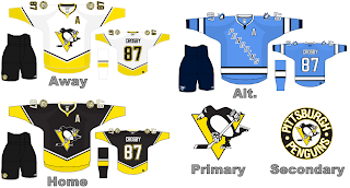
First off, I've hated the yellow ever since they upgraded to gold. No sense in going back. If you don't know what I mean, the color in the jersey to the right is a perfect example. But as I've mentioned before, this artist is very nostalgic and gives all his uniform renderings that touch. Replace that yellow and I think these are very good representations of what we'd all like to see for the Pens come the fall.

Second, I love the blue third jersey! I know the league has been talking about dumping that program for the new season while everyone adjusts to the sweeping uniform changes, but I love that blue jersey. I love the creativity and the designer's sense of nostalgia. One thing: The logo has never had a blue triangle. Switch it back to gold but keep the jersey blue. Awesome.


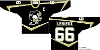
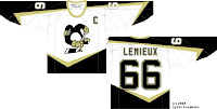
You didn't think I was done yet did you? This design is nothing new — as indicated by the 2004 copyright — and they feature the old jersey design. Still, I thought they warranted comment since they're just that cool. I think it's a really neat design that isn't seen in the NHL but should be. Not only that, I'm afraid of that penguin. It's just a very cool modernized version of the penguin they currently use in their logo. I miss the triangle, though. I'm sure they could work one in.

Anyway, that's what some fans see in the future for Pittsburgh uniforms. We won't know for sure, one way or the other, until the summer when the teams start unveiling their new duds. Keep it here for info on that, by the way, as it becomes available.

Next up: the New York Islanders (and you're going to laugh your ass off when you see it).

Rumor: New Bruins Logo Coming Friday

I don't care much for rumors since anyone can create one and no one has to take responsibility for it so I generally tend to shy away from them. Still, I've heard from several places and have referenced before in this blog that the Boston Bruins will be getting a new logo and uniforms this summer.
Now I'm getting rumblings of an unveiling date set for June 1. Well, that's this Friday so the good news is we don't have to wait long to see if the rumor is true.

That being said, I'm not adding it to the sidebar countdown but I did feel like making everyone aware of the possibility. Keep an eye on the B's web site along with NHL.com this week to see what happens.

I don't have any particulars on the new look — just that the spoked B is out and a new, fierce-looking bear is in. I'm assuming they're keeping the colors. If this does pan out, the Bruins will become the first Original Six team to make a major logo change in the last 50 years.

HF&P, Part 13: Carolina Hurricanes

Well, the "Hockey Fans & Photoshop" series is winding down now as we're just a mere two weeks out from the opening of the NHL Tournament of Logos. It's pretty exciting. But unfortunately, that also means the NHL season is ending. It's down to Ottawa and Anaheim in a true battle of the best. If you're wondering, I'm pulling for the Ducks to take home Lord Stanley.

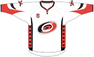
Correct me if I'm wrong friends, but I believe we've seen this designer's work before. This is a very simple design not a far cry from what the Hurricanes currently wear. All that's been done really is the hurricane flags worn horizontally around the waist have moved vertically to the sides under the arms.

This design also uses the front right shoulder numbers being worn by the Buffalo Sabres this season. I doubt that will become a league-wide mandate.

At this point I'd typically take the opportunity to point out flaws or suggest improvements, but I really can't. I like the Hurricanes' logos — both primary and secondary — and can't see a reason to change the color scheme or jersey design. It's a keeper. Now we just wait and see what the 'Canes actually have planned for next season.

Up next: the Pittsburgh Penguins.

HF&P, Part 12: Columbus Blue Jackets

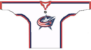
All right so today brings a good example of what happens when a hockey fan gets a hold of Photoshop and doesn't know how to use it. By the way, I use the term Photoshop generically here.


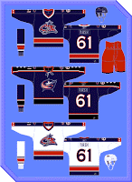
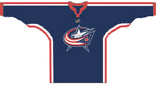
Really I think someone just got a hold of Microsoft Paint. Basically the designer was just trying to see what a jersey might look like with the secondary logo as the crest, which was announced by Doug MacLean before he got fired. Thing is, we've already seen that. It was called the Blue Jackets' third jersey.

The jersey in the middle there is what Columbus wore as alternate this season. I'm a big fan of it. I've also heard rumblings of a slight change in the color scheme. I don't know what, though. We'll just have to wait it out and see.

Now, lastly I should just apologize for mocking the obvious lack of talent in the designer of today's uniforms but come on as I am no better. At least this person took the time to open Paint for three seconds. I'm just sitting here at my keyboard looking on and making snide comments.

But that's fun too.

Next up: the Carolina Hurricanes.

HF&P, Part 11: Dallas Stars

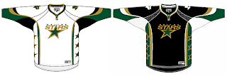
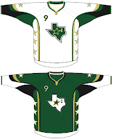
The "Hockey Fans & Photoshop" series pushes forward with a pair of designs a couple artists came up with for the Dallas Stars.

This is probably the most expected version of the new uniforms for Dallas. But personally I'd like to see a change in the logo. Nothing drastic, just an update. They have great colors but I feel like they could use a better logo.

And when I say that I do not mean what you see here to the right. I believe this design was rather ill-conceived. While it would be a welcome change to see a new crest on the Stars' sweaters, certainly this is not the way to go. This is the secondary logo and should stay that way.

Also worth noting in this design is the jersey number located on the front right shoulder. As I've discussed, the Sabres introduced that this season but it doesn't appear yet that the NHL plans to adopt it league-wide.

As far as that goes, I'm guessing the designer of this one also did the Flyers (yesterday). This is relevant only in as much as this person created a secondary logo for Philly. Why not come up with a new one for Dallas while you're at it? I was impressed by the Liberty Bell.

Anyway, we'll find out just exactly what's going down for next season at some point this summer. I can't wait.

Coming tomorrow: the Columbus Blue Jackets.