It occurs to me that I'm really running out of time if I want to get the "Hockey Fans & Photoshop" series completed by the time the tournament starts. It's only nine days away! That being said, I'm going to be a little ambitious leading up to it by giving you two posts a day! That's right, I said two.
There's no real reason why I couldn't continue this series into the tournament except for that I just don't feel like it. On the other hand, if I do come across new artwork, I'll be sure to pass it along. Now, on with it already.
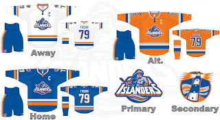
Now before you say anything, I warned you last time that you would laugh your ass off on this design. That being said, changes like this fascinate me and therefore I love it. Of course it would send hockey's ultra-traditionalists into a tailspin. Maybe that's why this sport has never really gone mainstream — the traditionalists won't allow it.
That's disappointing, isn't it?
Anyway, there you have it. One fan's nostalgic throwback in the Rbk EDGE template. It's a beautiful thing. It's basically the same as the '90s logo that failed after just a season with the aqua color replaced by gray. So anyway, I don't hate it but I give it no chance of actually making it onto the backs of an Islander players.
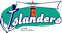 So speaking of getting all radical and crazy, I came across the coolest web site the other day. Somebody came up with a whole slew of concept logos for NHL teams. I'm going to put them all in one big post on Tuesday, but thought I'd give you a little preview today. Just look at that thing. I don't even know what pee wee team should have that lighthouse on their sweaters.
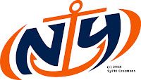 These works of art are nothing short of sheer genius. I mean, the "NY" cleverly placed within an anchor! Does it really get any better than this?
Okay, I'll stop now. While the Islanders have no intention — at least not publicly — of changing their logo, these logos are still fun. And they've been around several years, as indicated by the copyright date.
So I hope you enjoyed that at least a little bit. Just something to laugh at on your Sunday afternoon.
Up next: the New York Rangers — and that's coming later today in the second of two posts.


 Yeah, so not all that surprisingly there's been no announcement of a new logo for the Boston Bruins today. Although I have since rather conveniently read that there will be an announcement at the draft, a la the Washington Capitals. So whatever, I've heard there will be a new logo this year but until we get official word from the league or team, they're not going in the sidebar countdown.


