HF&P, Part 23: Columbus Blue Jackets II

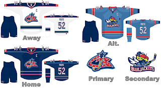
Wow, we're already up to the 23rd part in a series of posts about fan-designed NHL jerseys for the new season. We continue by revisiting the Columbus Blue Jackets — last featured in Part 12. That one may have been a rather lame design but at least it used the new primary logo.

Here the designer must've have come up with this design prior to the new logo announcement — that being that the former secondary logo will now be the primary. Oddly, this design doesn't even reference that logo as secondary or otherwise. Still, I like what they've come up with based on what they had to work with at the time.

I really do like the sky blue alternate jersey — despite the league shying away from those this season — but I do not like the bug logo. I don't think anyone does — or ever has. It needs to be swatted and smashed.

Anyway, feel free to leave a comment with your feelings regarding the logos and designs and such.

Next time: the 2007 Stanley Cup Champion Anaheim Ducks.

HF&P, Part 22: Detroit Red Wings

Check it. There's more from the "Hockey Fans & Photoshop" series this evening. Let's go to Hockeytown.

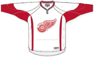
I know, I think we were all expecting something with a little more pizzazz. But there it is. A fan artist's rendering of a possible design for the new Rbk EDGE uniforms to be worn by the Detroit Red Wings.

Short post, I know. There's another one on the way though.

Up next: We're going to take another stab at the Columbus Blue Jackets — because I can.

New Unis Coming For Jackets...

...but we already knew this didn't we?

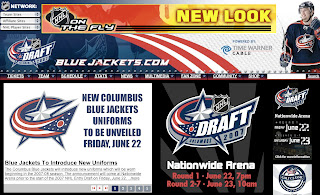
I saw this today on the Columbus Blue Jackets web site. They made the official announcement on June 1. You can read the press release below or simply go to their site.

Columbus Blue Jackets To Introduce New Uniforms For 2007-08 Season Prior To Start Of NHL Draft On Friday, June 22

June 1, 2007
BlueJackets.NHL.com

COLUMBUS, OHIO — The Columbus Blue Jackets will introduce their new home and road uniforms prior to the start of the 2007 National Hockey League Entry Draft at Nationwide Arena on Friday, June 22. The unveiling will include two Blue Jackets players and take place on the Entry Draft stage just prior to the start of the draft.

The Blue Jackets will join the other 29 NHL member clubs in wearing the Rbk Edge uniforms beginning with the 2007-08 season. Last January, the NHL and Reebok announced a partnership that has created the new technologically-advanced uniform system, which was worn by the Western and Eastern Conference All-Star Teams at last year's game in Dallas.

The Rbk Edge Uniform System was designed with performance and safety at the forefront. It is the culmination of more than two years of research and testing with active participation by NHL players, the NHL Players' Association and NHL team executives. The launch marks the first time in the history of major North American professional sports leagues that a league-wide uniform innovation has been established.

The 2007 NHL Entry Draft will be held at Nationwide Arena on Friday, June 22 and Saturday, June 23. The first round will begin at 7 p.m. on Friday with rounds 2-7 beginning at 10 a.m. on Saturday. Tickets are free for both days and are available at www.BlueJackets.com. Additional information on special events surrounding the draft will be announced in the coming days.

For information on Blue Jackets season tickets, mini-plans and group tickets for the 2007-08 National Hockey League season, call (614) 246-PUCK or (800) NHL-COLS.

HF&P, Part 21: Toronto Maple Leafs

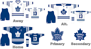
They're calling it blasphemous — the idea that the Toronto Maple Leafs may be changing their logo for the 2007-08 season. I say, why not? More power to them. Anyway, they're the 21st entry in the "Hockey Fans & Photoshop" series here on the NHL Tournament of Logos blog leading up the start of the competition in less than a week.

What do you think? As you can see, it's more work from Mr. Nostalgia as we dig into the time capsule and retrieve these old relics. The "primary" logo is of course currently used on the Leafs' third jerseys while they "secondary" logo hasn't been used in decades. But it's an interesting look. Any Toronto fans feel like weighing in?

That's really all I have to say on this matter. Check back tomorrow for more cool fan-made designs.

I also want to make sure that I mention every so often that these images I'm posting are stolen — borrowed, rather. I'm finding them at various places online and am trying to get them all posted in one place for the enjoyment and interest of fans everywhere. If you or someone you know has designed them, please feel free to drop me a line and let me know about it so I can credit you. I am by no means taking credit for anything here — unless I say so specifically.

There. Now onto other things.

Coming up next: the Detroit Red Wings.

HF&P, Part 20: Boston Bruins II

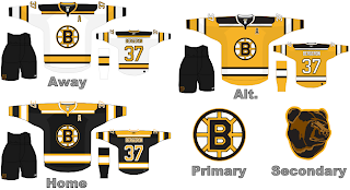
The "Hockey Fans & Photoshop" series trudges on with yet another new uniform design — this one, for the boys from Beantown — the Boston Bruins. We took a look at one design back in Part 8 but I've discovered another out there.

It's a nice one. But it's never going to happen. I haven't heard anything official yet but the Bruins are apparently redesigning the logo — something in the neighborhood of a scary looking bear a la the Hershey Bears of the AHL.

Regardless, I like this design. It's simple but it's different. I also like the yellow jersey even though no one else will and the league is probably opting away from third jerseys for a little bit while everyone adjusts to the sweeping uniform changes.

What do you think of them? Comment me.

Up next: the Toronto Maple Leafs.