Red Wings vs Kings


vs
RED WINGS
KINGS
0-0
0-0

The Aesthetics
I've said before that ultra-traditionalism shall have no part in this competition. So I don't care that the Red Wings logo has been around for ages. It could use an upgrade. This is, after all, 2007. Among other things, I like the Kings' color scheme. It's something different.
Kings

The Nickname
I can't say for sure what sort of bird a Red Wing would belong to, but I'm fairly sure the King of the land would have nothing to say about it.
Red Wings

The Analysis
When I think "king," I think crown, so the Kings hit it right on the money. But I like how the Red Wings logo incorporates a wheel. After all, before Detroit was dubbed Hockeytown, it was Motor City.
Red Wings


WINNER
2-1


Thrashers vs Rangers


vs
THRASHERS
RANGERS
0-0
0-0

The Aesthetics
Even though I didn't like the team's name, I've liked the Thrashers' logo ever since it was first unveiled when the team started playing in 1999. The Rangers, on the other hand, not so much. I think they should upgrade to the shoulder logo on the third jersey. Much nicer.
Thrashers

The Nickname
If the Thrasher is living in a national park, the park Ranger is protecting it and therefore has the upper hand.
Rangers

The Analysis
I don't know why it is that almost all the pro sports teams in Atlanta have to be named for birds, but the hockey team got burned. Falcons and hawks are birds of prey and despite "thrashing" being a good verb for use in defeating opponents, the thrasher is what, a songbird? Come on. By default, the Rangers take this one.
Rangers


WINNER
2-1


Stars vs Blackhawks


vs
STARS
BLACKHAWKS
0-0
0-0

The Aesthetics
Albeit slightly boring, the Stars have a much sleaker look than the Blackhawks. I've always found the Indian head a little clunky and intricate, not to mention its lack of a defined color scheme.
Stars

The Nickname
Chief Black Hawk may have been a tough son of a bitch, but a Star is a giant all-consuming ball of fire.
Stars

The Analysis
The Blackhawks get their name from Chief Black Hawk who was a Sauk warlord in the area of what is now Rock Island, Illinois which is less than 200 miles from Chicago. Not bad. On the other hand, the Stars take their name from predecessor Minnesota North Stars. I think it works great, what with Texas being the Lone Star state. The only drawback is that the team name is spelled out in the logo and, by and large, I'm not a fan of that. Still, they squeak by with the point.
Stars


WINNER
3-0


Tourney Starts Up Tomorrow!

Can you feel the excitement yet? No? Am I building this up too much? I'm totally being sarcastic every time I tell you how awesome this tournament is going to be. It's going to be a three-month-long load of dung. You read that right.

Seriously though, I'll have fun writing it, but whether you'll have fun reading it is a completely different question altogether. What's cool is that it's finally starting tomorrow. I anticipate posting the first matches of the NHL Tournament of Logos tomorrow morning around 10 AM or so. (Don't hold me to that.)

For the time being, if you don't have a clue what this so-called "tournament" is about, may I suggest the Introduction. It's great reading and it will get you up to speed on this competition. Follow that up with a little bit of Rules & Regs and a side of FAQs. In fact, while you're getting your dose of the FAQs, feel free to ask some questions of your own. I swear I'll answer them on the double!

That's all from me for tonight. After the tournament gets started, I have some cool concept logos and jerseys to share. Look for that sometime tomorrow afternoon once the first matches have been posted.

HF&P, Part 30: Tampa Bay Lightning II

You know, the fact that this is the 30th segment in a series about the NHL — which has 30 teams — might lead you to believe I've covered all my bases. Unfortunately this is not the case. More about that in a moment. First, we're going to take another look at a design for the Tampa Bay Lightning. We last looked at them in Part 1 of the "Hockey Fans & Photoshop" series — the original.

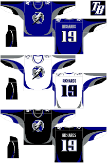
So there it is. We've come full circle. Overall, I like it. The stripes are surely different. The designer has taken the secondary logo and made it the crest with some minor adjustments. I don't hate it, but if it were me, I'd come up with an entirely new logo for the team. But that's me.

The "TB" logo for the shoulder is nice if not a little overdone and generic. I say that, but generally speaking, this design is far better than what the team currently wears — or should I say, wore until the end of the 2006-07 season.

So as I was saying, due to the nature of this series, a number of deserving teams got missed in this series — which isn't to say it's over necessarily. If you have any designs — your own or something you found on the web — that I've overlooked, please feel free to send them along.

The teams I haven't seen any fan-made artwork for are the Buffalo Sabres, Atlanta Thrashers, Florida Panthers, Chicago Blackhawks, Colorado Avalanche, Phoenix Coyotes, Minnesota Wild and Nashville Predators.

Anyway, if you know of or have a graphic I haven't posted here, drop me a line in the comments and tell me all about it. I might even post it as part of the series.