I've been scouring the web over the last couple of weeks in search of logos designed by fans for their favorite teams. Logos that are cool — or not cool as the case may be — but will never see the front of an NHL jersey.
As is the case with most of these logos, I can't remember where I found them so if you designed any of them, feel free to let me know via a comment. And for the record, great work! Anyway, let's dive right in.
 This is a logo designed for the Tampa Bay Lightning. As you can plainly see, the designer makes use of a lightning bolt as the "B" in "TB" for — you guessed it — Tampa Bay. As I've said, I've never been a huge fan of clearly obvious letters in logos, but this one isn't horrible. Still not my favorite though. I feel like there's a way to do it well that's subtle. Look at the New Jersey Devils logo. It features a very subtle "NJ" — so subtle you kind of have to stare at it to see it. That's what I like in a logo. But that didn't stop someone from coming up with a few concept logos for the Devils. I'll have those tomorrow in Part 2.
 Until then, I have an Edmonton Oilers logo to share. Basically, the artist has kept the oil drop from the original logo and set it inside a gear — a little like the team's third jersey logo. It's nice, but as far as the colors go, I'm more a fan of the silver and blue in said alternate logo. But who am I to complain? Any Oilers fans out there reading this? What do you think?
Now our feature presentation. It's been widely rumored as of late that the Toronto Maple Leafs have plans to alter and adjust their logo for the new season. Reports have suggested that only minor changes to the leaf silhouette will take place but that the logo will remain in large part much the way it is now.
So turn your attention to the right. The top logo is basically the maple leaf from the Canadian flag turned blue with "Toronto Maple Leafs" written inside. Next we have a maple leaf within a circle — a logo which seems oddly familiar yet for some reason I can't quite place it. NHL All-Star Game logo? Olympics logo? If you recognize it, let me know.
And finally, we're treated to this gem on the bottom. If you want radical, this one is for you. I have no idea what's going on there. It scares me a little. I mean it's way too intricate to ever seen on a uniform which is why I'm not truly worried — but, still, it's weird. In a way I like it and in a way I don't. That's all I have to say on the matter.
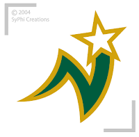 And finally, check out this blast from the past. Someone came up with this design for the Minnesota North Stars about 11 years too late. Personally, I never liked the old North Stars logo — I say that knowing that I could be stoned to death for such a remark. It was just too — lame.
Not that this one is much better. But it has a little more something to it, at least.
So there you have it. Six concept logos for your Wednesday. Mull those over and get back to me in the comments. What do you like? What do you dislike? What would you like to cram down my throat? — all right, easy does it. I'm just sharing what I've found. Which reminds me, if you find any cool concept logos around the web or have any on your hard drive, let me know about them in the comments.
Stay tuned for Part 2 tomorrow — or whenever I feel like posting it.


