Oilers vs Red Wings


vs
OILERS
RED WINGS
0-3
1-2

The Aesthetics
The Oilers get this point for better use of color and simple design despite the name of the team being in the logo. The Red Wings logo is a little complex.
Oilers

The Nickname
If an Oiler were to accidentally get oil onto a Red Wing, the bird it belonged to would surely be unable to fly.
Oilers

The Analysis
While the Oilers logo is simple, I'm more a fan of the secondary and third jersey logos. They better depict the logo the team should have, in my opinion. On the other hand, the Red Wings logo does a fantastic job of symbolizing Motor City with the wheel attached to the wing.
Red Wings


WINNER
2-1


I'm A Little Concerned...

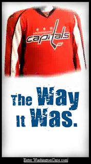
Why am I concerned? Folks, this very well may be the new Washington Capitals uniform and logo. And it is not looking good. Now you know me. You know I wouldn't post something I didn't believe to be the real deal where I didn't specifically say it was fan-created. I have a bad feeling this could be it.

Let's hope it's just that though. A bad feeling. And that the Capitals organization has a little more sense than this. And that there's a very Photoshop-inclined hockey fan out there who really hates the Capitals. All right then.

I nabbed this image off of a forum that seems to indicate the Caps may have intentionally leaked the new look. But like I said and will say over and over again, it could all be nothing. Still, I am inclined to post it. We'll just have to wait and see. The official word comes on Friday evening. Do stop by here for that news. You know I'll have it.

Thanks For The Comments

I wanted to take a moment to thank everyone — all two of you — for commenting. Just to let you know, I read and respond to all comments and appreciate them more than you can know. It means people actually read this drivel of mine. Makes it all worthwhile.

Seriously, keep reading and as long as you've got something to say, keep commenting!

Blues vs Oilers


vs
BLUES
OILERS
2-0
0-2

The Aesthetics
We certainly get a fair amount of blue between these two logos. That aside, the circle has always been a classic logo shape, but I've always found odd shapes more interesting to look at. The Blues logo features a musical note attached to a wing. My eye is more drawn to it.
Blues

The Nickname
I guess you might say an Oiler could sing the Blues. But who has the upper hand. Since an oil man is a person, though, he has the freedom of choice. He could sing a happy tune if he wanted.
Oilers

The Analysis
Both teams have been in the league for a lot of years and both, in the past decade, have given upgrades to their logos. In fact, the Blues current logo is more of an improvement on the original. But you could also say that about the Oilers as well. It's a very difficult call to make as to which team gets this point, but as far as logos go, I've never liked ones which spell out the team name. The Blues get it.
Blues


WINNER
2-1


Senators vs Maple Leafs


vs
SENATORS
MAPLE LEAFS
1-1
0-2

The Aesthetics
The Senators logo makes much more use of color than the Maple Leafs. Another thing that detracts from the Maple Leafs logo is, as always, the words spelled out. I believe it was in the '70s or '80s that the Leafs actually donned a wordless Leaf on their uniform shoulders. What ever happened to that?
Senators

The Nickname
If a Senator, walking down a sidewalk, stepped on a Maple Leaf that had fallen from a tree, he would no doubt crush it with a crackle.
Senators

The Analysis
Despite the fact that I like the use of a design similar to the Canadian flag's primary element as the Maple Leafs logo, I always go back to my distaste for logos which spell out a name and/or city. But I'd settle for something even a little more interesting to the eye. The logo used on the third jerseys is a good example of what can be done. And even though I like the Senators logo, it wouldn't hurt if they did the same. They're third jersey crest is one of the best. Ultimately, however, they do get this point.
Senators


WINNER
3-0