Flyers vs Rangers


vs
FLYERS
RANGERS
2-1
1-2

The Aesthetics
Both logos symbolize storied franchises but as I've said many times before, words can kill the aesthetics of any logo. That and I love subtle letters such as the "P" in the Flyers logo.
Flyers

The Nickname
As with any bird, it's the job of a Ranger to protect the Flyer, who therefore has the upper hand.
Rangers

The Analysis
Quite honestly, red, white and blue have never been such important colors to New York City than in the aftermath of the attacks of 9/11. That makes the Rangers colors very significant. Meanwhile, the Flyers logo doesn't go a very long way to symbolize its home city of Philadelphia.
Rangers


WINNER
2-1


Sharks vs Ducks


vs
SHARKS
DUCKS
2-0
0-2

The Aesthetics
The Ducks' unfortunate choice to make a wordmark their primary logo may very well be their downfall in this competition. On the other hand, the Sharks logo is good enough to beat out just about anyone. Talk about fierce!
Sharks

The Nickname
A Shark could totally eat a Duck. The Duck wouldn't stand a chance.
Sharks

The Analysis
Ultimately the Sharks logo is nearly perfect for its location of San Jose, and with any California team you would expect non-traditional colors. I think it's great that the Ducks opted to go with the orange and gold after the name change, but a logo with an actual Duck or even just the footprint would be exponentially better.
Sharks


WINNER
3-0


Islanders vs Thrashers


vs
ISLANDERS
THRASHERS
0-0
0-2

The Aesthetics
I've never been the biggest fan of words or hockey sticks especially in hockey logos. It's a little too on-the-nose if you ask me. The Islanders have both and for that reason they should lose the point. But then this logo is supposed to be traditional right? They've used it for a few decades now (minus those couple of years with the Gordon's fisherman). Still, the Thrashers logo is visually interesting and makes great use of color.
Thrashers

The Nickname
If a Thrasher was flying over an Islander, the bird would surely poop on his head. I know, effort.
Thrashers

The Analysis
It stood the test of time even when a mid-'90s mistake couldn't. The Islanders logo may only be 35 years old, but to many hockey fans, it's been around forever. But that doesn't automatically win you a point in this competition. You need to really show something. In this case, the Islanders logo shows a sense of where it's from with the map of Long Island featured. The Atlanta Thrasher? Maybe. But I'm not getting a feel for the city.
Islanders


WINNER
2-1


Oilers vs Red Wings


vs
OILERS
RED WINGS
0-3
1-2

The Aesthetics
The Oilers get this point for better use of color and simple design despite the name of the team being in the logo. The Red Wings logo is a little complex.
Oilers

The Nickname
If an Oiler were to accidentally get oil onto a Red Wing, the bird it belonged to would surely be unable to fly.
Oilers

The Analysis
While the Oilers logo is simple, I'm more a fan of the secondary and third jersey logos. They better depict the logo the team should have, in my opinion. On the other hand, the Red Wings logo does a fantastic job of symbolizing Motor City with the wheel attached to the wing.
Red Wings


WINNER
2-1


I'm A Little Concerned...

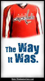
Why am I concerned? Folks, this very well may be the new Washington Capitals uniform and logo. And it is not looking good. Now you know me. You know I wouldn't post something I didn't believe to be the real deal where I didn't specifically say it was fan-created. I have a bad feeling this could be it.

Let's hope it's just that though. A bad feeling. And that the Capitals organization has a little more sense than this. And that there's a very Photoshop-inclined hockey fan out there who really hates the Capitals. All right then.

I nabbed this image off of a forum that seems to indicate the Caps may have intentionally leaked the new look. But like I said and will say over and over again, it could all be nothing. Still, I am inclined to post it. We'll just have to wait and see. The official word comes on Friday evening. Do stop by here for that news. You know I'll have it.