Blues vs Blackhawks


vs
BLUES
BLACKHAWKS
3-1
1-3

The Aesthetics
The simple design and straightforward color scheme of the Blues logo starkly contrasts the Blackhawks. We know that Blackhawks colors are red, black and white from their uniforms, but then why does the logo also have green, yellow, blue, orange and tan? The world may never know. Clean up your act, Blackhawks logo.
Blues

The Nickname
A Blackhawk indian could do a rain dance. Can the Blues man do that?
Blackhawks

The Analysis
Both teams have appropriate logos though neither goes out of its way to represent its home city graphically. Ultimately its the simplicity and clean, sleek look of the Blues logo that wins it the point.
Blues


WINNER
2-1


Panthers vs Devils


vs
PANTHERS
DEVILS
3-0
0-0

The Aesthetics
Finally, the Devils have a match. And things are looking up already. You have the subtle "NJ" along with a simple, fear-inspiring design gives them the edge over the Panthers logo. It may seem like I hate all logos with small details, but that's just not the case. Sometimes it works and sometimes it doesn't. Normally it would work for the Panthers, but just look at that Devils logo.
Devils

The Nickname
The Devil could strike a Panther dead if it ever tried to attack. Yeah, he's that powerful.
Devils

The Analysis
Here's where the Panthers avoid the sweep. They are a very aptly named team. There's nothing wrong with the Devils, but I feel like that gets used a lot. Perhaps the Devils can get this point against another team.
Panthers


WINNER
2-1


The Caps Unveiling Party


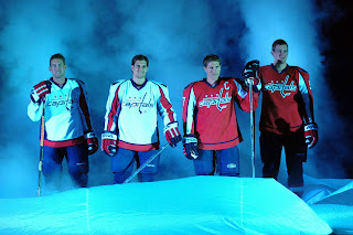
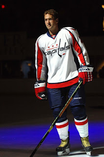
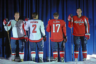
This evening the Washington Capitals had their big draft day party in D.C. where they unveiled the uniforms to fans. Check out all the cool smoke and stuff.

Ex-Bolt Ben Clymer is seen here modeling the brand spankin' new Caps duds. They're sharp uniforms. I still hate the logo though. I don't mind the shoulder logo with the eagle in the form of a "W." Anything but a logo made out of the team name.

I do get nostalgia and throwbacks and stuff, but come on. Put that on the shoulder or something. Anyway, it's not up to me and I'm not even a fan of the team. I'm just hoping the Lightning come up with something cool this summer.

We're all waiting on the "EDGE" of our seats. Come on! You don't like puns?

No New EDGE Jerseys At The Draft

The Chicago Blackhawks just took Patrick Kane as the first overall pick of the 2007 NHL Entry Draft. The jersey they gave him was the standard jersey and not the new Rbk EDGE jersey. So perhaps we can expect more of the same from the rest of the league tonight. I'll be sure to keep you in the loop if you aren't watching on Versus right now.

UPDATE (7:41 PM): We've had three picks so far and everybody's handing out the "old" jerseys. It's like the all-star game all over again when we all were hoping to see the new uniforms then. Looks like we'll have to wait indefinitely this summer for each team to announce as they feel like it. By the way, the old Caps logo is still on the draft board. We'll see if they give their pick (#5) the newly unveiled jersey.

UPDATE (7:50 PM): The Capitals had their new jersey on hand to give to Karl Alzner as the fifth pick.

UPDATE (8:46 PM): We're nearly halfway through the first round of the draft and only the three teams that have previously unveiled their new Rbk EDGE uniforms have doled them out to their newest players tonight. Doesn't seem like anyone will be unveiling here tonight. For the record, those three teams are the Capitals, Bruins and Blue Jackets.

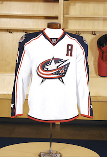
Blue Jackets Jerseys Unveiled!

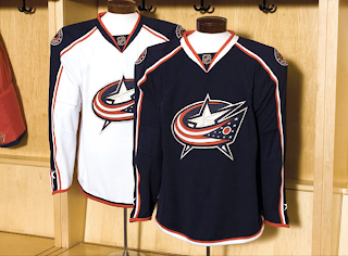
And here it is. No real shock. It's what we expected. Just wanted to post it in photographic form. The draft is going on now. We'll get to see some more new uniforms I'm betting.

UPDATE (7/21 6:43 AM): I just realized I had some better images of the new Blue Jackets uniforms which were unveiled in Columbus on draft day. Thought I'd post them in case you hadn't seen them yet.

They look sharp and this new logo is far better than what they have been wearing. Incidentally, as a funny side note, I recently read on a message board somewhere someone calling the shoulder logo a "rebel hat." Clearly this person is out of touch with American history since those of us who aren't know that the "blue jackets" were the Union soldiers. I got a chuckle out of it.

You can't really see it well in the photos, so for a better look at the logo I'm referring to, check it.