Thrashers vs Penguins


vs
THRASHERS
PENGUINS
1-2
0-2

The Aesthetics
Neither team has been very strong in the tournament up to this point, but it's still early for them. Again we see a pair of logos which prominently feature hockey sticks. It's a hockey team so that is just too obvious for my taste. Regardless of that, in my humble opinion, the Thrashers logo is cooler.
Thrashers

The Nickname
The Thrashers is a bird of flight but the Penguin is a bird of non-flight. The Thrasher could taunt the Penguin if either ever made it into the same climate zone.
Thrashers

The Analysis
Neither logo does a good job of representing their city, but my eye is just more attracted to the Thrashers logo for its use of multiple colors. Don't get me wrong, I like the Vegas gold in the Penguins logo, but they aren't going to beat the Thrashers.
Thrashers


WINNER
3-0


Islanders vs Capitals


vs
ISLANDERS
CAPITALS
0-0
0-0

The Aesthetics
The Capitals' new logo debuts in the tournament today — a day after being officially unveiled — and sadly, there's nothing very impressive about it. Both logos manage to spell out the team names completely. And both incorporate a hockey stick. And a puck! Completely unnecessary, in my opnion. Neither team should get this point. But somebody has to. The Islanders logo is a lot easier on the eyes in comparison.
Islanders

The Nickname
It's in the Capital where laws are written that might affect Islanders and perhaps what fish they're allowed to catch or not catch. I suppose.
Capitals

The Analysis
As I mentioned in Aesthetics, both logos have hockey sticks, pucks and the team name spelled out. The difference (aside from color) is how they incorporate representations of their home towns. We have an orange map of Long Island on one which is fairly obvious. On the other we have a very subtle ode to D.C. with three stars above Washington which are culled from the District of Columbia flag. I love subtlety in logos.
Capitals


WINNER
2-1


Blues vs Blackhawks


vs
BLUES
BLACKHAWKS
3-1
1-3

The Aesthetics
The simple design and straightforward color scheme of the Blues logo starkly contrasts the Blackhawks. We know that Blackhawks colors are red, black and white from their uniforms, but then why does the logo also have green, yellow, blue, orange and tan? The world may never know. Clean up your act, Blackhawks logo.
Blues

The Nickname
A Blackhawk indian could do a rain dance. Can the Blues man do that?
Blackhawks

The Analysis
Both teams have appropriate logos though neither goes out of its way to represent its home city graphically. Ultimately its the simplicity and clean, sleek look of the Blues logo that wins it the point.
Blues


WINNER
2-1


Panthers vs Devils


vs
PANTHERS
DEVILS
3-0
0-0

The Aesthetics
Finally, the Devils have a match. And things are looking up already. You have the subtle "NJ" along with a simple, fear-inspiring design gives them the edge over the Panthers logo. It may seem like I hate all logos with small details, but that's just not the case. Sometimes it works and sometimes it doesn't. Normally it would work for the Panthers, but just look at that Devils logo.
Devils

The Nickname
The Devil could strike a Panther dead if it ever tried to attack. Yeah, he's that powerful.
Devils

The Analysis
Here's where the Panthers avoid the sweep. They are a very aptly named team. There's nothing wrong with the Devils, but I feel like that gets used a lot. Perhaps the Devils can get this point against another team.
Panthers


WINNER
2-1


The Caps Unveiling Party


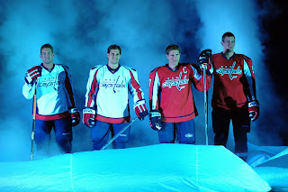
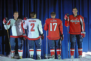
This evening the Washington Capitals had their big draft day party in D.C. where they unveiled the uniforms to fans. Check out all the cool smoke and stuff.

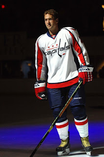
Ex-Bolt Ben Clymer is seen here modeling the brand spankin' new Caps duds. They're sharp uniforms. I still hate the logo though. I don't mind the shoulder logo with the eagle in the form of a "W." Anything but a logo made out of the team name.

I do get nostalgia and throwbacks and stuff, but come on. Put that on the shoulder or something. Anyway, it's not up to me and I'm not even a fan of the team. I'm just hoping the Lightning come up with something cool this summer.

We're all waiting on the "EDGE" of our seats. Come on! You don't like puns?