Devils vs Penguins


vs
DEVILS
PENGUINS
9-1
2-5

The Aesthetics
The Devils logo is simpler compared to the Penguins, in which hockey equipment is prominently featured for no good reason. We should already know its a hockey team. They've had a lot of matches lately and every time I talk about the fact that I like the '90s logo better as a primary crest. Anyway, Devs win the point.
Devils

The Nickname
All-powerful evildoer. Small, flightless bird. Devil beats Penguins.
Devils

The Analysis
This category looks at the logo for its appropriateness (is that a word?), references to the home city, and use of subtle elements among other deeper things. That should tell you right there Devils get the point. The "NJ" is cool but the hockey stick, gloves and skates worn by a pissed-off penguin just look silly. That's the second sweep in as many days for the Devils.
Devils


WINNER
3-0


Thrashers vs Bruins


vs
THRASHERS
BRUINS
4-5
3-2

The Aesthetics
These are two very different logos. But on straight-up looks and color combinations, I'm a fan of the Bruins logo. The changes they made recently make a big difference in my eyes and I've never liked the hockey stick in the Thrashers logo.
Bruins

The Nickname
A Bruin would kill a Thrasher with his thumb. If he had a thumb. Instead he'll just have to use his giant teeth or something.
Bruins

The Analysis
This is where the Bruins lose the point. And you could say I'm being spiteful when I tell you the sole reason I'm taking this point away from them is that there's not a bruin to be seen in this logo. I like the one on the new shoulder patch. But what can you do? Also I actually do like the Thrashers color combo.
Thrashers


WINNER
2-1


Jersey Design Concept For Lightning

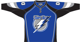
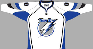
So I thought I was finished with that whole "Hockey Fans & Photoshop" series but it turns out there's more. After the possible leak of what may be the new logo for the Tampa Bay Lightning, a fan had some fun designing a uniform based on it. I honestly can't remember where I found it, but I'd have to guess ModSquadHockey since that's where I originally came across the logo itself.


This is what he came up with. It's pretty cool. I'm a big fan of switching to blue for the home jerseys. The black has gotten old. And despite there being a number of other teams that wear blue (the Thrashers, Rangers, Maple Leafs, Blues, Predators, Oilers, Blue Jackets and Canucks...) I still think the Lightning could pull it off. And should.

Obviously, it's not the offiicial design. If you consult the sidebar, you'll see we still have 38 days to wait for the big announcement and unveiling by the Bolts. Personally, I can't wait. I'm on pins and needles.

By the way, as a complete side note, I would like to thank those of you who drop by here on a regular basis. A while back I mentioned hitting a record of over 300 hits in a single day. That was surpassed yesterday with 514. I'm kind of surprised, actually. Incidentally, we're already over 400 today at it's not even 5 PM. It'll be interesting to see if we can beat yesterday's record.

Once again, thanks for dropping by.

Islanders vs Devils


vs
ISLANDERS
DEVILS
1-8
8-1

The Aesthetics
How many of my silly rules can the Islanders possibly break with one single logo? Most of them is right. The Devils, however, have so much I like. Simplicity at its finest. I see horns, a pointy tail and a subtle "NJ." That says Devils like almost nothing else could.
Devils

The Nickname
The Devil's a pretty nasty guy. Islanders are just pathetic humans to him.
Devils

The Analysis
I'm a big fan of the outline of Long Island in the Islanders logo, but it's not better than the Devils. I'm sorry but it's true. The team name spelled out. The hockey puck, the stuck (as cleverly placed as it may be), maybe the Isles will get this point against another team. Not the Devils. It seems like sweeps are the order of the day.
Devils


WINNER
3-0


Red Wings vs Wild


vs
RED WINGS
WILD
3-6
8-0

The Aesthetics
I feel like the detail in the Red Wings logo is a little too heavy-handed and unnecessary. However, I don't see any upgrades coming for it in the near future. People in Detroit love their team and their traditional logo, in 80 years, we've yet to see even a secondary logo that veers from this design. Anyway, that forest scene in the Wild logo gets cooler every time I look at it.
Wild

The Nickname
There may be a bird in the wild with Red Wings, but the Wild is an unforgiving place with plenty of predators.
Wild

The Analysis
I've given this point to the Red Wings on many occasions for the wheel attached to the wing, signifying Detroit as the Motor City. But what better scene could you have to portray Minnesota? Plus the name itself gives you a clue as to the teams geographical location. I can't really think of how you could improve upon the Wild logo. Hence the sweep.
Wild


WINNER
3-0