Predators Unveil New Uniforms!

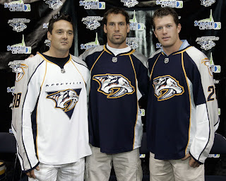
The Nashville Predators have joined the small club of teams who have unveiled their new uniforms in the Rbk EDGE style for the 2007-08 season. And here they are.

Vern Fiddler, David Legwand and Ryan Suter modeled the jerseys in front of the home crowd at a team rally in Nashville. As far as differences from what they used to wear, you'll notice that the white jerseys now feature the word "NASHVILLE" written above the crest. I understand you can peel it off and replace it with "HAMILTON." No, but seriously.

Hope you like them. The Preds are the fourth team to officially unveil the new duds. I'm going to start keeping a running list of who's unveiled what. Some of the teams that have yet to do so have announced dates for said unveilings. You can find countdowns at the top of the sidebar.

Lightning Jersey Concept Designs

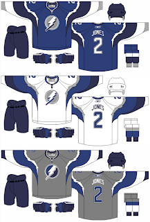
In the weeks prior to the "possible leak" of what may be the new Tampa Bay Lightning logo, I came across the fan-made uniform design below.

The designer was attempting to redesign the Lightning's logo and uniforms without black. Personally, I think black is an integral part of any Lightning design, but that's just me — a lifelong fan of the team.

Just thought you'd all like to see it. Form your own opinions. As for me, I don't like the color combination but I am a fan of the Lightning bolts around the shoulders.

Canucks Jersey Concept Designs

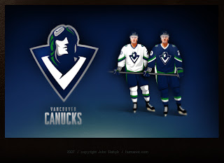
Last week, I posted some fan-made designs for the Vancouver Canucks' new logo and uniforms. We've heard that they're going to be unveiling a new logo this summer so everyone's wondering how it will look. So here are some more.


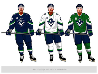
These way-too-cool designs come from John Slabyk, he of Blue & Gold Project fame. He's a graphic designer who was implored by fans to take his artwork to Larry Quinn with the Buffalo Sabres. They liked his work a lot but a meeting with the team's GM yielded nothing. Not to be discouraged, he has come up with a potential new design for the Vancouver Canucks.

And this is it. It's really cool but it's probably a little too high-quality for the NHL. The design is really clean and even incorporates the classic stick-in-rink logo of the 1970s while sticking with those traditional colors. So far, responses I've read to the design are mixed, though. I think the gist is that a lot of people like it but aren't naïve enough to think the design would actually ever been worn by the team.

Personally, I'm not giving up hope on the Canucks or the NHL. Anything is possible and one day soon I hope to see them donning a logo that doesn't feature a whale more prominently than, well, a Canuck.

Lightning vs Capitals


vs
LIGHTNING
CAPITALS
3-5
4-3

The Aesthetics
While the Lightning logo may include an annoying wordmark, the Capitals logo is almost nothing but a wordmark. And not even a very good one. I like the Capitals' new colors, but I don't like what they did with them.
Lightning

The Nickname
If Lightning struck the Capital, it could all go up in flames.
Lightning

The Analysis
Both logos spell out the team name so it comes down to the more subtle elements. And in that area, the Capitals logo has a hockey stick and a puck. Still, I'm a fan of the three stars about the word "Washington." The Lightning logo, on the other hand, has no such subtle elements. Now if we were looking at the secondary, it has an outline of the state of Florida which is a nice touch. But we're not. No sweep for the Bolts here.
Capitals


WINNER
2-1


Sharks vs Predators


vs
SHARKS
PREDATORS
4-5
6-3

The Aesthetics
Neither of these two logos are very simple in design but offer unique colors and appropriate symbols for their teams. I like the teal but the Sharks logo does not make enough use of it. There's a thin line of it in the triangle surrounding the shark. Plus, there's a hockey stick so I don't exactly love it. Meanwhile, the Predators logo is very sharp despite its minute detail.
Predators

The Nickname
This is a tricky one. In most instances, a Shark is a Predator. In part for that reason, the Sharks will slide by with this point.
Sharks

The Analysis
The Predators got their name from the remains of a saber-toothed tiger found by construction workers during the building of their arena. The Sharks don't have a story like that. All right, but I can't hold that against them. What I can say is that this outdated logo needs an update. And one is coming in just four days, as a matter of fact. Maybe it'll have a better chance then.
Predators


WINNER
2-1