While perusing a Calgary Flames fan message board, I caught a glimpse of what could be the Flames' new Rbk EDGE jersey. I apologize in advance for the crummy quality of the image below.
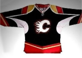
The story is that a friend of the person who posted it supposedly works in the arena and got a chance to see one of the mock-ups for the Flames. He snapped it quickly with his cell phone and here we are. If it does turn out to be real, I'd have to say the design elements on the sleeves are an interesting choice.
But as of now, we don't really know anything official from Calgary. So take this for what it's worth. What do you think of it?
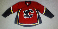 UPDATE (1:31 PM): A helpful reader just pointed me to this image to the left. It's certainly not as scary as the black one, but I'm not wild about the vertical black stripes up the side. Other than that, it seems to be in keeping with the current Calgary uniforms.
But wait, there's more!
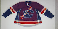
UPDATE (5:18 PM): As a follow-up to one reader's comment regarding the Quad City Flames jerseys. I knew I'd seen them earlier and I just found them again so I figured I'd post them so we're all on the same page with regard to that.
Forgive the crappy image quality but they appear to be photos taken covertly probably with a cell phone or the like. If the Calgary Flames jerseys end up looking like this, I don't think anyone will be able to complain. They look pretty sharp.
For what it's worth, I really don't think the black looks very good with a white flaming "C." The red jerseys look a lot better with the black "C."
 UPDATE (6:51 PM): This just in: It was a Flames fake-out! In one of the best Photoshop examples I've seen to date, it turns out the red Flames jersey I posted in the 1:31 update is not a photo of an actual jersey at all! A message board post — to which you can find a link below in the comments — all but proves that this jersey was made using a photo of the blue Rangers jersey unveiled yesterday as a template — only flipped over. It's a good example of what the artistically inclined among us can do with our spare time. Color me impressed.
As a reader also pointed out, though, this jersey appears to be based on the Quad City Flames jersey I posted photos of earlier this evening, so it may not be out of the realm of possibility that something like this graces the Saddledome ice come the fall. It's all a game of wait and see. I'll let you know when anything becomes official. In the meantime, thanks for reading.
And hopefully that will be the last update to this post. It has gotten very long.


