Islanders New Uniform Update

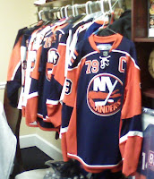
Remember those frightening mock-ups we first saw a while back for the New York Islanders? The image on the left should jog your memory. It's scary.

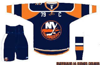
Then somebody put that into a jersey template which turned out like this. And it didn't leave any of us feeling any better about it.

Well anyway, I was surfing around yesterday and came across something that appears to substantiate that blurry photo. But again, we don't know anything for sure as the Isles have yet to make any sort of official announcement.

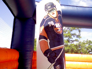
It looks to me like one of those moon bounce things kids play on at church carnivals and the like. Inside it is a painting of a giant New York Islanders player (#79, Yashin?) wearing a jersey with a new style — one that looks an awful lot like the jerseys in that photo.

So take that photo for what it's worth. The person who posted it said he saw it at Stony Brook University. For more on that, go here.

By the way, I found another template designed based on that infamous photo above over at Islanders Castaway.

That's all I've got for the Isles today. Thoughts, comments?

Blue Jackets vs Red Wings


vs
BLUE JACKETS
RED WINGS
8-1
4-7

The Aesthetics
The Red Wings logo is very flat. There is one color and its traditional as with any Original Six team. I think it's okay but also that there's still room for improvement. But I'll leave it there. As for the Blue Jackets logos, it's a huge improvement over the previous logo (anybody remember the electric green bee?). At the very least, it makes better use of color than the Wings logo does.
Blue Jackets

The Nickname
A Blue Jacket may carry a bayonet, but chances of him shooting a bird with Red Wings are slim.
Red Wings

The Analysis
Both teams have colors in their names and yes, those colors are prominent in each logo. In fact, red is the only color in the Red Wings logo. The Blue Jackets logo prominently features the Ohio flag wrapped around a silver star in the form of a "C" as has been mentioned. A reader also pointed out that the star signifies Columbus as the capital city. And, yes, it's that cool.
Blue Jackets


WINNER
2-1


Sabres vs Bruins


vs
SABRES
BRUINS
5-4
6-2

The Aesthetics
It's a bit of a toss-up here. I think both logos are pretty aesthetically strong. But these are both logos that have been changed in the last couple years. As far as improvements, I think both are better than what they had, but that the Bruins logo is more of an improvement than the Sabres. The return to traditional colors was nice but for a way to make it better, just ask John Slabyk.
Bruins

The Nickname
This would have been a good showdown if it was bruin and buffalo. But instead, it's Bruin versus Sabre, and with the latter in the hands of an experience swordsman, I have my doubts for the big bear.
Sabres

The Analysis
Neither logo portrays its name it's meant to very well — although the case has been made that there's a blue sabre along the back of the buffalo with the horn also serving as the handle. I'd still like to see the secondary logo on the crest sans the word marks, but that may have to wait until the day third jerseys make their glorious return.
Sabres


WINNER
2-1


Wild vs Coyotes


vs
WILD
COYOTES
11-2
5-4

The Aesthetics
Well this is it for the Wild — last match of the tournament. They're going to be the first ones finished. And for that, we're going to milk this forest scene for all its worth. If you don't see how cool it is, then I'm convinced you're blind. That coyote just looks awkward to me. But then again I didn't hate the original Coyotes logo from the late '90s.
Wild

The Nickname
The Coyotes live in the Wild, true. But so do bears.
Wild

The Analysis
I've said it all before about the Wild logo. I'm not sure what else I can add. It's really a great team icon. But just one more time for posterity: Inside the outline of a bear's head you've got a beautiful forest scene featuring trees, mountains, a river, a sunset and — wait for it — the north star in a fitting tribute to the history of The State of Hockey. Anything I missed? I think the Coyotes logo is designed well but it doesn't have nearly the depth of the Wild. And that's that for the Wild in this tournament.
Wild


WINNER
3-0


Capitals vs Thrashers


vs
CAPITALS
THRASHERS
4-6
5-6

The Aesthetics
The hockey sticks in these logos abound. But that's fine, what I'm staring at is the wordmark that the Capitals are calling a logo. The Ducks made this mistake and I hope they're going to learn from it. Seems we'll have no such luck with the Caps. Plus I think the Thrashers logo has a sharp and rather unique color scheme.
Thrashers

The Nickname
Hmm. Maybe the Thrashers open fire on the Capital by freeing their "droppings" on the buildings causing mountains of paperwork as the government tries to get it all cleaned up. Stretch, yes.
Thrashers

The Analysis
I'm sorry, I was a fan of the Capitol dome logo. I don't know why it had to go just because the colors got changed. But who knows why the Capitals do anything? But I can't in good conscience allow them to have this point. That's a neat bird on that Thrashers logo.
Thrashers


WINNER
3-0