Capitals vs Rangers


vs
CAPITALS
RANGERS
4-7
2-9

The Aesthetics
Man, the red, white and blue abound. Though, personally, I'm one of the few that believe a darker blue would better serve the Rangers. But then I also like the Lady Liberty logo better than the shield. For one thing, they don't even use a logo anywhere on their regular jerseys. Still, the Capitals logo is a wordmark and that doesn't earn it points in my book. I'm going with the shield.
Rangers

The Nickname
The Capital is the center of the goverment and Rangers are mere governmental peripheries.
Capitals

The Analysis
The Rangers logo is a classic. The Capitals thought their '70s logo was a classic which is why they used it for the inspiration for the new logo. It's inexcusable, really. Even the eagle on the shoulder is better than the wordmark as far as crests go. The Rangers deserve this point to right along with the win.
Rangers


WINNER
2-1


Flames vs Canucks


vs
FLAMES
CANUCKS
9-1
5-6

The Aesthetics
Both of these logos are made from the letter "C." One forms a Haida-style whale while other emits fire. I like the simplicity of the Flames logo but also the color scheme of the Canucks logo. Since word on the street is that these colors aren't long for this earth, I'm going to give them this point.
Canucks

The Nickname
Flames burn everything, Canucks included.
Flames

The Analysis
Looking at the Canucks logo, I'm continually confused by the whale. This isn't to say that I believe the orca has no connection to the Canucks as a team (as opposed to the organization), but I really like the design John Slabyk came up with. You know the one. Anyway, they can't win for the "C" (symbolizing "Canucks" and "Canada") because the Flames have one of those too. Plus, how can you improve on a logo for a team called the Calgary Flames, anyway?
Flames


WINNER
2-1


Bruins vs Penguins


vs
BRUINS
PENGUINS
6-3
3-7

The Aesthetics
Looking at these two logos side-by-side, it's fairly obvious why the Penguins shouldn't have switched to the Vegas gold. Which one of these stands out more? But like all you Pens fans know by now, the hockey gear the penguin is wearing bothers me. I can't explain it.
Bruins

The Nickname
Giant carnivore versus tiny, flightless bird. Is there any question the Bruin eats the Penguin?
Bruins

The Analysis
Unfortunately for the Bruins, this won't be a sweep. The reason is that I see a penguin in the Penguins logo but a bruin is nowhere in sight. (I take that back. Check the shoulder of the jersey.) If only they'd make that bear in the secondary mark the primary logo. But the truth is, the B's logo is one of the most recognizable in sports so to change it would probably be silly. Still, I stand by my rules for this tournament, despite the bullshit they produce.
Penguins


WINNER
2-1


Stars vs Coyotes


vs
STARS
COYOTES
5-5
5-5

The Aesthetics
Talk about an ocean of mediocrity (based on my ridiculous criteria). Both teams are 5-5 after their first 10 matches. Let's see how they fare versus each other. I like both color schemes but as you know by now, I'm tempted to go with the logo that doesn't so much symbolize the name as spell it out. And that's what's going to happen.
Coyotes

The Nickname
I don't think the Stars have lost this point yet. But come on, unimaginable celestial ball of fire. Little desert dog. The Coyote never had a chance.
Stars

The Analysis
It seems like the Stars logo goes farther in symbolizing the region as much as the team name. While there's a coyote in the Coyotes logo and it features desert colors, it doesn't scream Arizona to me. The big "lone star," on the other hand, says nothing other than Texas.
Stars


WINNER
2-1


New Blackhawks Jersey Design Concept

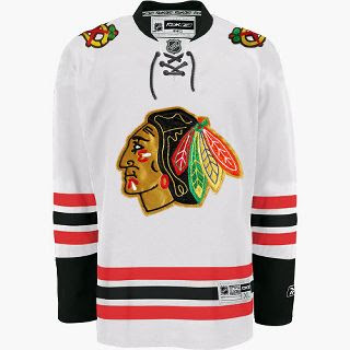
We haven't been hearing much about the Chicago Blackhawks lately, but I came across this design on the 'Hawks official message board. Have a look.

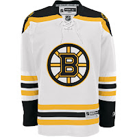
Now, have a real good look. I mean get out your fine-tooth comb and really go over that puppy because I have my doubts as to the veracity of this image. It sure does look like a Blackhawks Rbk EDGE jersey, but the first thing that caught my eye was that familiar horizontal striping pattern on the sleeves and bottom of the sweater. Remember this?

Now compare it to the Bruins jersey to the left. Dead on. So I'm sorry if I got anybody's hopes up. It is just a very good Photshop job based on the B's road Reebok sweaters. Wondering what tipped me off? The stripes on the Blackhawks' white jerseys go black-red-black whereas the ones in this image go red-black-red.

Anyway, I'm continually impressed by the work people put into these jersey designs. You gotta think I'm pretty interested in the subject on account of writing this blog but I'm not sure I'd really go to the extent of coming up with my own design concept. Kudos to the folks that do, though. They give me something to write about.

The Blackhawks have yet to give word of plans for any sort of formal or official announcement, so until we hear something, it's a cool idea to muse on. Any Chicago fans reading? What do you think?