New Sharks, Canadiens Jersey Design Concepts

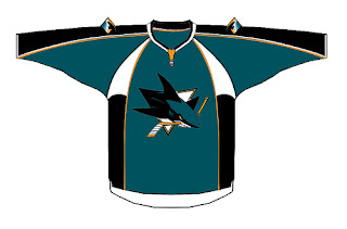
I was pointed the way of another fan-made jersey design concept for the San Jose Sharks. The designer doesn't seem to be a big fan of the orange being added to the color scheme as its used very sparingly here.


It's neat and I think it could probably work. Though I'd expect to see something rather different when the Sharks actually unveil their new jerseys in September.
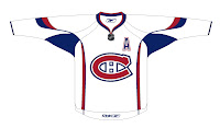
And while we're looking at fan-designed jersey concepts, I've got one for Montreal Canadiens fans. Like many others, it's based off of this year's all-star jerseys so the real deal probably won't look anything like this. The one thing I wouldn't be surprised to see is the giant logo on the front. That seems to be a theme among all the jerseys that have already been officially unveiled.

Anyway, I haven't heard anything official from the Canadiens regarding an announcement or unveiling date, so we'll keep our ears and eyes peeled until we do.

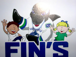
Yes, More Canucks Stuff

I saw this graphic on the Canucks Central message board. Aren't you guys impressed I remembered? I even snatched a link just to prove it. It's apparently artwork on some new kid-oriented promotional material from the Vancouver Canucks. It's called "Fin's Friends" as I understand it.

You see Canucks mascot Fin wearing a rather unique jersey. I can't speak to its veracity, but so far I haven't determined a real reason to doubt it. It has a lot of what we've heard including: dropping the maroon from the logo, the word "VANCOUVER" appearing over the crest on the road white sweaters, and the return to vintage colors blue and green.

Also, on the shoulder of Fin's jersey is this logo. It's kind of an edgier version of the vintage stick-in-rink logo. I think it works.

So... Canucks fans? What do you think of all this? You think this could be the real deal for your uniforms come the fall? Or is it just more annoying speculation?

Though the Canucks have made nothing publicly official, we've been hearing that a new logo/jersey unveiling is set for Wednesday. Whether or not it will actually happen remains to be seen.

Capitals vs Rangers


vs
CAPITALS
RANGERS
4-7
2-9

The Aesthetics
Man, the red, white and blue abound. Though, personally, I'm one of the few that believe a darker blue would better serve the Rangers. But then I also like the Lady Liberty logo better than the shield. For one thing, they don't even use a logo anywhere on their regular jerseys. Still, the Capitals logo is a wordmark and that doesn't earn it points in my book. I'm going with the shield.
Rangers

The Nickname
The Capital is the center of the goverment and Rangers are mere governmental peripheries.
Capitals

The Analysis
The Rangers logo is a classic. The Capitals thought their '70s logo was a classic which is why they used it for the inspiration for the new logo. It's inexcusable, really. Even the eagle on the shoulder is better than the wordmark as far as crests go. The Rangers deserve this point to right along with the win.
Rangers


WINNER
2-1


Flames vs Canucks


vs
FLAMES
CANUCKS
9-1
5-6

The Aesthetics
Both of these logos are made from the letter "C." One forms a Haida-style whale while other emits fire. I like the simplicity of the Flames logo but also the color scheme of the Canucks logo. Since word on the street is that these colors aren't long for this earth, I'm going to give them this point.
Canucks

The Nickname
Flames burn everything, Canucks included.
Flames

The Analysis
Looking at the Canucks logo, I'm continually confused by the whale. This isn't to say that I believe the orca has no connection to the Canucks as a team (as opposed to the organization), but I really like the design John Slabyk came up with. You know the one. Anyway, they can't win for the "C" (symbolizing "Canucks" and "Canada") because the Flames have one of those too. Plus, how can you improve on a logo for a team called the Calgary Flames, anyway?
Flames


WINNER
2-1


Bruins vs Penguins


vs
BRUINS
PENGUINS
6-3
3-7

The Aesthetics
Looking at these two logos side-by-side, it's fairly obvious why the Penguins shouldn't have switched to the Vegas gold. Which one of these stands out more? But like all you Pens fans know by now, the hockey gear the penguin is wearing bothers me. I can't explain it.
Bruins

The Nickname
Giant carnivore versus tiny, flightless bird. Is there any question the Bruin eats the Penguin?
Bruins

The Analysis
Unfortunately for the Bruins, this won't be a sweep. The reason is that I see a penguin in the Penguins logo but a bruin is nowhere in sight. (I take that back. Check the shoulder of the jersey.) If only they'd make that bear in the secondary mark the primary logo. But the truth is, the B's logo is one of the most recognizable in sports so to change it would probably be silly. Still, I stand by my rules for this tournament, despite the bullshit they produce.
Penguins


WINNER
2-1