Mailbag: Lightning Fan Concepts

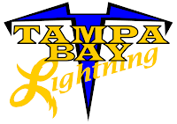
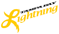
A few people have responded to yesterday's post about the St. Pete Times requesting fan designs for the new Tampa Bay Lightning logo. I've received a couple of designs I thought I'd share.

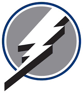
The first one comes from Doug and its simply the current primary logo sans the text.

It's very plain and it feels unbalanced. It's better than having the text, though, if you ask me. Then Michael emailed in with a completely new concept. And he likes yellow.

It sort of reminds me of a '50s high school jacket. What do you guys think? These two were also part of that set. Feel free to continue sending in your concept designs and I'll continue posting them.

By the way, if you've desgined a logo or uniform for another team and would like to have it posted, send it along and I'll put it up here. You can email me at nhllogos@gmail.com.

Flames vs Avalanche


vs
FLAMES
AVALANCHE
10-1
11-1

The Aesthetics
Despite what some readers may think, I actually like letter-based logos. We've got flames on a "C" and an avalanche on an "A." Plus, I've said before that I feel like the Avalanche logo will be an all-time NHL logo classic. But that's not to say the Flames logo isn't already. However, when we look at the elements of these logos, the avalanche is being led by a subtle puck and that is cool.
Avalanche

The Nickname
This is the ultimate battle. Fire and ice. The Flames melt the Avalanche, turning it into a waterfall which extinguishes the fire. That was a pretty good one.
Flames

The Analysis
This is another hard call to make. If you want to know my thoughts on these logos, you should go back and read their previous matches since I'd rather not go through it all again. The deciding factor, though, will be that as one of the few Canadian teams, the Flames logo's "C" can stand for Calgary or Canada. The "A" is only for Avalanche.
Flames


WINNER
2-1


Hurricanes vs Sabres


vs
HURRICANES
SABRES
10-1
6-5

The Aesthetics
These two logos are definitely in the same league. The colors may be different but the designs are very similar. Notice how they're both outlined in silver. Weird. Anyway, I'm partial to the puck in the eye of the storm in the Hurricanes logo.
Hurricanes

The Nickname
I'm not sure a swordfight is the wisest thing to do in a Hurricane. Those winds can make blunt object deadly. Imagine what it could do with a sharpened Sabre.
Hurricanes

The Analysis
I've said before that the Sabres logo makes for a very strong sports symbol. The problem it has here is that its more buffalo than sabre. At least with the Hurricanes, at least you get a hurricane. But really, how can you deny the impressiveness of the 'Canes logo? Like I've said, the only thing I'd change is the aspect. Make it a little rounder — like an actual hurricane.
Hurricanes


WINNER
3-0


Blue Jackets vs Coyotes


vs
BLUE JACKETS
COYOTES
11-2
5-6

The Aesthetics
These are a couple of young logos — less than five years under their belts. The Coyotes logo certainly says desert but not any better than the old one. I like it, but not more than the Blue Jackets logo. These is where small detail can actually help.
Blue Jackets

The Nickname
If a Coyote snuck up on a Blue Jacket while he was sleeping, do you think he'd be able to react quick enough to avoid becoming dinner? I have my doubts.
Coyotes

The Analysis
The Blue Jackets logo features an Ohio flag forming a "C" for Columbus. How can you improve on that? The Jackets definitely hit the mark with this logo. Nice to see them going with it as the primary this season. The Coyotes logo doesn't really have anything like that and it just looks awkward to me. By the way, this is the finale for the Jackets.
Blue Jackets


WINNER
2-1


Design Your Own Lightning Logo

All right, one final post for today and then I think I'll rest for a while. As you may or may not know, it is believed that the new logo for the Tampa Bay Lightning was leaked a few weeks back.

By and large, fan response hasn't been great. So as a way of letting people vent or something, the St. Petersburg Times is asking readers and fans to design their own Lightning logo and submit it for future posting on their web site. You can find more information on Damian Cristodero's Lightning Strikes blog.

I thought this was really cool and I recommend that anyone, Lightning fan or not, who has a concept to submit it. And if it wouldn't be too much trouble, email it to me as well. (I can offer the instant gratification of posting it within hours.) You can email me at nhllogos@gmail.com if you're interested.