Newsday Makes Isles Unis Official

I'm still trying to gather more information, but apparently, Newsday posted a photo yesterday of Rick DiPietro in the New York Islanders' new road jersey.

Even though it doesn't come from the team directly, it's safe to say we can confirm this as the real deal. I'm adding it to the sidebar, making the Isles the ninth team to show off their new duds. If you guys find anymore info or photos, please let me know.

Thanks to the guys that emailed me initially on this photo.

Oh, and yikes. What is going on there? The weird stripes around the shoulders... the sleeves in a different color. I'd definitely like to see some more angles of that jersey. Thoughts?

Wings Rearrange Captains' Jerseys

A reader emailed me a link to this article from the Detroit Free Press regarding the Red Wings new uniforms today. Apparently, today the Wings officially unveiled the jerseys to the public (despite having posted images of it online last week).

Notice anything strange about it?

Traditionally, the captain's "C" is worn on the player's left shoulder — this is true across the league. But apparently, because the tip of the wing logo reaches too high, the "C" would have collided with the confluence of three different types of material. So to avoid that problem, Niklas Lidstrom's "C" will swap sides starting this year.

Here you see equipment manager Paul Boyer showing off the new threads. Not too shabby, if you ask me.

Naturally, this will affect Detroit's alternate captains as well. Just like the "C," the "A" will also go on the right shoulder now. What do you guys think of the new location? Does it really make a difference?

Flames Post Online Jersey Teaser

The Calgary Flames have formally announced September 4 as the date for their official jersey unveiling. A date I already have in the sidebar countdown.

Unfortunately, the image they posted is merely a teaser and while can't see the finer details of the jersey — such as a shoulder patch — it does appear that the home sweater will be red with a lace-up collar. Pretty nice. Can't wait to see the rest of it.

By the way, big thanks to alltherage for pointing out this information. For a quick link to the order form, check it!

A Few Ideas For Bolts

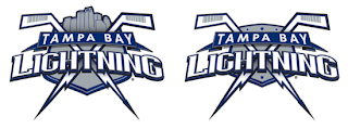
As is probably more than painfully clear, I am a huge Tampa Bay Lightning fan. So when artwork for my Bolts gets submitted, naturally I'm more than eager to post it. First off, as a reminder, this is allegedly the Lightning's new logo.

Anyway, today I have lots to share. We'll start off with the cream of the crop.

This pair of Lightning logos was designed by a local advertising firm, apparently. I was an overall fan until my girlfriend pointed out that the hockey sticks look more like golf clubs. Now that's all I can see. But if the sticks could look more like sticks, I think this would make for a very strong shoulder patch. Not a great primary, but definitely an awesome secondary. I like the skyline in the one on the left.

Moving along, though. Another designer emailed me some ideas for a new Lightning logo.

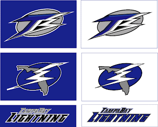
Everything there seems like it's about to fall over. I'm not sure why it all needs to lean so far to the right that way. I also can't speak very highly of the secondary mark, which appears to be drawn by hand. I applaud the effort in trying to make the "B" in "TB" look like a lightning bolt, but I don't think it's working out.

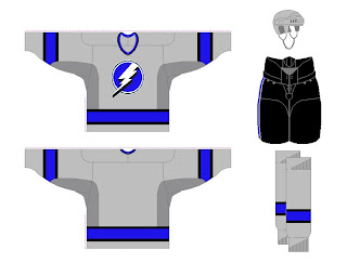
And finally, another fan designer sent in these concepts. How about a Lightning jersey in gray?

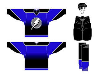
Same artist also came up with a design borrowed from the Vancouver Canucks' previous third jersey. Have a look at that one.

Any other Lightning fans out there? What do you think of these ideas? Anything worth considering in here or should we tie it all to a kite in a thunderstorm?

Revisiting The Senators

On Monday, we got a preview of the Ottawa Senators' new logo set courtesy of Canada's government trademark web site. They were black and white on the web site, so we had to imagine how the coloring might work (at least for the secondary mark).

The image I posted had the outer circle in gold. Here's how they might look in red or white.

As for the primary logo, one fan ran with that on a jersey concept. See below.

Not sure how I feel about the striping across the chest. Certainly an interesting choice, though. Thoughts on that?

For the part of you that persistently resists change, one fan designer altered the new logo to mix in some of the old.

Truthfully, I'm not a fan. Until we get to the shoulder patch. I think that is pretty cool. I like the old-time stripes and the contrast in that logo, which you'd think would be hard to achieve, is excellent.

Sens fans, what do you make of all this here? Good? Bad? Ugly?