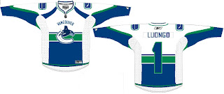
I'm starting another new series tonight — because you know I just love series. In "Here's How You Fix It," I'm going to post Rbk EDGE concept art designed by fans who feel their team's new uniforms are less than stellar. The reason I'm starting with the Vancouver Canucks is because of the sheer volume of work I've gotten for them.
So we'll start with the most conservative and work our way out.

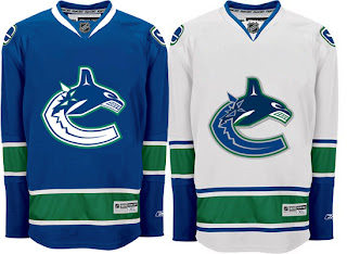
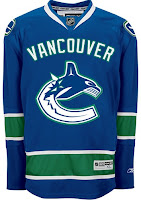
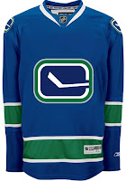
The biggest complaint these jerseys have garnered since August 29 is about the text over the logo on the chest. Along with that is the fact that the logo and jersey colors don't match. The jersey has prominent green stripes yet there's not a hint of green in the logo. This design takes care of both of those problems, it's already so much improved.
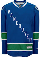
Now I say that despite being among the less-vocal group that isn't bothered by the giant VANCOUVER across the chest. So, consider leaving that — we'll just add some green to it.


Either that or move the stick-in-the-rink logo to the crest. Also a good option because now it matches the design scheme of the jersey much better.
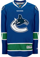
But back to the text. What say we dump the logo all together on one sweater and go the route of the mid-90s Pittsburgh Penguins.


But if that's a bit to liberal for your tastes, there's no reason we can't just leave the logo how it is and simply shrink the name of the city. Hell, even a couple of Vs around the elbow might be all right.
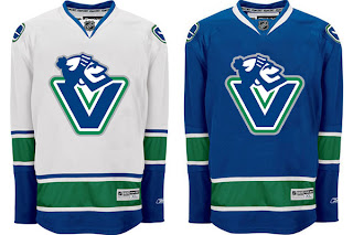
Now if you really want to go wild and crazy, among the new logos unveiled by the Canucks as part of their rebranding was the one you see featured on these sweaters.

To me, that is what a logo should be. I'd venture to say it's damn near perfect for this team. I recognize not everyone will agree but that's why you can never make everyone happy with these things. Half of everybody wants to relive the "good 'ol days" while the other half wants to unload a stale image. Personally, I think this makes for a pretty good mix but what do I know?
One thing to note is that the designs above have changed nearly everything but for the striping pattern on the jersey itself. So I'll share one more concept that toys with that.

It approaches the Montreal Canadiens a very small bit, but doesn't work because of the contrast between the top and bottom. You'd never be able to read the number on the back of the sweater. The nice thing this design makes use of is smaller text above the logo on the crest.
By the way, all of these designs and many more can be found in the Concepts Gallery.
What do you guys think? Would any of these be a good fix for the Canucks' Rbk EDGE jersey? Is it irreparably broken or is great just the way it is? Comment below.
Up next: Colorado Avalanche.


 2000
2000 1992
1992 1967
1967


