Oilers, Here's How You Fix It

The Fix It series trudges on tonight as we consider improvements to the new Rbk EDGE NHL uniforms. I told you yesterday that you'd be in for a treat on this one.

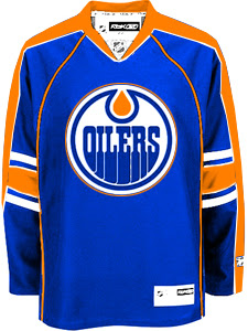
As far as I'm concerned, the Edmonton Oilers have gotten stuck with one of the worst new sweaters in the league. That's a personal opinion, but I stand by it. Many have complained that the Rbk EDGE jerseys look a lot like practice jerseys. I disagree with that statement as a generalization. But here, I find it appropriate.

I have several designs to show you and I'll save the best for last. We'll start out by making some very slight alterations that would improve the jerseys on a major scale.

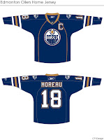
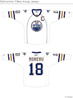
By simply extending the stripes on the sleeves to wrap completely around the elbows and adding a shoulder patch — one borrowed from last year's third jersey — you already end up with a sweater that doesn't look quite so blank. It's disappointing to see that the Oil couldn't manage something as easy as this on their own.

Then we have another design very similar to this but with a brand new shoulder patch.

I think that's a very interesting logo and with a little work, it could be great. I also truly believe that fixing the elbow stripes and adding something to the shoulders is all this jersey needs to really make it shine.

But speaking of shining, this is what you've been waiting for. Personally, I feel like it's one of the best Edmonton concept designs I've seen this summer.

The pattern was borrowed, obviously, from the Florida Panthers' new duds, but these colors are what Oilers hockey is all about. Imagine Gretzky and Messier wearing this. You almost can't help it. I am very impressed with this design, but as a Bolts fan I'm not sure I really have a say. I'll leave it to the rest of you now to decide. Especially Oilers fans.

Tell us how you feel about these fixes in the comments.

Up next: Washington Capitals.

Poll: Canadiens vs Blues


vs
Montreal
CANADIENS
St. Louis
BLUES

If for no other reason than the support I've been getting from you guys, I'm going to give this thing another shot. All votes cast prior to today are gone. Please place your votes again and this time we'll all try to be mature people about it. I really want this to work out because I think it's really fun. I don't want to take away the voting because I feel like the best aspect of this site is the interaction I get with everyone via the polls. So vote and be merry!

We're now in the final round of the NHL Tournament of Logos. One of these two logos will be crowned by you all as the best in the NHL. It's been some stiff competition all the way through but the Montreal Canadiens have been proven the best in the East and the St. Louis Blues the best of the West. It's been a pretty exciting run so far!

I would like to encourage everyone to go out and get as many people as they can to vote. Post the link on blogs, message boards or wherever else you can. Let's get as many people as we can to vote on this final round!

As a side note, one difference you might notice in this poll is that while it still closes after one week, I've changed the closing time to 5:00 PM so we can announce the winner just prior to the first games of the new hockey season. Also, we'll have to count yesterday as a lost day. But I'm not worried about it because everyone who wants to cast their vote should be able to access the internet at least once a week. (Or so I would hope.)

By the way, once the season has started, I hope you guys will continue to return to the blog and vote on all the logos. I'll be starting up a new tournament as early as next Friday. If you have any suggestions that you think will keep you interested in coming back, feel free to let me know either by email or in the comments. Thanks, all!

Poll opening date
Sep 27 @ 5:37 PM
Poll closing date
Oct 3 @ 5:00 PM

07CHTRN | #5 | MTLvSTL

Jersey Concept Art Galore

Busy day today. Shame I'm only getting to my first post at 5 PM, but some days, that's the way it goes.

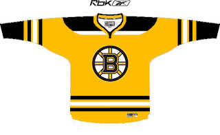
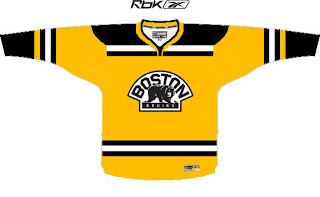
Always gotta kick things off with some good concepts. So let's dive in with the Boston Bruins.

I like these logos much better on a yellow jersey than the old bear head. Although, I say that now but to be fair, when it came out I thought it was pretty damn cool.

I also like the striping patterns on both jerseys. When the third jersey program is reinstated next fall, I hope the Bruins consider something like this. It's very sharp.

Then, one thing a lot of people have been contemplating is what the Atlanta Thrashers would look like if the road jersey matched the home jersey.

Perhaps it would look like this. That's really nice, if you ask me. I really love the asymmetry of that light blue jersey. The city down the arm looks great and it's so unique to this team. I'm really impressed and I only wish the Lightning had thought of it first.

One reader also emailed me a handful of concept designs. I wish I had larger images, but this is what was sent.


My favorite in that set is the Kings but I think the red Blue Jackets sweater is ironic and very sharp. Not a fan of the black Wings jersey and the blue Isles jersey reminds me of the Lightning's old black sweaters with the white along the shoulders.

Now it's time for your input. Let us know what you think in the comments below.

Poll Removed Temporarily

Dear NHLToL readers,

It's a really sad and pathetic thing when a handful of arrogant and uneducated people decide they have to ruin something that was only meant to be fun. I'm appalled by what happened with the Canadiens vs. Blues poll last night.

For anyone who is unaware, I've taken taken it down today indefinitely. In checking the results when I woke up this morning, I discovered almost 60,000 votes had been cast while just over 30,000 hits were logged on the site itself during the day. If you're thinking that those numbers don't match up, you'd be right. I've tried really hard to avoid this but since I know what was going on was a sham, I am unable to continue with the poll right now.

I will, however, still continue to write this blog and post other polls, but I don't feel it would be right to continue with the tournament at this time. I hope to reopen it soon and avoid a repeat of yesterday's events.

Now I'd like to address those responsible: I'm sure you think you're just the coolest right now. I would imagine many other people, myself included, would disagree. It was a childish and immature stunt that I hope will not be repeated. Everyone here knows this tournament doesn't have any real meaning. If that was your point, way to state the obvious. Congratulations.

All I was merely trying to do this summer was offer a simple respite to those waiting for hockey season to start up again. We're all hockey fans here and it seemed like this would be something fun to pass the time. So I set up this hole-in-the-wall blog and started posting polls. I'm saddened that you refuse to take it for what it is.

I would ask you to please avoid the temptation to do the same thing when I re-post this poll in the future. I don't know why you did it. I don't care. I would just like it to stop. It's entirely unnecessary.

If you would like to address me personally, you can email me at nhllogos@gmail.com.

Thank you.

Chris
NHLToL

Yahoo! Pick Of The Day!

I'll tell you when you know you've made it as a blogger. It's the day you become a Yahoo! Pick. Well guess what site is the Pick of the Day for today.

I can hardly believe it! Huge thanks to whoever is responsible for that!

To those of you visiting for the first time via Yahoo!, may I recommend you cast your vote in the poll that will determine the best logo in the NHL. And I hope you enjoy your visit!