We Like Concept Art

Yes, we do. And concept art loves us. First off I just want to thank everyone who sends in their cool and crazy work. I love opening my email everyday to see what surprises await me.

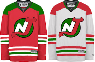
One such surprise was this New Jersey Devils uniform concept. If I'm to understand right, the logo seen here is one of the original designs that never made the final cut.

The Christmas colors don't work. If you want to see how to make green and red work together, see the Minnesota Wild.

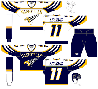
Here's an interesting Nashville Predators design that was actually a little too good to be considered for the Friday Freak Outs.

I say "good," but not necessarily on the level of the NHL. If not as a Preds third jersey, I could totally see something like this passing in the AHL or ECHL. I like the white swipes across the sleeves. Need to find a different font for the wordmark, though. That one doesn't work.
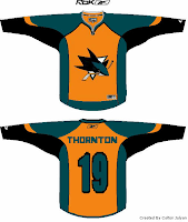
And then I have this San Jose Sharks concept which I think I'm only posting because the orange seems to annoy Sharks fans to no end. And I like a little ribbing now and then.

I was going to try to say this isn't that bad of a design, but it really is. The teal works too well for the Sharks. No need to go playing up the orange when you already have the best color in hockey. I would like to see more silver come back though.

They need to bring that back. Moving right along now.

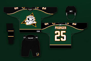
This Anaheim Ducks design is a bit of a mix between concepts I've posted here in the past. While this jersey looked great with the flying duck logo, I can't honestly say it looks horrible with this one. I know it's a Disney cartoon, but they do some of the best animation work in the world, so let's not knock them there. And despite the fact that they're similar to the Dallas Stars, I think these colors would serve the Ducks well. Maybe use the logo on a third jersey, though.

That's enough out of me. What do you guys thinks of these? Are they total duds or do they have some redeeming qualities?

Mailbag: For The Habs' Shoulders

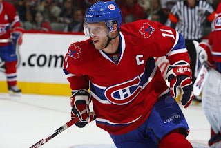
I got an interesting email the other day with a new concept logo for the Montreal Canadiens. It wouldn't replace the primary, but rather serve as a secondary.

I don't think it's a necessary addition to the Habs' look, but I still like it a lot on its own merits. The designer, Gary, had this to say about it in his email to me.

There's two motivations behind it. One is political, the fleur de lis within the maple leaf clearly shows Quebec as a part of Canada, and not a seperate entity. However, using it as the base of the maple leaf is symbolic of the fact that the true Canadian identity requires a strong Quebec. The other reason is to honour Quebecs former NHL team, the Nordique, who proudly displayed the fleur de lis on their jerseys. Despite the rivalry between the Nords and Habs, NHL in Quebec City was great for the province and country.

I've had the idea for a long time but never tried it out. Your blog/website gave me the motivation to give it a try today while I should have been working.

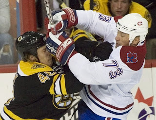
We appreciate his work and he even went the extra mile to show us how it might look on a couple of jerseys.

I have to say, I don't hate it and it goes rather well with the logo and uniform. My only problem is that when I look at it all I see is Nordiques. And I'm pretty sure they don't exist anymore.

So what do you guys think? Love it? Hate it? Have any suggestions for improving it? Comment away.

Poll: Kings Logo History


1967
1988

1998
2002


With the Ducks and Kings opening the season with the NHL Premiere in London this weekend, I'm opening logo history polls for this two teams. The Anaheim poll was opened yesterday and the Los Angeles poll is opening today.

Place your vote and then feel free to leave a comment as to how you came to your decision. Tell all your friends to drop in and vote! The more voices heard, the more accurate the results!

Poll opening date
Sep 30 @ 8:57 AM
Poll closing date
Oct 7 @ 11:59 PM

07BONLH | LHLAK

Rbk EDGE Review: Predators

Part 6 of 30. All 30 NHL clubs have unveiled new jerseys under the new Rbk EDGE Uniform System for the 2007-08 season. Here at the NHLToL, we're going to review every one of them. Read up and then rate the new sweaters. We'll do a full ranking after completing all of the reviews.

Rbk EDGE Uniform System

Nashville Predators


New Uniforms

Old Uniforms

The Unveiling
Thursday, July 19. The Predators unveiled their jerseys at a fan event at Sommet Center in Nashville.

Home vs. Road
Home: Blue. Road: White. The two sweaters are essentially mirror images of each other but for minor alterations in terms of overall design and both feature secondary logo patches on each shoulder.

The blue home jerseys feature yellow piping extending down from the collar. The side panels are white. A thick stripe of silver outlined in blue extends from the neck to the cuff on the sleeves which are otherwise blue from the shoulder to the elbow and white to the cuff with blue piping around the wrist. The collar is blue and yellow and the primary logo serves as the crest.

The white road jerseys feature blue piping extending down from the collar. The side panels are blue. A thick stripe of silver outlined in blue extends from the neck to the cuff on the sleeves which are otherwise white with blue piping around the wrist. The collar is blue and yellow and the primary logo on a blue triangle serves as the crest with the word "NASHVILLE" just above it.

In The Details
The same shoulder patches featuring the secondary logo are found on both shoulders of each sweater. The white sweaters feature the city name above the logo, slightly differentiating it from the blue sweaters. The same numbering and lettering style has been retained.

New & Old
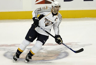
There are several differences in the overall design of the new sweaters when compared to the old. The silver shoulder yoke now extends completely down the arm. It also had yellow piping and a much thicker blue stripe around it that curved down to the wrist. The stripe and elements around the waist are also gone but replaced by side paneling. The new white sweaters do not include as much blue as the old ones did. On the ice, the jerseys look relatively similar, but you can find differences if you're really looking.

Standard FAQ
Numbers on the front? No.
Laces at the collar? No.

NHLToL Editorial by Chris
I've always been a fan of the Predators' jerseys. The old white is one of two non-Lightning jerseys that I actually own. (The other being a 1996 Mighty Ducks third jersey so that may not be a good barometer.) Looking at the home sweater on a rack, it can make you think of a t-shirt, the way the blue extends only down to the elbow. But I think that just adds to its uniqueness while many find that it's a fault. Another thing a lot of folks aren't fond of is the city name above the logo on the road sweater. That's one element I'm on the fence about. I see the merits of it while at the same time am bothered by it as a design element. On top of that, seeing these jerseys on a rack versus in action are two very different animals. I really don't care for how the whites look on the ice. I am impressed with the blues though. I'll call it a wash. 3/5


Buy your new Predators jersey!