Result: Canadiens vs Blues


CANADIENS LOGO VOTED CHAMPION!

Congratulations go out to the Montreal Canadiens' logo! It has been declared by the voters at the NHL Tournament of Logos to be the best logo in the National Hockey League right now.

I can't believe it's finally over. After nearly eight long weeks of voting in a competition that involved all 30 NHL logos, the best one has come out on top. It's been a great ride — despite its bumps — and I appreciate every single one of you who dropped in to cast your votes.

Now you no longer have to wonder which logo is really the best. Now you know. It's the logo of the Montreal Canadiens! Habs fans, bragging rights are yours!

By the way, we'll be raising the Championship Banner in the sidebar on Friday night. Be sure to check it out!

Montreal Canadiens
55% 9,144 votes
CHAMPION

St. Louis Blues
45% 7,525 votes
RUNNER UP

16,669 total votes votes


Poll opening date
Sep 27 @ 5:37 PM
Poll closing date
Oct 3 @ 5:00 PM

07CHTRN | #5 | MTLvSTL

Maple Leafs, Here's How You Fix It

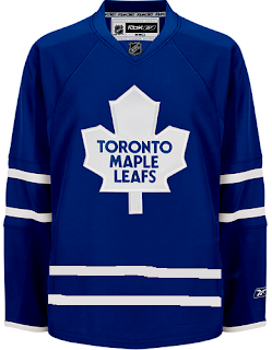
The Fix It series has worked its way into the double digits today. In this episode, we explore ways of improving the Toronto Maple Leafs' brand new Rbk EDGE uniforms.

No question, the biggest complaint has been its simplicity and the fact that while wearing the home uniform, a player is nothing more than a giant blue blob. One minor change some feel might rectify this is adding the same double-stripe found around to the elbows to the waist.

If that's not entirely to your liking, however, I've got more. No, your eyes aren't playing tricks on you. These are the new Phoenix Coyotes jerseys recolored to blue and featuring the Leafs logo. If you look closely at the shoulders you'll see the remnants of the "PHX" patch.

But isn't that a sight to behold? Something about them just makes those jerseys look quite nice in my eyes.

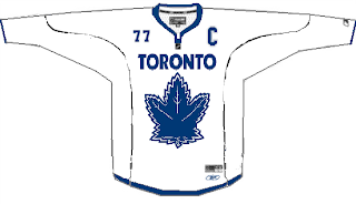
And then if that still isn't your cup of tea, perhaps you enjoyed the new Vancouver Canucks sweaters. Perhaps Toronto could go that route.

Or perhaps not. That scares me a little bit. So let's pretend you never saw that one.

That's all I got. Up next: Nashville Predators.

Fan Art For Ducks, Stars, Coyotes

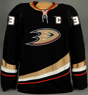
I've been getting some really awesome concept art sent to me lately so let's dive right into some of it, starting in alphabetical order with the Anaheim Ducks.

If this had been sent to me sooner, it would've been part of the Ducks, Here's How You Fix It post from a week ago. That team would look so good in this jersey and I'd eat all my words.

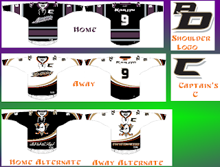
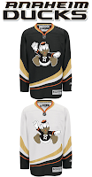
Then I was sent another set that I'm having some difficulty with.

That was making my head spin a little. So as to save me from having to explain it, a description straight from the horse's mouth:

I really wanted to pull together the Ducks' history in the jerseys. I tossed around a lot of ideas but landed on this set of home/away and two alternates. The home and away follow the current script years in Anaheim and I took a page from baseball for having different scripts for home and away. The home jersey features the 04-06 Anaheim script with Ducks in place of Mighty Ducks. The road is basically the current road jersey with an updated name font, captain's "c" and the script/oval logo. Both home and away jerseys feature and interlocking "AD" shoulder patch in the team script as well as front laces.

For the alternate I just changed the current sweaters up a bit but the new shoulder patch, front laces, a recolored Disney logo, and Anaheim, and Ducks wordmarks on the bottom of the home and road jerseys respectively. Just something a little different.

I like the jerseys independently of each other, but together they don't make a good set. I've heard of teams using different logos for their home and away sweaters, but never completely different color schemes. I think your team starts losing its identity when that happens.

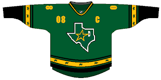
I've also got a Dallas Stars concept that puts the state of Texas right on the crest. Not a bad idea, but it should be the white logo. It needs more contrast.

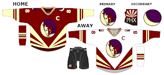
And finally, someone went a little nutty with the look of the Phoenix Coyotes. It's a harsh mix of the old and new.

I'm not really sure I have the words to describe it. Perhaps you do so feel free to leave a comment.

Some Unusually Familiar Concepts

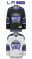
I got a funny email yesterday. Check out these. See if you notice a pattern.


I don't feel a need to explain or comment on them really. They sort of speak for themselves. Pretty clever, if you ask me. What do you think of them?

Reebok Fixing EDGE Issues

An article on TSN's web site was emailed to me and I thought it would be worth sharing. Apparently, Reebok is responding to the moisture issue players are having with the new EDGE jerseys. In short, the wick-away technology is doing a fantastic job of keeping water out of the uniform, but also trapping sweat inside which results in very wet skates and gear.

October 2, 2007

New sweaters here to stay

Darren Dreger
TSN.ca

NHL players will tell you the practice and preseason version of Reebok's sweater design needs work.

The NHL has recognized the issues and Tuesday morning in a conference call with Reebok the league was assured alterations will be made.

The biggest issue focused on the water resistant coating on the fabric of the sweaters. It was designed to keep moisture out.

It did that, but also trapped the moisture in which led to soggy equipment and unhappy hockey players.

To correct that problem Reebok says it has developed a treatment that permits sweat to escape through the fibers, yet still manages to stay reasonably dry.

This new sweater is being shipped to teams around the league, with the Pittsburgh Penguins and Reebok's spokesman Sidney Crosby likely to debut the modifications as early as Friday.

Despite the public outcry from the game's fighters, the NHL doesn't see the need to alter the design to accommodate their needs, other than to further investigate whether the sweater's tie-downs have to be improved.

The belief is most fighters cheated in the past, utilizing the loose fit to get their arms free, or to shake-off binding elbow pads.

That can't happen anymore and the NHL has no intention of changing how the sweater is tailored.

The coordinating socks on the other hand have been replaced in hopes the issue of tearing that some players experienced in the preseason, has been corrected.

The message to all players from the league and the manufacturer is, it's a work in progress and patience is required.

Further modifications are likely, what isn't likely is the NHL turning back and abandoning a deal that pours millions into league coffers.

Very interesting. I think it's great that they're addressing this problem so quickly. What do you guys think about Reebok now? At least they're listening to the players.