CBS Beats NHLToL To The Punch

I'm not sure how prudent it is to go promoting your competition as such, but I've never been one for prudence so here goes. I got an email today from Jeff who pointed out an interesting new feature at CBS Sports' web site.

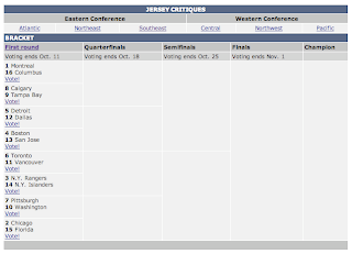
Well crap, they even thought of a better name than I did. Sweater Showdown. And here's their bracket.

My guess is they just started within the last few days judging by when each voting period ends. So since I won't be doing a head-to-head jersey competition for some time — if ever, at this point — I don't mind sending you guys over there to cast your jersey votes with CBS.

However, if you'd like to rate the individual jerseys for the ranking I'll be publishing next month, go ahead and continue voting here at NHLToL. And if you guys want me to, I don't mind doing a head-to-head sweater tournament here as well.

Just drop me a line and let me know how you feel about it. And let me know what you think of the setup over there at CBS Sports. Do you like voting on one round all at once they way they have it, or do you like how I post a new poll every day? I'm all ears.

Bolts Add Numbers At Home

I made reference to this in the Rbk EDGE Review for the Tampa Bay Lightning, but I thought I'd do a separate post to keep everyone up to date.

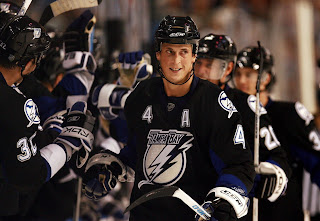
After the jerseys were unveiled initially, the Lightning were the only team to have numbers on the front of one jersey but not the other. In this case, the white road sweaters had them but not the black ones. Seems the team has changed their mind though. The numbers are now on the front of the black jerseys too.

You can see that in this picture from Thursday's opening night game against the New Jersey Devils.

Speaking as a Lightning fan, I kind of like them as a design element by themselves. With the white shoulder yoke gone, the jerseys would've looked very plain up there for guys who don't have an "A" to wear. Anyway, just thought I'd share that.

Poll: North Stars vs Sabres


vs
Minnesota
NORTH STARS
Buffalo
SABRES


The Vintage Tournament is kicking off today! It's going to be a good one. Remember, polls in this tournament will only be open for five days so get your votes in now!

Place your vote and then feel free to leave a comment as to how you came to your decision. Tell all your friends to drop in and vote! The more voices heard, the more accurate the results!

Poll opening date
Sat Oct 6 @ 9:00 AM
Poll closing date
Wed Oct 10 @ 11:59 PM

07VNTRN | #1A | MNSvBUF70

Rbk EDGE Review: Ducks

Part 12 of 30. All 30 NHL clubs have unveiled new jerseys under the new Rbk EDGE Uniform System for the 2007-08 season. Here at the NHLToL, we're going to review every one of them. Read up and then rate the new sweaters. We'll do a full ranking after completing all of the reviews.

Rbk EDGE Uniform System

Anaheim Ducks


New Uniforms

Old Uniforms

The Unveiling
Friday, September 14. The Ducks unveiled their new jerseys to fans during their first preseason game.

Home vs. Road
Home: Black. Road: White. The two sweaters are essentially mirror images of each other.

The black home jerseys feature swooshing gold-white-black-orange stripes around the bottom. These stripes are broken up by solid side paneling. Similar stripes are found around the sleeves. The collar is orange with gold trim and the primary logo serves as the crest.

The white road jerseys feature swooshing gold-white-black-orange stripes around the bottom. Black extends down to the bottom of the jersey from the orange stripe. These stripes are broken up by solid side paneling. Similar stripes are found around the sleeves. The collar is orange with gold trim and the primary logo serves as the crest.

In The Details
Because of its proportions, the crest is the smallest on any of the new Rbk EDGE sweaters. The same numbering and lettering style has been retained.

New & Old
Little has been changed on the new sweaters as the Ducks just introduced new ones last summer. Some slight differences include the collar (as with all of the jerseys) along with the way the side paneling breaks up the striping of the jersey.

Standard FAQ
Numbers on the front? No.
Laces at the collar? No.

NHLToL Editorial by Chris
I know these jerseys now have a Stanley Cup behind them, but I cannot get over how poor the logo is. I understand the marketing team wanting to disassociate themselves with the "Mighty" name, but surely there are better ways of doing that. I should say that without the logo, I really do like these jerseys. But a uniform is more than just colors and stripes. The logo is the biggest part and I have never been a big fan of it. That and the numbers and captains' letters are oversized when compared with the crest. The lack of imagination has spurred me to award my lowest rating yet. 2/5


Buy your new Ducks jersey!