Rbk EDGE Uniform Ranking

The ratings are in! Here is the official ranking for the new Rbk EDGE uniforms as decided by you, the readers, here at NHLToL.

4.3Boston Bruins
4.1Montreal Canadiens
4.1Washington Capitals
4.0St. Louis Blues
4.0Chicago Blackhawks
3.9Columbus Blue Jackets
3.8Detroit Red Wings
3.8Tampa Bay Lightning
3.6Phoenix Coyotes
3.6New York Rangers
3.6Minnesota Wild
3.5New Jersey Devils
3.4Los Angeles Kings
3.4San Jose Sharks
3.4Ottawa Senators
3.3Philadelphia Flyers
3.3Pittsburgh Penguins
3.3Carolina Hurricanes
3.3Calgary Flames
3.1Vancouver Canucks
3.1Buffalo Sabres
3.0Florida Panthers
3.0Colorado Avalanche
3.0Nashville Predators
2.9New York Islanders
2.9Atlanta Thrashers
2.7Dallas Stars
2.6Toronto Maple Leafs
2.6Edmonton Oilers
2.6Anaheim Ducks

This ranking was reached by averaging the ratings chosen by voters in each of the individual Rbk EDGE Review posts. I reviewed all 30 NHL uniforms and within each review was a poll where readers could rate the uniform. See all 30 reviews.

All 30 polls will remain open forever so folks can continue to keep casting votes. The above ranking is based on results as of this morning. Any changes after more votes are cast would be negligible and wouldn't count for this ranking.

One other note is that despite how it may appear above, there were no ties in the rankings. For the purposes of this post, each rating was rounded to the nearest tenth of a point. For example, while the Canadiens and Capitals each received a 4.1, if you look further beyond the decimal, you'd see that the Habs have 4.146 while the Caps have 4.089, which is why the Canadiens are ahead of the Capitals. Make sense?

Hope you guys enjoyed the reviews! Please leave your comments below.

Poll: Barons Franchise Logos


SEALS
GOLDEN SEALS
BARONS


They were first the California Seals. Then the Oakland Seals. Then the California Golden Seals before moving to Cleveland to become the Barons. Finally, this franchise folded and merged with the Minnesota North Stars. But before they folded, which logo do you think was their best?

Place your vote and then feel free to leave a comment as to how you came to your decision. Tell all your friends to drop in and vote! The more voices heard, the more accurate the results!

Poll opening date
Sun Oct 28
Poll closing date
Thu Nov 1

07BONRF | RFCLE

Red & Black

We've got a color theme for this concept post. Check it out.

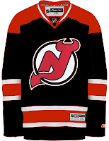
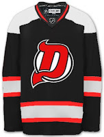
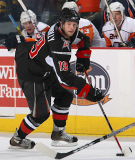
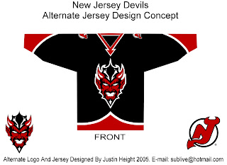
The most obvious place to start is the New Jersey Devils.

They both offer unique ideas for an alternate jersey. I don't think we'd really want to see the Devils in anything but red on a regular basis. Very interesting how these two different artists came up with something so similar yet so different.

But for something completely different, look no further.

That's a pretty scary logo. Looks like somebody's tattoo.

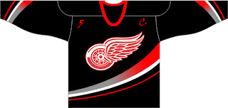
And here's a team you don't often associate with black.

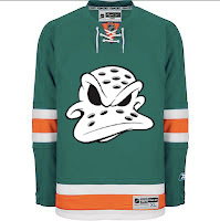
The ironic part is the Ducks' template on a Red Wings jersey. Just so many things wrong with that. I know the Red Wings are sworn enemies of third jerseys, but I think they should try one out some day. Maybe not this design, though.

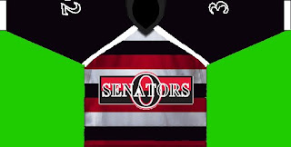
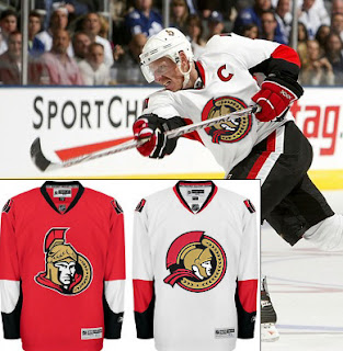
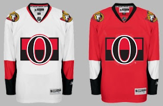
Another black and red team is the Ottawa Senators. Here's an example of what they shouldn't do with a third jersey. Ever. And here's another.

Now here's something that would work — even as a full-time road jersey. This 2D Senators logo is quite possibly better than the primary. It's unfortunate it's nowhere to be seen on their uniforms. Rumor was that it would be featured on various bits of team merchandise. If anybody owns anything with that logo, send me some photos.

And while we're on the topic of doctored photos of jerseys, more and more I'm in favor of the black/red/silver color scheme for the Buffalo Sabres — who are presently being conquered by my Lightning (that goes out to all my email hecklers).

Yeah, it's true. My Sabres-fan readers have taken to email trash talk. Well we'll just see how that goes, won't we? It's 2-0, not five minutes into the second period. Hope you're watching.

UPDATE (9:33 PM): Sadly, I may have spoken too soon with regard to the game. It's now tied.

UPDATE (10/28 8:17 AM): Stupid overtime.

Poll: Avalanche Franchise Logos


NORDIQUES
AVALANCHE


Place your vote and then feel free to leave a comment as to how you came to your decision. Tell all your friends to drop in and vote! The more voices heard, the more accurate the results!

Poll opening date
Sat Oct 27
Poll closing date
Wed Oct 31

07BONRF | RFCOL

Just To Freak You Out XII

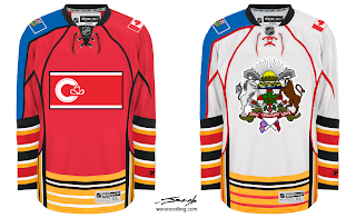
Welcome to the 12th installment of the Freak Out Fridays. Hope you enjoy this one. We'll kick things off with one of the craziest things I have ever seen.

Like the designer said, who needs a logo when you've got municipal and provincial art to plaster across your sweater? And I counted well over 50 stripes on each sweater. I love those right sleeves. So much so that I've gouged out my eyes. The rest of this will be written by touch-typing.

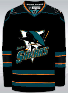
Now keeping it in the Western Conference, check this out.

I guess what troubles me the most is that someone has removed the shark's fin. That's just cruel.

Speaking of cruel...

I dare any league to dress any team in that uniform. Make that a double dare! (Actually, I'm half-expecting to see that duck morph into a dolphin.)

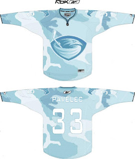
But wait, there's more. Say you're a team looking to blend in with your surroundings. Let's say your hunting ducks, for instance. Might this be a good way to camouflage yourself?

I think it might.

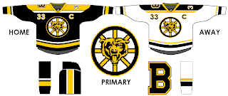
And finally, anybody here watch Conan? One of my favorite segments is "If They Mated." Someone sent in a concept that fits into that category well. What if we mated the Boston Bruins and Chicago Bears (of the NFL for those of us who think football is a waste of time and energy)?

Behold the answer.

I just don't know how I feel now. A little dirty. A little freaked. A little worried about the nightmares I'll have tonight.
Anyway, I hope you guys have enjoyed this Freak Out Friday. Looking forward to finding some great content in my inbox this week for the next episode! You can email me at nhllogos@gmail.com.