Poll: Oilers vs Senators


vs
Edmonton
OILERS
Ottawa
SENATORS


Yesterday brought the Battle of New York and today brings the Battle of Canada. Either way, the final here in the Third Jersey Logo Tournament will see a New York logo facing a Canadian logo.

Place your vote and then feel free to leave a comment as to how you came to your decision. Tell all your friends to drop in and vote! The more voices heard, the more accurate the results!

Poll opening date
Thu Nov 22
Poll closing date
Mon Nov 26

07TJTRN | #3B | EDMvOTT

Poll: Sabres vs Rangers


vs
Buffalo
SABRES
New York
RANGERS


The third round of voting has begun! Place your vote and then feel free to leave a comment as to how you came to your decision. Tell all your friends to drop in and vote! The more voices heard, the more accurate the results!

Poll opening date
Wed Nov 21
Poll closing date
Sun Nov 25

07TJTRN | #3A | BUFvNYR

Decide On The AHL's Best Logo!

If you haven't been following the AHL Tournament of Logos over at ToHL, now is the time to get involved! We're down to the final two. In the championship round it's the Manitoba Moose against the Bridgeport Sound Tigers. But only one will walk away with the victory and bragging rights as the AHL's best logo.

And as I've mentioned, the third round of the Third Jersey Logo Tournament here at NHLToL will begin tomorrow. At the moment, it's looking like we'll have a Battle of New York on our hands for that first poll. Should be interesting.

A Third Jersey For The Wings?

The third round of voting on the Third Jersey Logo Tournament will begin on Wednesday so keep an eye out for that. In the meantime, I've managed to break away from Super Mario Galaxy (80 stars) if for only moments to share with you some Detroit Red Wings concept art. This, of course, coming on the heels of the Motor City being named the most dangerous city in America. Kudos on the whole gas station owner feud thing.

Crazy.

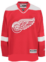
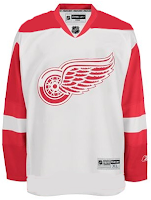
All right, so moving right along into the hockey stuff now. We'll begin with what you'd probably consider your basic throwback alternate.

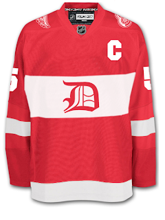
I don't think many Wings fans would lodge a lot of complaints over something like this. It's still got that traditional look and feel but at the same time it's something new.

For a change of pace, how about a new logo entirely? Get it en-"tire"-ly. I should stop that now.

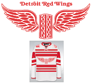
Personally, I'm not the biggest fan but it's definitely got the old-time hockey feel.

Now, if it's something completely and totally different that you're after, look no further. I've got you covered there as well.

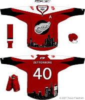
The designer described his work this way: "As you can see, the skyline wraps around the base of the jersey. I'm sure you're wondering about the logo. It is an image that has been familiar with Detroiters for decades. It's a statue called the 'Spirit of Detroit.' If you google it I'm sure you'll find a good photo. I think it's a great representation of Detroit that many Detroiters would appreciate."

So Detroiters, how do you feel about these? I'm interested to get some feedback here.

But just so you guys don't think I've gone completely crazy, I've got a couple of very conservative redesigns as well.

So now let's hear it. Could any of these pass muster for a potential Red Wings third jersey? Or is Hockeytown destined to never join the alternate sweater club? Post comments below.

Hurricane Of Concept Art

There's no new poll today so it'll just be this post all by itself. I've had a bunch of Carolina Hurricanes concept art sent to me over the last couple of weeks so I thought I'd gather it all up to share.

We'll start with a pretty cool rebranding that involves a lighthouse as the Canes' primary logo as well as some slight changes to actual primary.

I don't know, for me, a lighthouse will always say Islanders. I don't know if I'll ever be able to shake that. I do like this logo and uniform set, though. Very nice quality.

While we're on the topic of redesigned logos, here's an interesting re-imagining of the current secondary mark. I know the team is based out of North Carolina, but does South Carolina also consider the Hurricanes their team since they go by just the Carolina name? Am I thinking about this too much?

It's a nice logo, but it needs some tightening up where the outline of the state is concerned. Way too much tiny detail in their. This would be like a six-inch patch. No need for all that detail. But even if it were the crest, it should still be cleaned up.

Here are a couple of third jersey designs.

And we'll finish things off tonight with another third jersey concept I found quite interesting.

Classic and what have you. Definitely a Colorado knock-off, but nice on its own merits. You be the judge. Let us know what you think about these in the comments.

By the way, I made wholesale updates to the Concepts Gallery this weekend so be sure to check that out. Added about 50 new images.