Concepts On The Isle

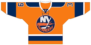
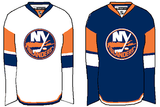
I got a couple of nice New York Islanders concepts delivered to me. I felt like sharing them tonight. The first is a really simple improvement over the new design introduced this year.

It's not much, but it makes the sleeves seem like they're actually a part of the jersey. And it does away with the pointless piping around the shoulders.

Now if you just can't live without the piping, here's how you do it the right way. Tip: Use a different color for the shoulders.

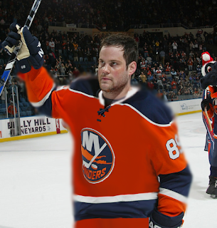
Plus, I've always liked the Islanders in an orange jersey. Just like I preferred the Stars in green — even the Wild in green as well. It's almost like there was actually a mandate requiring teams to wear black, blue or red (the Sharks with the teal the only exception). Anyway, here's to orange jerseys and Mike Comrie.

Though he appears to be disintegrating as if in one of those sci-fi films.

I'll have more stuff to post tomorrow. I hope to make a large-scale update to the Concepts Gallery as well.

Just To Freak You Out XXI

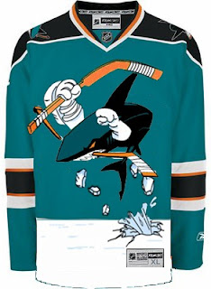
The Freak Out series hits 21 this week — old enough to get hammered. And boy, I think some of the designers this week had to have been hammered. I mean, just look at this.

It might take a moment or two to notice that this is an "If They Mated" example. It's the new Sharks secondary logo merged with the Mighty Ducks third jersey of the mid-90s. But I love it!

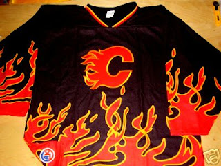
This Flames jersey is on fire! Someone on eBay is really selling it. For real.

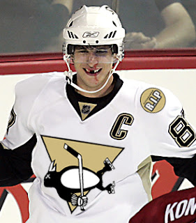
Sidney Crosby recently dropped the gloves in a rare on-ice event. This picture isn't real but it cracks me up nonetheless. There's just so much about it that's so wrong. I'm curious to see if the guys over at Pensblog have anything to say about this.

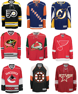
And finally, we have a plethora of "matings" here to share.

To sum things up, what you see above is the Flyers and Bruins, Rangers and Islanders, Devils and Sabres, Blue Jackets and Blackhawks, Avalanche and Wild, Blues and Red Wings, Canucks and Hurricanes (weird!), Bruins and Flyers (opposite of the first one) and Stars and Coyotes.

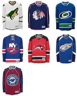
But wait, there's more.

This one is interesting because it's all opposites of the previous image. They are the Coyotes and Stars, Blackhawks and Blue Jackets, Hurricanes and Canucks, Islanders and Rangers, Sabres and Devils, Red Wings and Blues (what the—?), and Wild and Avalanche.

Hope you enjoyed being freaked out. Have a fantastic weekend!

Poll: Capitals vs Thrashers


vs
Washington
CAPITALS
Atlanta
THRASHERS


Place your vote and then feel free to leave a comment as to how you came to your decision. Tell all your friends to drop in and vote! The more voices heard, the more accurate the results!

Poll opening date
Thu Dec 27
Poll closing date
Mon Dec 31

07SCTRN | #3B | WSHvATL

Poll: Hurricanes vs Canucks


vs
Carolina
HURRICANES
Vancouver
CANUCKS


The third round has begun! Place your vote and then feel free to leave a comment as to how you came to your decision. Tell all your friends to drop in and vote! The more voices heard, the more accurate the results!

Poll opening date
Wed Dec 26
Poll closing date
Sat Dec 30

07SCTRN | #3A | CARvVAN

Merry Christmas, Edmonton!

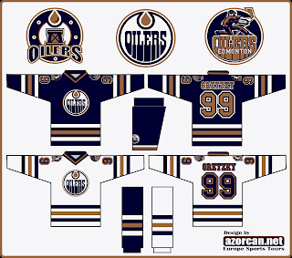
Santa has delivered some Edmonton Oilers concept art for me to post this evening.

This first one keeps with the copper theme but makes a few adjustments. For one thing, there are two different secondary logos — one for each shoulder. It also continues the stripe all the way around the sleeve.

Not too bad overall, though. The letters on the nameplate might be a bit hard to read but the secondary logos are well done. I like the one on the left, personally.

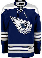
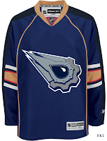
These two jerseys are a couple of designs featuring the logo you guys voted as the NHL's best third jersey logo. One with silver, one with copper. I like the silver.

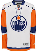
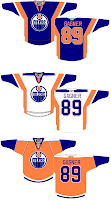
And these two were just fun. I think that jersey on the left looks bad with an Islanders logo on it. The Oilers logo doesn't improve it. On the right are a few concepts with some interesting striping. The orange jersey was ill-conceived, I think, but the other two have my attention.

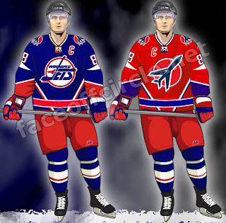
Finally, as a bonus for those of you longing for the days of the Winnipeg Jets, enjoy this.

Those are pretty sharp. Too bad we'll never get to see jerseys like that anytime soon.

I hope you all enjoyed your Christmas (if you celebrate it) and the day off (if you were lucky enough to get it). The third round of the Secondary Logo tournament kicks off tomorrow.