Oilers Jersey Concepts

Got a handful of Edmonton Oilers concepts to offer up before I call it a night.

That one is very traditional, this one not so much.

But I like that oilman shoulder logo. Was sad to see it go and surprised at the number of you who nominated it into the Quest For The Worst tournament. But to each his own, right? Speaking of which.

Interesting pair of sweater designs there, but not all that "traditional" and I don't think they'd garner a lot of votes from fans.

Then this last one's just weird.

I'll be back with more tomorrow. In the meantime, keep the votes coming in as we narrow it down to the finalists for the Quest For The Worst.

Just To Freak You Out XXVIII

This is the 28th installment of the Freak Out series and the 1,002nd post of the blog. It's Friday, everybody! And you know what that means.

I feel this needs no explanation.

Yes, it's that bad of an idea. And believe it or not, it gets worse.


I don't know how anyone could consider corporate sponsorships which manifest on the uniforms.

Anyway, there's also some third jersey fun to freak you out. If you're the Blues, I'll tell you what you don't do. You don't wear a yellow jersey.

The Blues.

And for the Canadiens, I like the red sweater with the blue shoulders, but I'm not sure the white one is the way to go here.

Also, I'll throw in an "If They Mated" logo, matching up the Kings and Sharks.

It may be a terrible idea, but it's extremely creative and I love that.

And for good measure, here's a plethora of concept art based on the notion of creating jerseys with two colors — split down the middle.

Everybody's covered and they're all worth a look, most notably the Bruins, Red Wings, Islanders, Rangers, Canucks and Capitals. That's some pretty intense craziness right there.

Have a great weekend, all!

Poll: Bruins vs Canucks


vs
Boston
BRUINS
Vancouver
CANUCKS


REMEMBER: You're choosing the WORST logo!

Place your vote and then feel free to leave a comment as to how you came to your decision. Tell all your friends to drop in and vote! The more voices heard, the more accurate the results!

Poll opening date
Fri Feb 22
Poll closing date
Tue Feb 26

1000 Posts!

That's right, this post I'm writing here is my 1,000th! I began this blog on May 9 and as of today, it now has a thousand posts. I'm very proud and as always, I'm more than appreciative of you guys for continuing to drop in. Obviously, you all are the reason I keep doing this. So as a thank you, I have some third jersey news.

Well, it's not so much news as concept art. It's all the ideas we've had for next season's new third jerseys... visualized! I'll begin with our friend Gary who's emailed in every other week or so since way back in October. He came up with designs for most of the teams we're expecting to see thirds from in the fall.

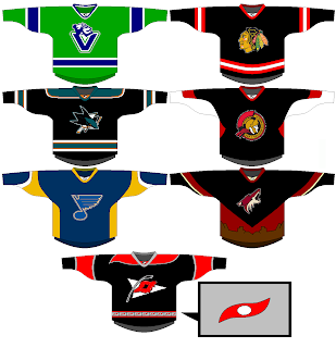
Vancouver's all right. Needs more of a forest green. Chicago, San Jose and Ottawa are pretty much what I'd expect. I like the 2D logo on the Sens jersey. Nice touch. We already know the Blues will have a new logo for their third. The desert scene didn't work out to well for the Coyotes last time so I doubt they'll try it again. And I like the idea of using the Hurricanes' secondary logo as the crest.

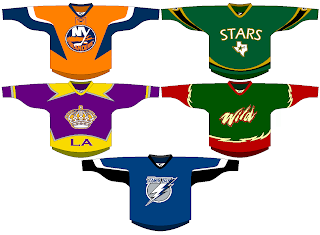
The Islanders and Lightning designs meet expectations, but the rest are a little out there if you ask me. I can't see the Kings bringing back the gold anytime soon. They'll probably stick with silver and black. The Stars sweater is interesting but could use some work. I like the green. Speaking of green, I can't imagine the Wild using that wordmark as a crest. I'd expect to see the bear head and a much cleaner design more along the lines of the current road jersey.

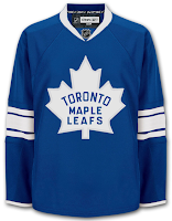
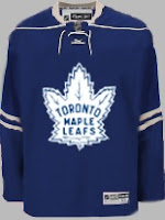
Among that list but not included in Gary's designs were Thrashers and Maple Leafs. Other readers came up with some good designs for them. First, a white version of Atlanta's home sweater.

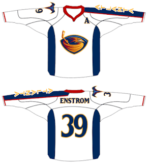
It's nice but I can't see the Thrashers adding another white jersey — especially as an alternate. As for the Leafs, we've got a lot to consider.

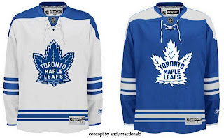
When you think Toronto third, you automatically think vintage/retro/throwback. These fit that bill quite well.

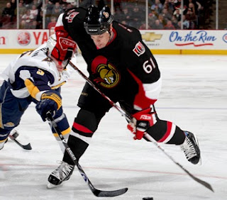
Anyway, I also had a lot of submissions dealing in black. For instance, take the Senators jersey above, painted on Cory Stillman.

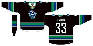
Also a black version of a jersey with the new Johnny Canuck logo.

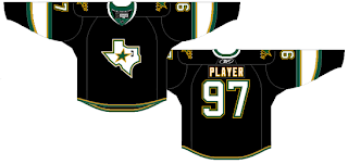
And a black Stars sweater with the Texas state logo.

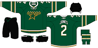
Personally, I'm more a fan of this green version.

And finally, we'll look at a team who hasn't said a word about a third jersey in the future, but one for which it could work unbelievably well — the Washington Capitals. Imagine a uniform set that looked like this.

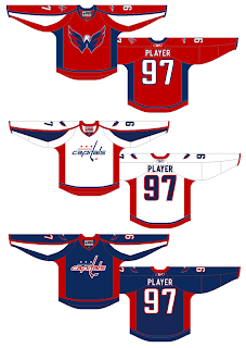
Now those are some nicely designed jerseys.

Remember, if you've got some quality work you'd like me to post, send it along to nhllogos@gmail.com.

Some Unconfirmed Third Jersey News

I got an email earlier in the week that I was unable to post until now. It was from a reader who wrote in that a Reebok representative has apparently confirmed which teams will be wearing third jerseys next season. I'll say right off that neither I nor this reader can completely vouch for the veracity of this information, but having said that, I see no reason not to put it out there anyway as mere speculation.

The list includes the Sabres, Oilers, Flyers and Blues, which we've already heard rumors about. However, it doesn't include the Penguins who are apparently looking to don the retro jerseys they wore at the Winter Classic.

The rest of the list shapes up like this, in alphabetical order:

  • Atlanta Thrashers

  • Boston Bruins

  • Carolina Hurricanes

  • Chicago Blackhawks

  • Dallas Stars

  • Los Angeles Kings

  • Minnesota Wild

  • New York Islanders

  • Ottawa Senators

  • Phoenix Coyotes

  • San Jose Sharks

  • Tampa Bay Lightning

  • Toronto Maple Leafs

  • Vancouver Canucks

From that list, all but four had third jerseys last season. One would assume most of them would stay the same.

Boston, Toronto and Vancouver wore retro threads. An obvious choice to keep. Vancouver switched back to their original colors this season. However, the introduction of a new Johnny Canuck logo leads me to wonder whether they might head in that direction for an eventual discontinuation of the whale altogether. But that may just be wishful thinking.

Chicago, San Jose and Ottawa simply wore black versions of their standard jerseys. Seems to me they'd probably do something similar with new thirds. Also, Carolina has never had a third but black seems like a smart option. And since introducing their new colors and logo, the Coyotes have yet to try out a third. But if they do, you might see it in black as well.

I wouldn't be surprised to see the Kings and Islanders stick with last year's thirds. They utilized different colors, and a different logo in Los Angeles' case. Minnesota made their red third into their regular home sweater this year but the green may well make a comeback if they go with an alternate.

Dallas' most recent attempt at a third left a lot to be desired so we might see something completely different for them. Or we might just see a green jersey with "STARS" written across it in white. Also, Atlanta recently converted its original third to the current home jersey, so I'm not sure what to expect from them. Perhaps something in dark blue reminiscent of their early days?

And finally, there's my Lightning. Very few people liked Tampa Bay's blue third with rain drops, waves and lightning bolts on the arms from the late '90s. I was one of them. But I wouldn't expect to see anything like that if we do end up with an alternate next year. I would expect to see a nice blue sweater though.

Enjoy the speculation. As hard facts become available, you can count on me to have them posted right here at NHLToL.

So if you guys want to start coming up with concepts of what you think next year's crop of third jerseys might look like, go for it! Email them to me and they may well find their way onto the blog.