I think I promised you guys a concept post before the weekend was out, so here it is. I've assembled some of my favorite designs from my stash. There's a lot of quality work, so let's dive in.
First, an interesting new look for the Toronto Maple Leafs.
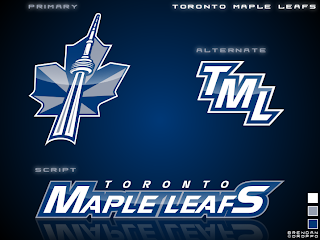
I'd like to see the jerseys that go with it. If nothing else, the production value is through the roof on this one.
But if you want to talk excellent concept logos, look no further than this one for the Washington Capitals.
I admit I had to stare at it a while, but there it is, a "W" and a "C." And I don't know why it took us so long to realize that if you put those two letters together the right way, it forms a star! However, I'm not sold on the wordmark. I get the whole Declaration of Independence thing (been watching John Adams today), but for a sports team it's not a good idea.
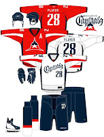
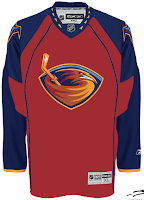
I like that Thrashers jersey as well. With much thanks to Jacob at We're Revolting! for that one.
You guys always give me trouble for my aversion to yellow jerseys, but I've come across a bunch that I actually like — despite their resemblance to what I can only assume is Hillary Clinton's favorite suit.
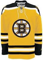
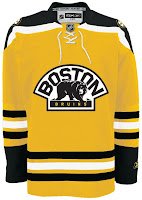
Well, it's the Boston Bruins of course. Can any other team really do a yellow sweater?
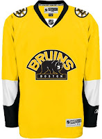
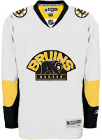
This second set wouldn't work because yellow is still a light color. It wouldn't work as a dark home jersey. However, I am intrigued by the use of the secondary logo with a black background and yellow text.
Up next are the Chicago Blackhawks.
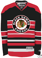
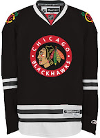
All those stripes do weird things to my brain. And there's not enough contrast in the other one. But I don't know, either could work as a temporary third jersey.
Finally, it's the Buffalo Sabres.
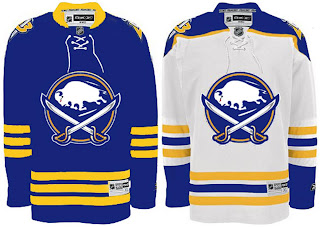
It's a nice logo on a traditional uniform design. I think you'd be hard-pressed to find nay-sayers.
That's good for now. Stay tuned for new polls going up tomorrow both here and at ToHL. Here, we'll have Cam Ward and Josh Harding going head to head and for the WHL Tournament of Logos, it'll be the Calgary Hitmen and the winner of the Americans/Thunderbirds poll which closes tonight.


