I know you've all been waiting for two whole weeks, but I'm all set just to freak you out now. And some of these should really get the job done.
We'll begin in none other than the Windy City with a couple of logos that almost had tears coming out of my eyes I was laughing so hard.
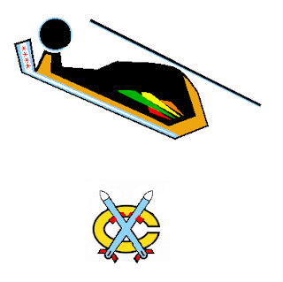
Yeah, it's a Blackhawk and two tomahawks. I'm not saying the idea was over-the-top clever, but the execution had me on the floor.
Then there's this.
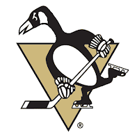
Which looks a bit more like a goose than a penguin. I guess that's what they were going for.

Not entirely sure what's going on there but the guy with the stick and... the eyes... that guys creeps me out.
We'll transition now from logo designs to jersey artwork. First, a completely new concept for the New York Rangers.
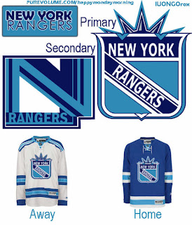
Yeah, they're the Broadway Blueshirts all right, I suppose. Which is a good reason why this should never happen.
Also, a not entirely unexpected result of naming your team the Ducks could be the nickname "mallards" — a completely harmless and ridiculous looking bird, let's all just be glad they didn't go with uniform colors to match.
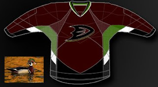
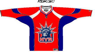
Because as you can see, it could have been way worse.
Or you could just put a bug on your sweater.
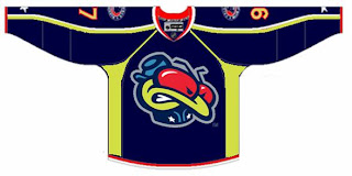
I don't recommend it. However, if you're a Pens fan, I do recommend a trip to The Pensblog for some of the most entertaining coverage of Pittsburgh hockey. Their series of site logos during this playoff season has cracked me up. Enjoy this one (unless you're a Sens fan).
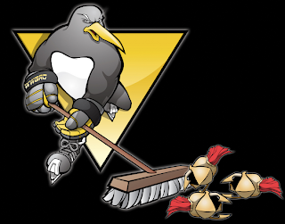
Unfortunately for them, there'll be no broom-clad penguin sweeping away wings of some sort.
Hoped you enjoyed this edition of the Freak Out Friday. Keep sending in the craziest artwork you can find/make and join me again in two weeks for another riveting episode.


