CHL Logo Champion


Congrats to the Knights!

With 49% of the vote, the logo of the OHL's London Knights has been declared the best the CHL after defeating the WHL's Broncos and the QMJHL's Huskies. Nearly 1,700 votes were cast in the final poll of the tournament which began at the now deceased ToHL. Thanks to all who voted!

As with the Huskies, I won't be able to have the banner up for a little while, but rest assured it's on my to-do list.

As you know, the NHL Center Ice Tournament will be starting on Monday. You can read up on the tournament and see the new bracket now.

IHA Atlantic Finalists Unveiled!

Over the past couple of weeks I've been inundated with logo submissions for the IHA project. Some of them are top-notch, professional grade logos, others... not so much. But after going through all of the logos sent in, I've narrowed down three finalists for each team in the Atlantic Division. You'll begin voting on them this week but for right now, have a look at the competition.

ATLANTA FIRE

NEW YORK AMERICANS

PHILADELPHIA TITANS

PITTSBURGH MINERS

WASHINGTON STARS

I've left off credits here for a couple of reasons which I won't get into. However, if your logo is featured here and you would like a credit, drop me a line via email and let me know and I'll be happy to add it. Otherwise, I plan to wait and credit the logos that win for each team.

Polls will start going up on Monday to decide which logo should be used for each team. I was going to let this be a surprise but I'll go ahead and tell you anyway. Along with each poll, I'll show some of the logos that were submitted but didn't make the final cut for one reason or another. So if you sent in a logo but it's not among those above, it may still be posted on Icethetics this week.

By the way, I've tried to weed out any logos with elements stolen from actual professional sports team logos, but if I've missed anything be sure to let me know. I've got backups to put in for most teams as far as the polls go.

Now I'd like to hear what you guys think of these logos. Post your comments and critiques below!

UPDATE (5:21 PM): It seems as if the IHA project is nothing if not controversial. A number of readers are concerned that the second Atlanta Fire logo above is too similar to the old Atlanta Flames logo. My opinion is that it's different enough to be considered original but yours is the only opinion that really counts as far as I'm concerned so I'm doing a quick reader poll here to gauge the general feeling on this. It'll be open until tomorrow at noon.

Center Ice Bracket Is Here!

The Center Ice Tournament bracket is ready to go. You can already see it in the sidebar. Or see a larger image below. Clicking on either bracket will take you to the full version.

I've made some adjustments as you'll notice. My favorite is no more pop-ups. I never did like that. I've also changed the layout of the bracket to help with the amount of space it takes up. Hope you guys like the changes. I know in the past I haven't been the best at keeping the bracket up to date but I'm going to try to turn over a new leaf with this tournament.

In case you missed it, further details can be found by clicking here. The tournament begins on Monday!

Blues, Blackhawks & Blue Jackets

Hope you guys are psyched for the Center Ice Tournament. I've been busy getting that prepared but in the meantime I did promise you concept art. Today's theme is the Central Division.

First up, the Blues — in an assortment of different colors.

These logos have a very different feel to them as well because of the hand-drawn look. The NHL has never really done anything like this. Also, there's a jersey to go with them.

But back to a more simplistic approach, what about a striping pattern on the jersey that alludes to the Gateway Arch?

Here's an interesting wordmark.

Next is my favorite subject, as you know, the Blackhawks. The designer tells me he came up with this logo around the time the Senators first introduced their 3Dish logo. You give the Indian head a quarter turn and he might look something like this.

I like it a lot — maybe not as a logo, but just in general. Plus, remember this logo? Somebody put it on a jersey.

Not bad at all.

We'll finish things up here with the Blue Jackets. Here we're replacing the hat with a cannon on the secondary logo.

And here's a variety of color patterns for Columbus' jerseys.

Nothing really jumps out at me (in fact, it took me a minute to notice they were all different).

Don't forget, tomorrow you'll get your first look at some of the logos designed for Project: IHA. I can't wait to post them and get your feedback. Plus the Center Ice Tournament bracket will make it's debut. So there's a lot you won't want to miss.

Center Ice Tournament

It's been a long time since we've had a full-fledged logo tournament underway here or on NHLToL. In fact, in the 26 days Icethetics has been up and running, we haven't had a single one aside from finishing up the CHL tournament. So today I'm announcing the first tournament here on Icethetics — it's the Center Ice Tournament.

Your vote will help determine which NHL arena has the best center ice design. The criteria you use to cast your vote is entirely up to you. You just have to pick which one you like better for whatever reason you choose.

There are 30 teams and each one will be included in the tournament. This means two teams will get first-round byes. They have been randomly selected as has the bracket which you will get a peek at tomorrow. But all 30 graphics are ready to go and in no particular order, here they are.


The original ice graphics were created by CanuckFanatic92 at hockeydownloads.com.

They are as close to accurate as I could find. They generally reflect last year's designs so this is what you'll be voting on regardless of whether anything has changed for next season. I recognize that teams celebrating special anniversary or hosting the all-star game tend to use special designs but I'm going with just the standard looks here. If you notice any major inaccuracies, best to point it out right away, though I can't say for sure whether I'll be able to make any changes.

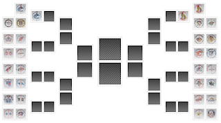
BRACKET You'll get your first look at the new bracket tomorrow and the tournament will begin on Monday. It's going to run basically the same as any other tournament we've done in the past. I think it's been a fairly effective system and you guys already know how it works so what's the sense in changing it?

POLL LENGTH The only major adjustment will be to the number of days a poll remains open. It was previously five days but I'm now cutting that to four. The majority of the votes are cast within the first two or three days anyway.

SCHEDULING A new poll will be posted every day in the first round. For later rounds, polls will be scheduled so that they can be posted on consecutive days. We will have a few days off between rounds as the tournament progresses, but I prefer not to have days off within rounds, if possible.

LAYOUT The individual polls will also have a new layout. If you've voted recently on the CHL championship poll you'll know what I'm talking about. The logos will now be arranged vertically and alongside the radio button you use to make your selection. The logos will also appear in random order when you load the page.

If you've got any questions about this tournament, feel free to ask by emailing me or leaving a comment. Remember, I'll reveal the bracket tomorrow and the voting will commence on Monday. And just because I enjoy teasing you, I'll tell you which poll will be first: Predators vs Bruins.