New Logos For 'Yotes, Bruins, Sabres

I saw a reader posted links to images of new logos for the Coyotes, Bruins and Sabres and figured I'd post them for everyone to see. (Also, it will serve as a backup in case the original images disappear at some point.)

I'm not worried so much about crediting the original person who got these graphics considering they probably shouldn't have had them in the first place. But this is the internet. What can you do?

We can start with Phoenix. First, we've got a better shot of the alleged third jersey logo I first posted last week.

It's an amazing looking logo. Let's hope the sweater design can live up to it. There's also what may be a secondary logo for the alternate jersey along with a brand new wordmark.

Nothing bad to say about either of those.

The Bruins have a new wordmark as well.

Very cool. And we've got a bit of a better look at the vintage logo the Sabres will wear on their thirds.

Thanks to Resist The Machine for finding all of those. If you guys come across anything else, email me and we'll let the world know.

Freak Out Friday XLI

Another Friday is upon us and it's time to freak you out. I'm starting with a rather frightening rendition of a Senators third jersey concept.

Just look at those eyes staring back at you. Scary stuff.

We've been talking a lot about the Dallas Stars lately. Anybody want a real Old West theme for the uniforms?

If you did, I'm sure you don't anymore.

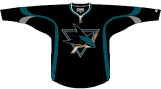
Stripes for the Sharks?

You know you'd buy that jersey. Don't try to deny it.

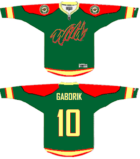
Here's a somewhat less freaky Wild concept sweater.

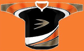
A new series within a series I started to FOFs ago showcased the infamous Mighty Ducks third jersey with the logos of other teams from around the league. We've done the Atlantic Pacific Divisions and today we've got the Southeast.


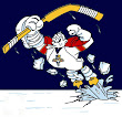
And while we're on this topic, under the heading of Other Things That Just Won't Die, the Iowa Chops are back for another round of mockery.

I don't think I need to say anything more. Just try to enjoy your weekend now that you've been freaked out.

IHA Poll: Houston Comets


Cast your vote and leave a comment about your decision. If you chose a non-finalist, tell us which one. Then tell all your friends to drop in and vote! The more voices heard, the more accurate the results!

Starts Fri Aug 8
Ends Mon Aug 11

Below are a handful of the logos that were submitted but not selected as finalists. If you think one of these should be the Houston Comets logo, select "non-finalist" in the poll and tell us your pick in the comments.


Overnight Art: California Style

It's late and I feel like you guys got shortchanged today with only an IHA Poll being posted. So I'm sitting here and I feel like writing up a pretty big concept art post — all about California. We'll start in Anaheim.

Here's an unusual idea for the Ducks — get rid of everything in the logo except for what's inside the D.

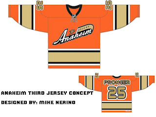
Or, to be more conservative, I've got an orange third jersey that's pretty sharp.

And an orange third jersey based on a purple one from the old days.

We could just go an entirely new route and find ourselves with a unique, new logo.

But maybe we'd better not. Continuing our California trip, let's head to L.A.

Same logo, two drastically different uniform designs. This next one loses the color altogether with a callback to the Kings' Gretzky days.

Now we head north to San Jose where we start with a new logo for the Sharks.

Notice the complete lack of orange. I always thought it was a nice accent. But that's why we have the one on the right. Though comparatively, those sweaters are a bit boring.

One designer suggested the team keep the shark of their current logo with the triangle of the old days.

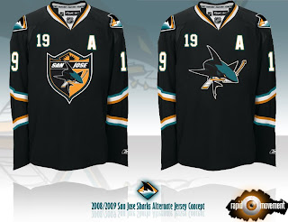
And this last one was forwarded to me, I believe, from a message board somewhere. If anyone's got the link, I'd be happy to add it. (Update: See the original post at HFBoards.com.)

I like both but the shield logo is my personal favorite.

Happy now? Go get some sleep. (And if it's morning where you are when you're reading this, have a nice day.)

IHA Poll: Edmonton Seahawks


Cast your vote and leave a comment about your decision. If you chose a non-finalist, tell us which one. Then tell all your friends to drop in and vote! The more voices heard, the more accurate the results!

Starts Thu Aug 7
Ends Sun Aug 10

Below are a handful of the logos that were submitted but not selected as finalists. If you think one of these should be the Edmonton Seahawks logo, select "non-finalist" in the poll and tell us your pick in the comments.