Finding Lost Logos
/Tuesday's post about blogger James Gordon finding unreleased logos in public trademark filings and an email from JP at Japers' Rink got me thinking about what other hidden gems might be out there on the United States Patent & Trademark Office's web site. Now I think "gems" is misleading because, by and large, logos that were trademarked but never used probably weren't that good in the first place.
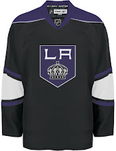
Even one that was trademarked and will be used wasn't that good. I'm of course referring to the Kings.
That got me thinking about the one other team who is supposed to be getting a new logo for their third jersey — the Blues. And we haven't seen anything from them yet. So I did a search. Unfortunately, it seems they haven't filed yet. However, I did find one interesting wordmark.
A Blues fan would have to let me know if this was used or not at any point. But I don't remember ever seeing it. I believe it dates back to the days of the trumpet logo you see on the right. That was a secondary logo worn as a shoulder patch during the Gretzky days when the team introduced red into the uniform.
I did like that trumpet logo a lot though, for what it's worth.
Moving on now to the Capitals. Here's a logo we have seen before here.
And here's one we haven't.
This is what JP pointed out to me in the first place. Last year he wrote up a post about these two logos. He didn't like either and while I know my opinion doesn't count for anything, I have to say I really like the one on the right.
Yeah, it has text in it and all that, but if you can look beyond it's major flaw, I think it's a very balanced and well-designed logo. Shame it never saw the light of day.
And finally, I have to bring it all back to my Tampa Bay Lightning.
This logo was trademarked by the Bolts but never used — thankfully. I first saw it at Boltsmag a few years back.
If you guys find anything else of interest, let me know and I'll post it.
UPDATE (8/22 1:02 AM): All right, this is incredible. Not only were both of those Blues logos used, a reader emailed in a picture of a banner that features both on a hockey mask — together!
How cool is that?

