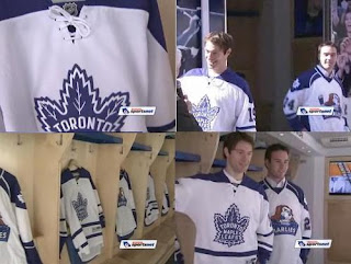
Maple Leafs Unveil Third Jersey!

The Toronto Maple Leafs unveiled their new third jersey today for the 2008-09 season at the launch of the Leafs Nation Mobile Fan Zone to kick off Blue & White Week.

The Leafs showcased the new duds without as much fanfare as some of the other teams have done this summer. Images grabbed from a video posted on the team's web site offer a first look at the sweaters.

It's exactly what we expected. No surprises. The same as what they wore prior to the Rbk EDGE era. The team made no indications of when the jersey will first hit the ice.

If you'd like to see the video in full, it's right here.

I'm really liking the way teams are offering embed links for their web videos. Makes it easier for me to show them to you.

So there it is!

No News Yet From Leafs

It's almost 6 PM in the east and we have yet to hear anything from the Toronto Maple Leafs regarding a third jersey announcement. I'm as confused as anybody since a lot of different things seemed to indicate today being the day — not the least of which being a schedule from Reebok.

I'll keep an eye out for the rest of the night and I expect emails from you guys should you hear anything first. But it's not looking good. There isn't even a mention of a third jersey on the Leafs' web site.

However, tomorrow is the unveiling date for the Edmonton Oilers' third jersey and they do have a graphic on their web site promoting the event.

That just leaves the Atlanta Thrashers on Wednesday and there still isn't anything official coming from them. Hmmm...

Maybe Reebok's having a little fun with us. Reebok, you kidders, you.

What Makes A Good Logo?

I was perusing some old issues of The Hockey News this morning. They're from almost a decade ago when I used to have a subscription. I was looking at the logo rankings for 1999 but something stuck out. I came across an article that has just as much relevance here at Icethetics today as it did then.

Todd McFarlane, creator of Spawn, is a great artist and a huge hockey fan — the essence of Icethetics. For those who don't know, he designed the Edmonton Oilers' third jersey logo you see on the left.

McFarlane was interviewed for this piece I was reading and was asked what he thought would make a good logo. So he came up with five guidelines. You can read the article below.

There's something about the Huntington Blizzard's logo that gives Todd McFarlane a chill.

Turnabout is fair play because McFarlane has been giving readers of Spawn comic chills for years. The Calgary-born artist has created a multi-million dollar entertainment and production industry sparked by his skill at drawing riveting images.

So, who better to evaluate logos than McFarlane? A self-professed hockey fanatic, he jumped at the chance to offer his two cents in THN's seventh annual minor pro hockey logo ranking.

In discussing the logos, McFarlane spawned five guidelines:

  • Cartoony characters with hockey paraphernalia are silly. "A Solar Bear with RayBans? A Stingray with a stick? Why not have a Pirate with a knife instead of a stick in his mouth? So many of these logos would've been better if you get rid of the stick."

  • The primary logo should be clean and uncluttered with words. "I'm pro image. Keep the city and nickname in the secondary logo or on a shoulder patch. The words are bigger than the icon in a lot of cases."

  • Ditch the cartoon characters. Consider the audience. "Two groups of fans attend games: children and adults. Kids are outnumbered five to one and it's the adults who buy the merchandise. They're more likely to buy if it's a cool logo. Plus, it's hard to determine what's cool for kids. What's cool for a seven-year-old is definitely not cool for a 12-year-old."

  • If you have to sell out and go with an animal caricature, "pick something menacing. Not a fish or a bird or a puppy. Be intimidating. Or at least be regal rather than dumpy."

  • The logo should be big and bold. "You should be able to distinguish it even from the nosebleeds or on TV from your couch. Too much detail just adds to the clutter."

—Brian Costello

By the way, I'd link to this article if I knew it existed somewhere else in cyberspace. I literally retyped it from the old worn newsprint where I read it.

So, all you graphic artists out there, keep these tips in mind, not only when designing logos for the IceHL, but in all your future designing ventures.

Now, I'm not done with McFarlane yet. THN got him to make a best/worst list of minor pro logos for the 1999-2000 season. That would include the AHL, IHL and ECHL. I've built graphics so you can see the logos and make your own judgments.

McFARLANE'S BEST: Huntington Blizzard (ECHL), Hamilton Bulldogs (AHL), Houston Aeros (IHL), Johnstown Chiefs (ECHL), Hartford Wolf Pack (AHL), Chicago Wolves (IHL), Louisville Panthers (AHL), Florida Everblades (ECHL), Pee Dee Pride (ECHL) and Michigan K-Wings (IHL).


McFARLANE'S WORST: Greenville Grrrowl (ECHL), Toledo Storm (ECHL), Dayton Bombers (ECHL), South Carolina Stingrays (ECHL), Saint John Flames (AHL), Hershey Bears (AHL), Mississippi Sea Wolves (ECHL), Trenton Titans (ECHL), Jackson Bandits (ECHL) and Mobile Mysticks (ECHL).


I wonder what he'd say about the Stingrays today and how his best/worst lists may have changed in the last 10 years.

IceHL North: Final Names

The final names for the IceHL's North Division are in! Hundreds of you made your voice heard by rating the finalists for each franchise. So here are the winners.


  • Calgary CAVALRY
    average rating 3.36/5 by 303 people

  • Edmonton KODIAKS
    average rating 3.74/5 by 312 people

  • Regina RENEGADES
    average rating 3.6/5 by 286 people

  • Saskatoon SHARPSHOOTERS
    average rating 3.24/5 by 258 people

  • Winnipeg WINTERHAWKS
    average rating 3.81/5 by 298 people

Based on these names, your task — should you choose to accept it — is to brand the franchise. You choose the color scheme and design primary, secondary and script logos around that. Additional logos may or may not be included in the voting process.

Submit your logo art by email to me at icethetics@gmail.com. Do not post links to artwork in the comments. They will be deleted and not considered for use in this project. I'm also outlining guidelines for submissions below. I'm taking them a little more seriously than I did for the IHA. If you don't follow them, your work will probably not be included.

North logo submission deadline: October 25

If you want your submission included, follow these instructions:

  • DO NOT STEAL ARTWORK. Logos copied or adapted from professional trademarked logos will not be permitted.

  • Submit three (3) logos: primary, secondary and script. Use a white background. If your logo requires a white outline (think Lightning or Capitals), then use a gray background with the white outline included. ALL 3 LOGOS will be used in the voting process. If you leave out one, your work may be disqualified.

  • Submit vector art if possible. I will accept .ai, .psd and .pdf files. If you cannot submit vector art, you must be able to provide high quality images in .jpg or .png files ONLY. All other file types may be disqualified.

  • You must include your credit within the graphic itself as well as the email. This can be your real name or a pseudonym. I need them in both places so I can easily search my email to find your artwork and email address. Failure to do so may result in disqualification.

  • By submitting your own original artwork to any Icethetics email address, you agree to grant permission of its use for online or print publication by Icethetics. Do not watermark your logos or they will be disqualified.

  • No jersey concepts, please. That will be a later step in this process.

I tried to be specific here but I'm happy to answer any additional questions you may have via email. I was very clear about this but keep in mind that if you do not properly follow the instructions above, your work will likely be disqualified. So read them carefully.

Just so everyone is aware, when it comes time to choose a logo for each team, the process will work basically the same as the name ratings. Logo rating pages will be posted for each team and up to 20 logo submissions will be available to rate. I'm sorry I can't include more but this assures that all worthy submissions will get a fair shake.

The difference here is that once the rating period has ended, there will be a vote on Icethetics of the top 3 rated logos for each team. This assures that we choose the logo everyone wants.

Start submitting your logos!

Back From Vacation

It occurs to me I never actually mentioned on the blog that I was going away for the weekend. Oops. Anyway, I took a long weekend — got that Oilers post up while I was sitting in a hotel on Friday — and now I'm back. And yes, I enjoyed it very much. Had a fantastic time.

I mention this only to let you know I have a lot of work to do today but I will try to get caught up on any news I may have missed. The IceHL stuff also needs to be switched over for this week. So today I'll be finalizing names for the North Division, posting ratings pages for the Northeast, and getting ready for the IHA logo tournament — which is starting very soon.

If you have questions, you know how to reach me.