Icethetics Season Preview 2011, Part 1

Before we look ahead to the new season, it's worth taking a brief look back. Over the past several months, Icethetics has been conducting a series of polls asking readers to rate all of the 90 uniforms worn in the NHL during the 2010-11 season. Now here they are, in the order you chose, from best to worst:

NHL Uniform Ranking 2010-11

AHL: New Thirds for Bears, Stars

While I was away on vacation last week a couple of AHL teams unveiled new third jerseys.

The Hershey Bears announced they are bringing back another retro look as their new alternate sweater for the 2011-12 season. It will make its game debut on Saturday, Oct. 15 for the club's home opener as they host the Norfolk Admirals.

On Wednesday, the Bears tweeted a graphic that showed the design, though an actual photo of the jersey itself has yet to surface. It features the "skating bear" logo that's been seen on a number of sweaters throughout the club's long history.

The Bears previously wore a maroon version of this jersey as their alternate. Presumably they're switching to white to make it easier to wear at home. In the AHL, teams wear dark uniforms on the road, so if a club wants to don a dark alternate on their home ice, they need to work out logistics with the visitor in advance.

Lately, it seems whenever a new Reebok Edge jersey is introduced, the game we play is which NHL team's template is it based on? I'll give you a minute. If you came up with the Buffalo Sabres home/road jerseys, you got it. The colors may be different, but the design is the same.

AHL Stars' new jersey and logoThe Texas Stars are also introducing a new white third jersey this season. 

Like the Bears, the Stars unveiled their new sweater online on Wednesday. But just over a week earlier, they first showed the new alternate logo seen on the shoulder. It's a wordmark that reads TEXAS with a star replacing the X.

Though this week's press release doesn't mention a specific date for the new sweater's debut, it does reference tonight's home opener a number of times. I'll keep an eye out for game photos.

Now a couple of pull quotes. Here's what the team says about the new secondary logo:

The new design was developed in coordination with the Texas Stars marketing department and the official jersey provider, Reebok. The new design will feature a centered two-tone gold star as the ‘X’ in Texas and will be comprised of the team’s existing colors with the addition of a new dark gold. 

“We are excited to unveil the new secondary logo for the Texas Stars,” said Texas Stars President Rick McLaughlin. “The new design is important to our team’s branding and establishing a new way to identify us. The new design looks great and will help us stand out in the league.”

And the new jersey:

The alternate jerseys are primarily white and dark green, with gold accents. The Texas Stars primary logo serves as the jersey crest, while the Stars new alternate logo (unveiled earlier in the off-season) serves as the shoulder patch on the new jerseys. The nameplates will consist of dark green lettering on the backs of the jersey.

The numbers on the sleeves and the backs of the sweater will be dark green with gold trim. The Stars will wear black pants, black gloves and white helmets with their new alternate jerseys.

“We are excited to unveil the new alternate jersey for the Texas Stars,” said Texas Stars President Rick McLaughlin. “The new jersey is an important extension of our brand in central Texas, using a combination of our original logo and our new secondary logo. Fans will be able to identify us in a whole new way.”

This one uses the template of the Phoenix Coyotes' third jersey. It's not a bad look and I like that they're using their actual logo on the front of this one rather than the text they use on their home and road sweaters much like the Dallas Stars.

UPDATE (9:05 PM): The Stars did not debut their third jersey during tonight's 7-0 blowout of the Oklahoma City Barons. Guess we'll have to keep an eye on them over the coming weeks to get a glimpse of it in action. Their next home game is Friday, Oct. 14.

Any AHL fans reading? What do you think of these new thirds? 

Senators Unveil Heritage Third Jersey

Senators unveil Heritage third jersey / Senators

Today, the Ottawa Senators officially unveiled their new Heritage Jersey, their alternate sweater from here forward. The new look syncs up with the leaks that have trickled out this summer, as the team previously confirmed.

The uniform design is a clever mix between modern aesthetics and the classic sweaters worn by the original Ottawa Senators club a century ago. While those early uniforms had stripes from top to bottom, nowadays, we see that as a rather garish look. So it's been simplified to a black jersey with wide stripes of red and "vintage white" around the chest, sleeves, waist and socks.

Jacob Barrette, the fan who helped develop the jerseyIn the past, I've maligned the overuse of this "retro" shade of white — meant to evoke aging fabric — but in this instance, it works very well. And regarding the question of whether it actually is off white, let me quote the team: "The uniform features the club’s official colours of black red and white, with the heritage jersey using an antique white that reflects uniforms of the past."

Senators Heritage Jersey photo gallery

Possibly the best part about this whole uniform is that it was a fan's concept that got the ball rolling on it.

The Senators not only credit graphic designer Jacob Barrette with helping to develop the uniform, but even included him in their press releases. In paying attention to their fans this way, I think the franchise just made a bunch of new fans here among Icethetics readers.

And I'm one of them. Bravo!

Unlike Barrette's concept, which featured the 2D version of the Senators logo introduced in 2007, the shoulder patches of this jersey are modeled after the "World's Champions" patches that the old Sens would sport after winning one of their many Stanley Cups.

Each patch reads "Ottawa Senators," but while the one on the right shoulder is in English, the one on the left is in French. Would that make this the NHL's first bilingual uniform?

If you haven't seen it yet, I recommend watching the video the Sens produced. It goes into detail about the history of the original uniform and how this one was developed. There's even a shot of Icethetics in it!

They show the third jersey poll we held a couple years ago. (It pops up at the 1:35 mark if you're looking for it.) Unfortunately they've framed out the name of the site. Still, Icethetics gets its first reference on an NHL team's official website, so I'll take it.

Daniel AlfredssonOne last thing. The Sens also released a 13-game schedule for the Heritage Jersey. Several of the dates are quite different from the partial schedule I posted back in August.

  • Thurs., Oct. 13 – vs. Colorado Avalanche
  • Sun., Oct. 30 – vs. Toronto Maple Leafs
  • Fri., Nov. 4 – vs. Montreal Canadiens
  • Wed., Dec. 14 – vs. Boston Bruins
  • Fri., Dec. 16 – vs. Pittsburgh Penguins
  • Tues., Dec. 27 – vs. Montreal Canadiens
  • Tues., Feb. 7 – vs. St. Louis Blues
  • Sat., Feb. 11 – vs. Edmonton Oilers
  • Fri., Mar. 2 – vs. Chicago Blackhawks
  • Wed., Mar. 14 – at Montreal Canadiens
  • Fri., Mar. 16 – vs. Montreal Canadiens
  • Sat., Mar. 17 – vs. Toronto Maple Leafs

With four games on the schedule, it's the Habs who will face this jersey most often. They won't get to see the Sens' standard red at all, in fact. And the only time Ottawa will sport the Heritage look on the road will be in Montreal. So how about that.

Now that you've seen the new alternate uniform in full, has your opinion changed from the first leak of the design? I'm of the opinion this is the best sweater the Sens have ever worn. Am I on my own there?

Sens Share Another Heritage Teaser

Just a little something to warm you up for the official unveiling tomorrow. The Ottawa Senators posted this picture on their website's splash page yesterday. They're really showing all their cards, aren't they? Though they did already confirm what's been previously posted on this blog.

Senators Heritage Jersey teaser video

Anyway, they're going to look really good in these Heritage Jerseys this year. Anyone going to Puck Drop tomorrow? Feel free to share some photos.

NHL Requires More Helmet Digits

Helmet numbers add to front / Tony Da CostaThis is one of those things that's going to annoy the crap out of everyone until we all eventually get used to it.

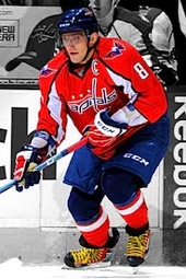
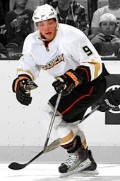
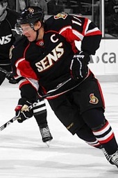
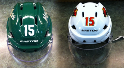
Yes, you're looking at the front of those Dany Heatley helmets. And yes, they have new number decals on them. Oh boy.

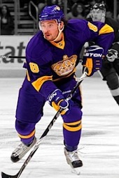
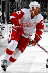
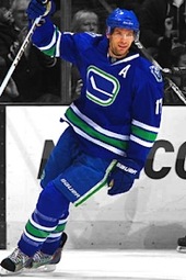
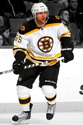
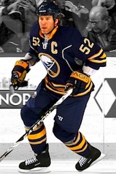
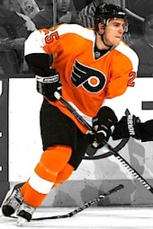
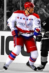
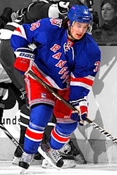
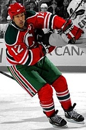
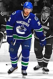
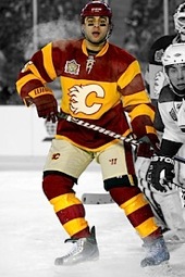
For most of the 1950s, the only way to identify an NHL player — apart from looking at his, you know, face — was the giant number sewn to the back of his sweater. It was during that decade that teams also started adding what we now know as TV numbers to their sleeves. I'm not sure when exactly it became a league mandate.

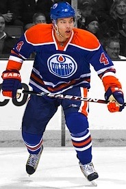
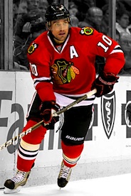
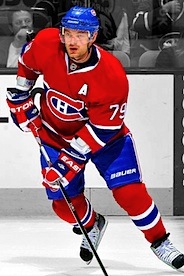
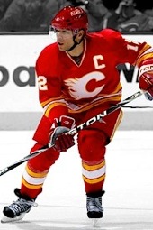
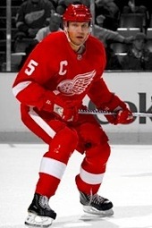
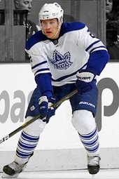
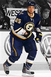
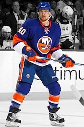
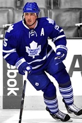
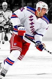
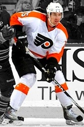
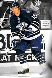
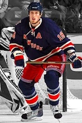
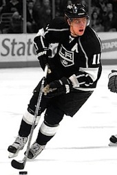
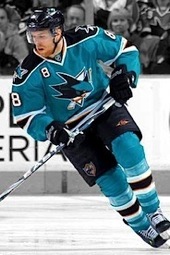
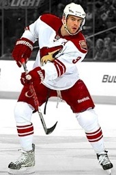
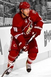
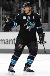
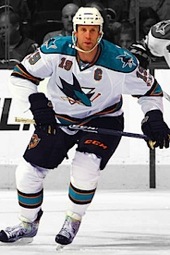
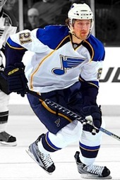
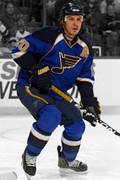
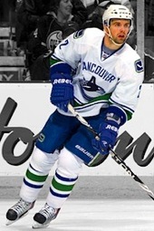
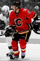
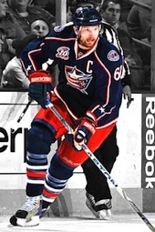
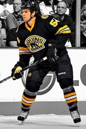
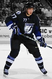
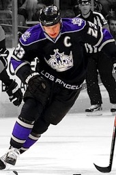
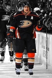
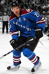
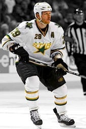
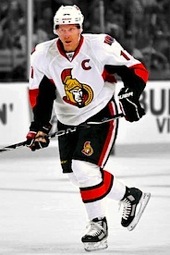
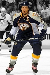
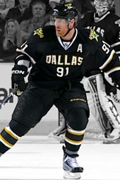
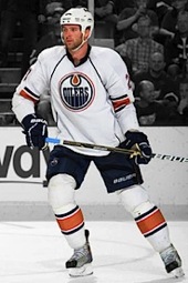
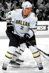
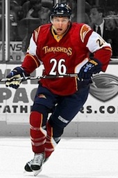
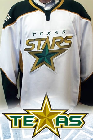
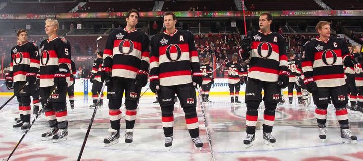
Over the years since then, surnames were added to the back above the number, and as helmets became a requirement, numbers were added there too. More recently, some teams have even started adding them to the front of their jerseys, some subtly (like San Jose) and others not-so-subtly (like Dallas).

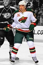
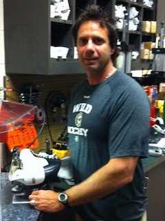
Tony Da Costa, Wild equipment managerThrough a series of tweets on Wednesday, we learned from the Minnesota Wild's head equipment manager Tony Da Costa that number decals are being added to the front of every NHL skater's helmet. And because of how the helmets are designed, they're really going on the top.

The reason we haven't seen these new head digits yet during the preseason is that the league isn't requiring the change until the start of the regular season. But obviously Da Costa and other equipment managers around the league are already preparing gear for opening night — which is now just a week away.

By the way, if you're a Wild fan, an Icethetics reader and on Twitter, you really should be following Da Costa (@Styleswild) just for his behind-the-scenes photos alone.

The NHL's senior manager of communications, Schuyler Baehman, went into a little more detail Wednesday with some tweets of his own. First, he confirmed that player numbers will be added to players' foreheads. Great. Then Baehman explained that they won't be required for goalie masks. Good because I'm pretty sure those are the most recognizable guys on the ice at any given time.

Next, the real nerdy stuff. He told us the numbers must measure between 1.25 and 2 inches in height. And finally, he answered the big question: Why? For that, I'll toss to a blockquote.

The new number placement is designed to aid on-ice officials, broadcasters, et al. by providing an additional point of player identification.

A few Twitter-enabled radio and TV play-by-play guys chimed in with their support for this change. Not sure how they're seeing those numbers that far away. But without my glasses I can't see what's right in front of me, so what do I know?

Right, so I understand the reason for adding the numbers. If it'll help with player IDs, then that's great. But I have to say, from a strictly aesthetic perspective, I'm concerned. Granted, I haven't seen how it will look on the ice, but I'm not sure how it can look good. Maybe I'll change my tune next week, but for now... yikes.

I think I already know the answer, but what do you guys think of this uniform change? Do the practical benefits outweigh the visual drawbacks? Or will it even look that bad at all?