The Icethetics Season Preview will continue, but news has been taking precendence for the last couple days. Today, we have a handful of official third jersey schedules that a few teams have released for the 2011-12 season (in order of their jersey ranking).
 The Minnesota Wild are set to bring back the NHL's only green sweater for its third season. The club recently released the third jersey schedule for the 2011-12 season and it's the first of five I have to share with you today.
The Wild's alternate uniform, unveiled in 2009, came in at 30th overall in the Icethetics NHL Uniform Ranking for 2010-11, which came out on Monday. The team will use it 15 times this season, the league maximum for third jerseys.
 John MaddenHere's a look at all the dates you can expect to see them:
- Sat., Oct. 8 – vs. Columbus Blue Jackets
- Tues., Oct. 18 – vs. Pittsburgh Penguins
- Sat., Oct. 29 – vs. Detroit Red Wings
- Fri., Nov. 25 – vs. Edmonton Oilers
- Mon., Nov. 28 – vs. Tampa Bay Lightning
- Wed., Dec. 14 – vs. Chicago Blackhawks
- Sat., Dec. 17 – vs. New York Islanders
- Sat., Dec. 31 – vs. Phoenix Coyotes
- Sat., Jan. 21 – vs. Dallas Stars
- Thurs., Feb. 16 – vs. Winnipeg Jets
- Sun., Feb. 19 – vs. Boston Bruins
- Sun., Mar. 4 – vs. Colorado Avalanche
- Sat., Mar. 17 – vs. Carolina Hurricanes
- Tues., Mar. 27 – vs. New York Rangers
- Sat., Apr. 7 – vs. Phoenix Coyotes
All of these dates are home games.
And you'll notice the schedule includes St. Patrick's Day (March 17). As I mentioned, the Wild are currently the only NHL club with a green sweater in their arsenal.
 The Buffalo Sabres are keeping their new third jersey around a little longer. In our NHL Uniform Ranking, the sweater finished 34th out of 90. Not bad but not great either.
On Wednesday, the Sabres confirmed that the sweater will be back for at least another season as they released a schedule of when it's to be worn during the 2011-12 season. It was launched last year as part of the club's 40th anniversary celebrations.
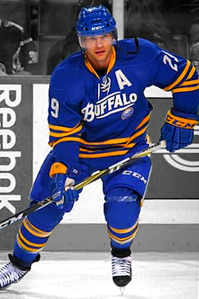 Jason PominvilleAccording to the team, the royal blue uniform will be seen in eight games this season, six at home and two on the road.
- Thurs., Oct. 27 – vs. Columbus Blue Jackets
- Sat., Nov. 5 – at Ottawa Senators
- Wed., Nov. 16 – vs. New Jersey Devils
- Sat., Dec. 3 – at Nashville Predators
- Fri., Dec. 9 – vs. Florida Panthers
- Tues., Jan. 3 – vs. Edmonton Oilers
- Fri., Feb. 10 – vs. Dallas Stars
- Wed., Mar. 14 – vs. Colorado Avalanche
It's surprisingly limited use for a third jersey. The NHL limit is about 15 games a season and most teams stick pretty close to that. Plus it was a pretty popular jersey last year.
In addition to these dates, the Sabres also said they'll wear their white road jerseys at home on Fri., Jan. 13 to accommodate the Maple Leafs sporting their new alternates that night.
By the way, one of the features of this jersey last year was the logo that was used as the club's anniversary mark — the classic Sabres logo with 1970 between the crossed swords. I assume that's staying as it's generic enough to not necessarily refer to the 40th anniversary. But I'll keep an eye on it anyway.
 In 45th place in the Ranking — dead center — was the black Carolina Hurricanes third jersey, which is entering its fourth season in use.
The Canes recently released their third jersey schedule for the 2011-12 season. It includes 14 dates — all at home — one of which was just this week.
 Jiri TlustyHere's when you can expect to see the black sweaters thoughout the new season:
- Wed., Oct. 12 – vs. Boston Bruins
- Tues., Oct. 25 – vs. Ottawa Senators
- Fri., Nov. 4 – vs. Washington Capitals
- Fri., Nov. 18 – vs. Buffalo Sabres
- Wed., Nov. 23 – vs. Montreal Canadiens
- Tues., Nov. 29 – vs. Florida Panthers
- Thurs., Dec. 1 – vs. New York Rangers
- Thurs., Dec. 15 – vs. Vancouver Canucks
- Wed., Dec. 21 – vs. Phoenix Coyotes
- Thurs., Dec. 29 – vs. Toronto Maple Leafs
- Fri., Jan. 6 – vs. Buffalo Sabres
- Fri., Jan. 20 – vs. Washington Capitals
- Mon., Feb. 20 – vs. Washington Capitals
- Sat., Feb. 25 – vs. Florida Panthers
Again with the Sabres on everyone's third jersey schedule. And it looks like the Capitals won't be seeing the Hurricanes' red jersey at all this season.
If I'm being cynical, I'd say this schedule may have something to do with selling jerseys for the holidays. Rather than being evenly spread out over the season, 10 of the 14 occasions are bunched up before or near Christmas. Just saying.
 Coming in at 60th in our Ranking was the new third jersey launched by the Columbus Blue Jackets last year around Thanksgiving. This will be its second season in use.
On Wednesday, the team released its schedule for the special uniform during the 2011-12 season. It will see action in 12 games this year — 10 at home and two on the road. The first time will be against the Ducks on Halloween weekend.
 R.J. UmbergerHere's how all of the Jackets' third jersey nights shake out:
- Sun., Oct. 30 – vs. Anaheim Ducks
- Sat., Nov. 5 – at Philadelphia Flyers
- Sat., Nov. 12 – vs. Winnipeg Jets
- Fri., Nov. 25 – vs. Buffalo Sabres
- Sat., Dec. 10 – vs. Boston Bruins
- Sat., Dec. 17 – vs. Tampa Bay Lightning
- Sat., Jan. 14 – vs. San Jose Sharks
- Sun., Feb. 12 – vs. Anaheim Ducks
- Sat., Feb. 18 – vs. Chicago Blackhawks
- Sun., Feb. 26 – at Pittsburgh Penguins
- Sun., Mar. 11 – vs. St. Louis Blues
- Wed., Mar. 28 – vs. Detroit Red Wings
Both times the Blue Jackets will sport their thirds on the road will be in neighboring state Pennsylvania. Interesting. Anyone want to talk about realignment? (Kidding!)
For the record, the Jackets still have their original third jersey launch page up on their website if you want more details about its design and such.
 We finish with one of the lowest-rated jerseys in our 2010-11 Ranking. The Phoenix Coyotes alternate is 79th of 90. Ouch.
On Friday, in the Desert Dog Blog on the Coyotes' official website, it was announced that the team will wear the third jersey for every Thursday home game as well as the Friday after Thanksgiving. This will be be its fourth season in use.
 Derek MorrisThey don't actually list the dates on their website, but based on the days they mention, here's how it all works out:
- Thurs., Oct. 20 – vs. Los Angeles Kings
- Thurs., Oct. 27 – vs. New Jersey Devils
- Thurs., Nov. 3 – vs. Nashville Predators
- Thurs., Nov. 10 – vs. Montreal Canadiens
- Fri., Nov. 25 – vs. Vancouver Canucks
- Thurs., Dec. 15 – vs. Edmonton Oilers
- Thurs., Jan. 19 – vs. Detroit Red Wings
- Thurs., Feb. 9 – vs. Calgary Flames
- Thurs., Mar. 1 – vs. Calgary Flames
- Thurs., Mar. 8 – vs. Minnesota Wild
- Thurs., Mar. 22 – vs. Colorado Avalanche
- Thurs., Mar. 29 – vs. San Jose Sharks
The Devils and Canadiens are the only Eastern Conference teams set to see the black thirds in action. The Flames will be the only team to see it twice.
The leaping coyote sweater is entering its fourth season in use by Phoenix, despite its unpopularity with Icethetics readers.
That's all I have for today. This post was supposed to go up on Thursday, but I just haven't had time to get it all assembled. I've also been aiming to wrap up the Icethetics Season Preview which has been a pretty spectacular cluster this year. I'll get there but...
All of that is taking a backseat next week to the launch of the IceHL Jersey Design Contest. We need to get that off the ground sooner rather than later. So I'll probably spend the rest of the weekend getting that ready to open up early in the week.
Update on 2011-10-17 01:04 by Chris
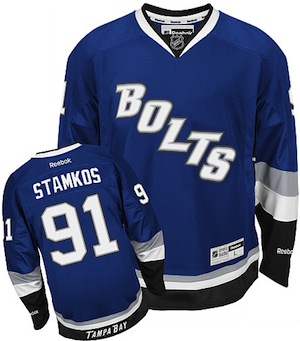
 I initially left the Tampa Bay Lightning out of this post because they haven't officially released a third jersey schedule that I know of. That said, over the last few years, they've typically used the blue BOLTS jersey exclusively for weekend home games.
The team has said the jersey will carry over following the recent rebranding, but obviously the shoulder patches — which featured the old primary logo — are going away. I'm not sure if they'll be replaced with the new logo or if they'll just be removed completely. The third jerseys now for sale online have no shoulder patches at all. But we'll have to wait for a game to know for sure.
 Again, this 13-game schedule is only theoretical. It's based on what the Lightning have done in the past, so I can't guarantee accuracy.
- Sat., Oct. 22 – vs. Buffalo Sabres
- Sat., Oct. 29 – vs. Winnipeg Jets
- Sat., Nov. 19 – vs. New Jersey Devils
- Sat., Nov. 26 – vs. Florida Panthers
- Sat., Dec. 3 – vs. New York Rangers
- Sat., Dec. 31 – vs. Carolina Hurricanes
- Sun., Jan. 15 – vs. Pittsburgh Penguins
- Sat., Feb. 4 – vs. Florida Panthers
- Sat., Feb. 18 – vs. Washington Capitals
- Sat., Mar. 10 – vs. Carolina Hurricanes
- Sat., Mar. 17 – vs. St. Louis Blues
- Sat., Mar. 24 – vs. New York Islanders
- Sat., Mar. 31 – vs. Winnipeg Jets
Like I said, this isn't official, but obviously I'll be keeping an eye on it as the season progresses. I'm especially curious to see what changes they make to make it part of the new look (current blue pants or black shells, for instance).
By the way, it'll be another couple of weeks before there are enough photos out there for me to update the Jersey Galleries, but it will happen. That's easily my favorite section of Icethetics.