PEI Rocket Becoming Islanders in 2013

The QMJHL's P.E.I. Rocket will play its final season in 2012-13. But not to worry Rocket fans, your team isn't going anywhere. It's just getting a new name beginning in the 2013-14 season. And because I waited so long to report this, I can now tell you what that name will be.

A year from now, the 13-year-old club will become the P.E.I. Islanders. And if that seems like it would be awkward to say out loud, you're absolutely right. But that's the way it is.

On August 22, the team announced it would be rebranded in 2013 and that the new name would come from the fans. For two weeks, the team accepted submissions. The top three entries were put up to an online vote from Sept. 6–19. They were P.E.I. Confederation, Islanders and Riptide.

At their home opener last Friday, the team announced that the new name will be Islanders. Apparently, Reebok will be developing the new look — colors, logos, uniforms and so on.

The franchise has undergone some front office changes recently and weren't satisfied that the name was connecting with fans. The team was founded in 1999 as the Montreal Rocket — named after the legendary Maurice "Rocket" Richard and their logo was even shaped like the No. 9 on his sweater. And in 2003, when the club packed up and moved to Prince Edward Island, they took the name with them. Guess 10 years was enough.

The Guardian recently ran polls regarding the new name. And the results were unusual. First of all, when asked to choose between the three finalists (Confederation, Islanders and Riptide), 59% of voters chose Riptide. However, in a later poll, only 54% give the new name a thumbs up.

What do you guys think of the new name? And what do you think Reebok will/should come up with in terms of a new logo?

Rivermen to Sport Fan-Made 3rd Jersey

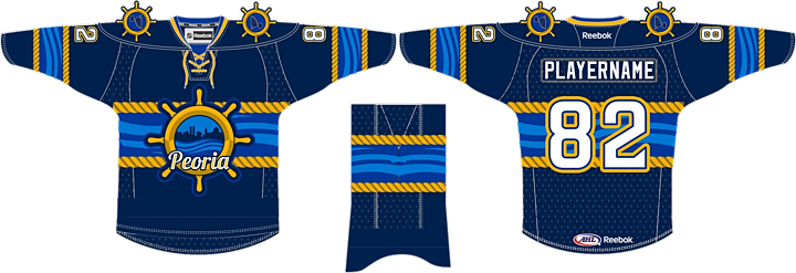
The AHL will very likely benefit from an influx of temporary new fans this season if this NHL lockout business keeps up. But the Peoria Rivermen are already benefitting from their existing fans in the form of a newly designed third jersey.

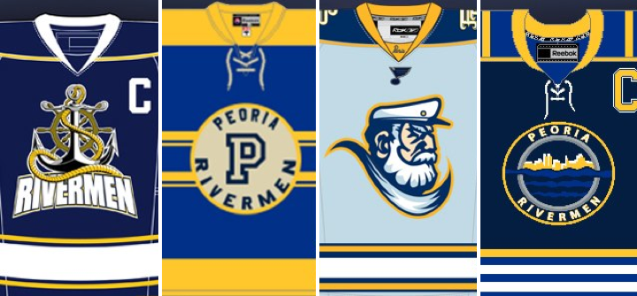
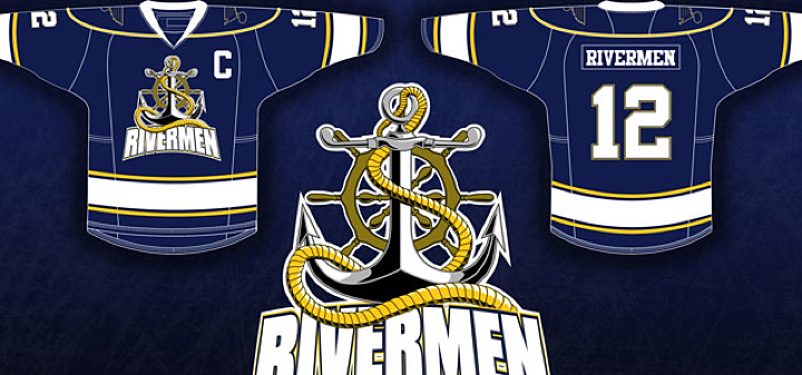
On August 27, the team unveiled this creation — the winner of a jersey design contest held over the summer. It beat out three other submissions with about 40% of some 1,400 votes cast over a three-week span.

The jerseys will be worn by the Rivermen in their game on Dec. 15 at Carver Arena against the Milwaukee Admirals. The jerseys will be auctioned off to the public following the game.

“I would like to say thank you to the Peoria Rivermen staff for creating such a unique opportunity,” said [winning designer Ryan] Malaschak. “Being a graphic artist and a passionate hockey fan my entire life, it has been a dream of mine to create a game-worn jersey at a professional level.”

The contest was opened on July 1 and these four finalists were revealed a month later.

It seems to me they were all great options. But I was partial to this one by Erik Kuhre.

Think you can do better? Submit your concept to icethetics@gmail.com and it may just show up on Concepts page someday soon.

The Sens' Unused 20th Anniversary Logo

Last season, the Ottawa Senators celebrated 20 years in the NHL. But they also used the occasion to look back on the history of pro hockey their city. They did so by recognizing a team from the early 20th century that shared their name with a special heritage uniform — designed by fan Jacob Barrette.

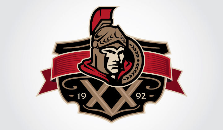
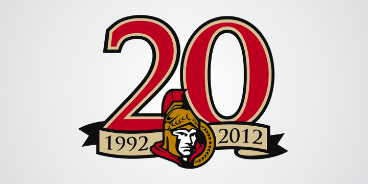
Now Jacob is back with some more insights into his involvement with the Sens last year. He tells me that the club commissioned him to design a 20th anniversary logo — one they unfortunately didn't use in the end. Take a look.

It's very unfortunate this logo got left in the dust. It's absolutely perfect. Here's what Jacob tells me about the design:

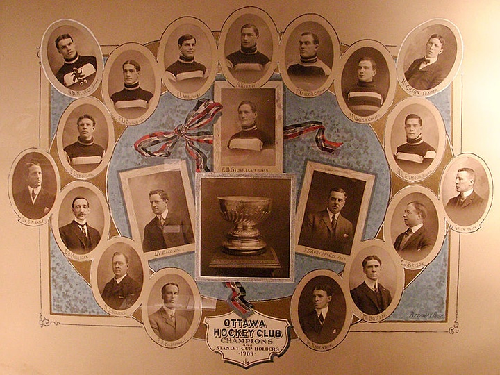
Because they were celebrating their 20th but also celebrating their whole history last season, I was asked to incorporate modern and vintage elements, with the Senators current logo as the main one (i.e. not the =O=). So the background of the logo is from this 1909 Stanley Cup holders poster.

That may be the coolest part. Take a look at the poster from which he took his inspiration.

Why, Ottawa? Why?

To jog your memory, here's what they actually used last year.

Just doesn't have that vintage feel, does it?

Imagine the Oilers in Seattle

Sorry, I just can't. It's ridiculous and we all know it.

In the midst of a lockout and negotiations to have a new arena built in downtown Edmonton, the bigwigs from the Edmonton Oilers paid a visit to Seattle today — just to poke around and such.

Monday, Seattle's City Council officially approved a plan to move forward with the much-discussed new arena project. That's great but the entire thing still hinges on securing an NBA or NHL franchise. And all the cities that already have them really like them and don't want us to take them. So that's the trouble.

To help alleviate that trouble, apparently, the Oilers brass was in town for "meetings" and a stop at KeyArena — down the street from me. (Oh, and to watch the Seahawks beat the Packers unconvincingly, as well.) Oilers fans hate it.

This is a stone that kills two birds. On one hand, it's the Oilers saying, hey Edmonton, you don't want to buy us a new arena, we'll find a new city that will. (Even though they really won't.) And on the other, it's Seattle trying to convince itself that there are potential teams out there to snatch up. (Even though there really aren't.)

Trying to follow it all is a nightmare. So I count on Chris Daniels. As a Seattleite, I just want to wake up one morning and find out we have a hockey team and an arena. And that I have season tickets.

But then I'd just have to wake up again.

Gladiators Mark 10 Years in Georgia

Before we dive in, two things: 1) I'm back. The The IceHL 2012 Yearbook — a labor of love and some intense work over the last few months — is finished! And 2) that means I'm getting back to the blog. And even though it's been a quiet year, I'm determined to find ways of keeping Icethetics interesting. Even if I have to make up news.

For today, however, I don't have to make anything up.

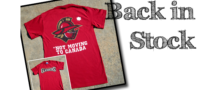
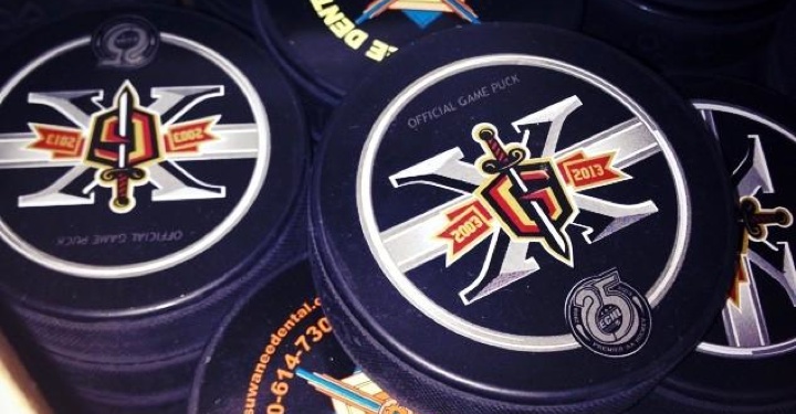
The ECHL's Gwinnett Gladiators unveiled their 10th anniversary logos last Thursday. During the 2012-13 season, they'll be celebrating "A Decade of Excellence and Achievement," as they put it. Of course that's ignoring the eight previous years the club spent in Alabama as the Mobile Mysticks.

The Gladiators primary 10th Anniversary Season Logo is a stylized number ten with the distinctive Gladiators head profile logo incorporated into the zero. It also features roman numerals along the side denoting the years of operation, 2003 to 2013. The Gladiators will also utilize a secondary logo that features a roman numeral "X" incorporating the classic "G" shield/sword logo version and stylized banner indicating the team’s tenure.

The Gladiators are affiliated with the Phoenix Coyotes. And most of the people at their games used to be Thrashers fans, right? There's gotta be a joke in there somewhere about fans getting shafted. I'm just not clever enough to find it.

Guys, the IceHL Yearbook was a huge weight off my shoulders and I'm tired of seeing this page so static. There's been a lot of news I haven't covered over the last month or so and it's my goal to put it here with new posts every day or at least every other day for the next several weeks.

After that? I don't know. Maybe we get some Top 10 lists going. We all like lists, right?

And let there be NHL hockey before 2013... please!