 Later this week, the NHL lockout will become real. Tangible. Those season tickets sitting on your kitchen counter. They'll be worthless. You can take them to the rink. But they won't get you in. And even if they did, there'd be nothing to see.
I may live three hours away from the nearest NHL arena and thousands of miles away from my team, but it'll become real for me just the same when I endure the futility of trying to tune in on opening night. So in an effort to satisfy my hockey craving before any of that ugliness happens, I bought tickets to see some unadulterated WHL action.
Wow.
It was quite a night. What follows is a photoblog about my experience at Saturday's game at ShoWare Center in Kent, Washington as the Seattle Thunderbirds hosted the Everett Silvertips.
My last (and first) WHL game — a year ago to the day, as a matter of fact — was in Victoria between the newly-minted Royals and the Medicine Hat Tigers. Let's just say it didn't leave a lot of lasting memories.
Not only couldn't I tell you the score without looking it up, but I don't even remember who won or much of anything about that game. (The Royals lost 4-2.) So I must admit I wasn't exactly holding my breath for this one. As sad as that sounds.
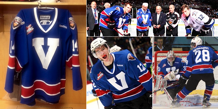
Then the teams skated out. And I got a shock. Neither was wearing the jersey I expected. And as a guy who runs a website dedicated to the subject, the surprise was strange. Actually, it felt good. I didn't think I could be surprised by these things anymore. But it also hammered home the point that I don't cover the major juniors very well. (I'm working to fix that.)
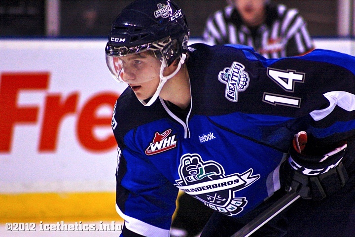
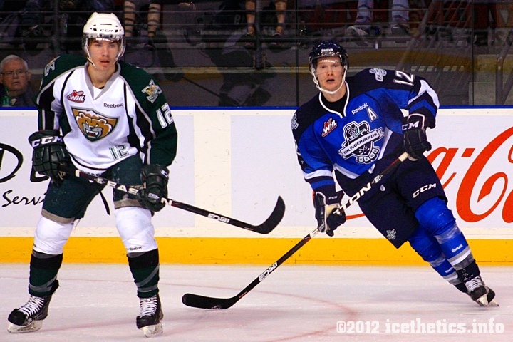
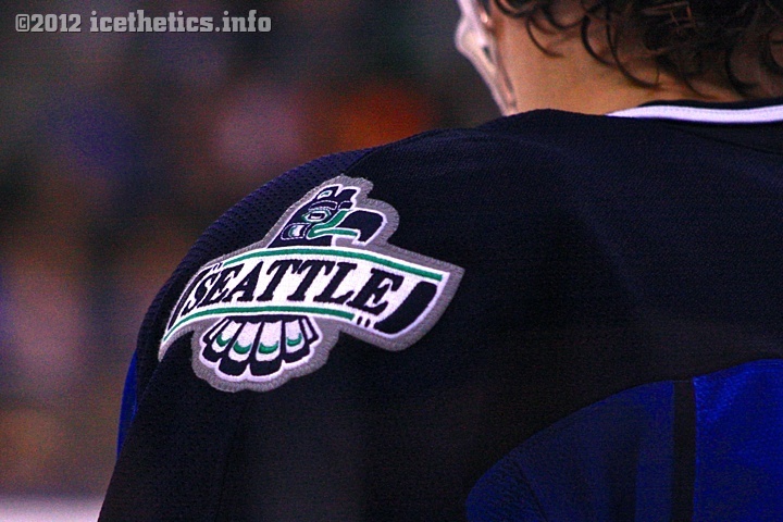
Connor Honey and the T-Birds were sporting their two-tone blue alternate jersey, which is actually entering its second season. It debuted last fall — a fact I might've known had I bothered to go to any Seattle games last season. (No, apparently, I had to go all the way to Canada to watch a game that's played in my backyard.) But anyway, the jerseys looked positively phenomenal.
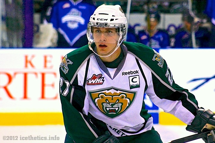
On the other side of Jesse Forsberg, the Silvertips were wearing a white jersey I'd never seen.
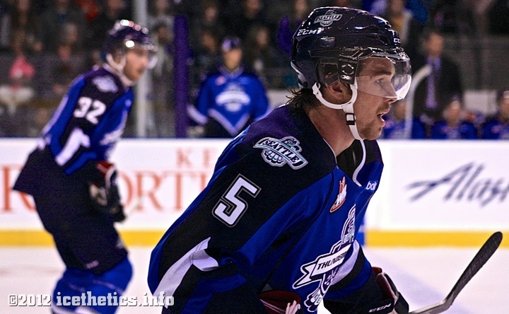
That's team captain Ryan Murray, wearing a unique C patch on his chest. If not for the lockout, I probably wouldn't have seen him. After being drafted by the Blue Jackets back in June, he was on track to make the NHL this season, I'm told. Instead, Murray was sporting a shiny new Silvertips sweater.
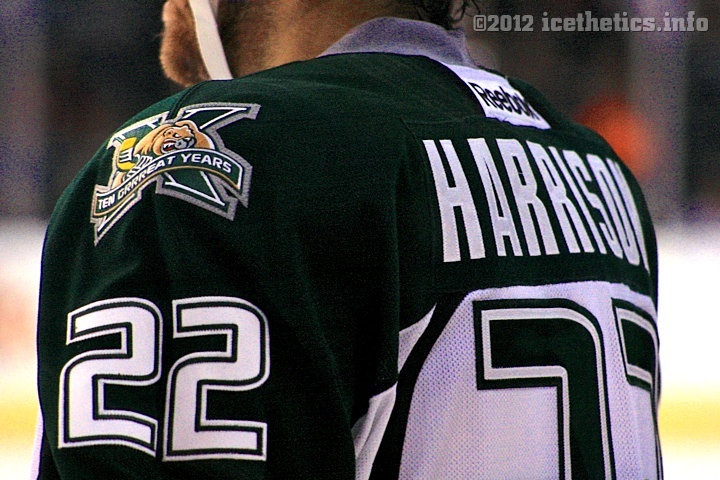
Turns out, it's not a third jersey as I briefly suspected. The Silvertips are celebrating their 10th anniversary this season with specially-designed home and road jerseys. (Which were unveiled two months ago.) And they looked "grrreat" on the ice as well.
Lest you think I'm only interested in looking at the jerseys during a hockey game, let me assure you I was very much into it. This game had it all. There was fast-paced action, lots of goals, drama, a penalty shot, and yes... even a couple of fights. This is hockey.
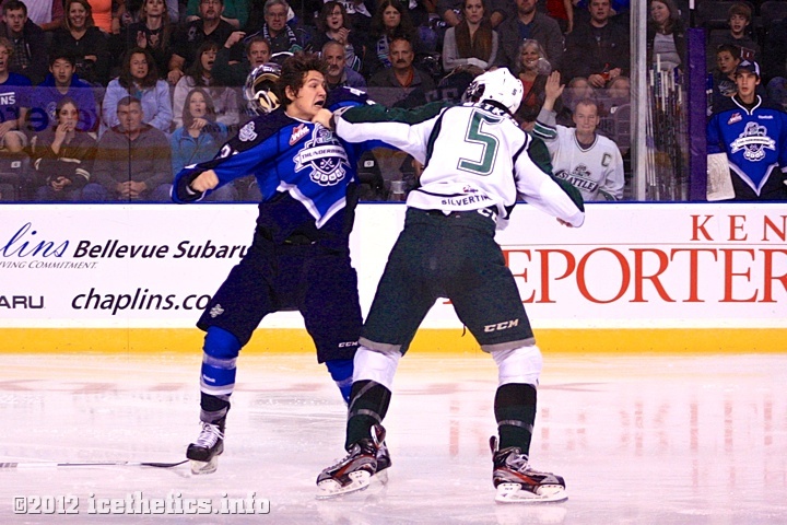
That's Michal Holub and Ben Betker getting friendly in the second period — which ended 2-2. After an early lull between two teams with losing records and the home team trailing for most of the game, something happened. The third period started.
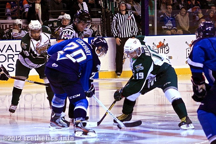
I don't know how he did it, but coach Steve Konowalchuk lit a fire under his Thunderbirds. One goal after another, the T-Birds came roaring back. Alexander Delnov scored four minutes in for a 3-2 lead — making up for a missed penalty shot in the first period. Not 30 seconds later, team captain Luke Lockhart followed up with an insurance marker. And before it was all said and done, Shea Theodore notched a power-play goal (his second of the night!) and cemented the 5-2 Seattle victory.
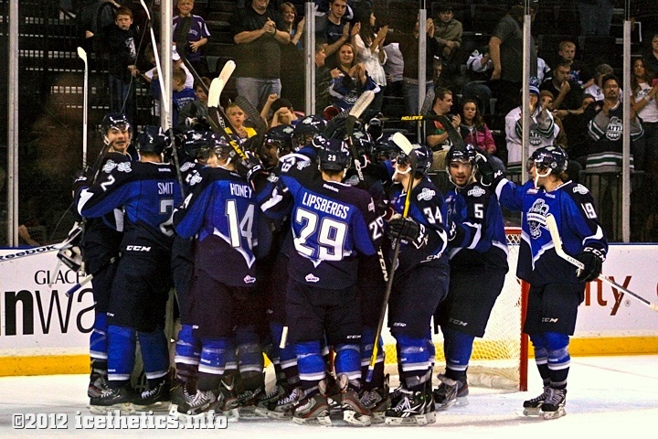
A celebration well-earned.
Maybe I've been unfairly judging the WHL on one lackluster game I went to a year ago. If this is more like the sort of hockey one can expect on a regular basis from this league, count me in! (Especially if this lockout persists and there are no Lightning games to watch.)
And by the way, if any T-Birds fans are reading, you guys are awesome! The Royals didn't have the kind of support you brought Saturday — and they're in Canada. I especially liked the "Everett sucks" chant after the goals. (I'm eager to head up to Comcast Arena and see what the north sound crowd is like.)
Finally, if you were hoping for a closer look at the Thunderbirds' third jersey crest, I've got you covered. It's a sharp jersey, and if replicas had been available in the arena shop, I would've bought one. But at $300, an authentic was a bit too rich for me.
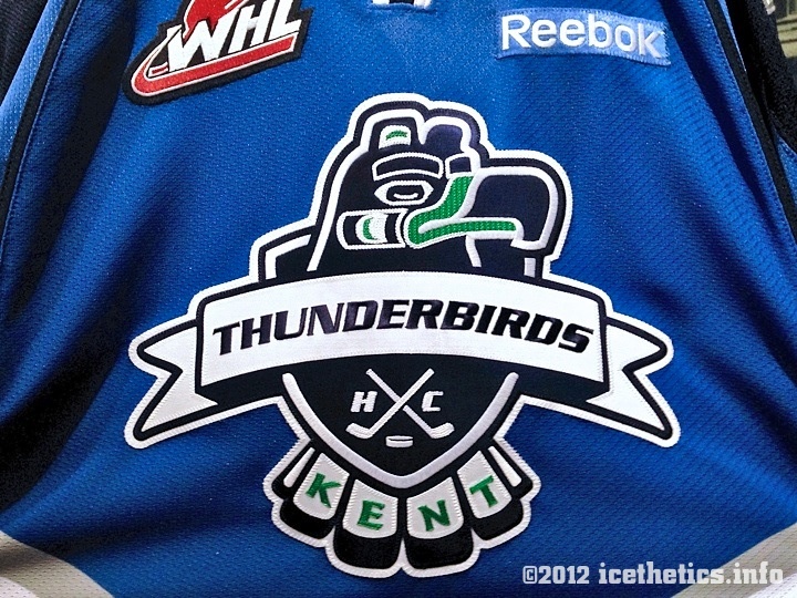
The Thunderbirds tell me the alternate uniform was designed by their in-house graphic artist Brian Eldridge.
Now here's to seeing more WHL games in the near future!
All photos © Chris Smith


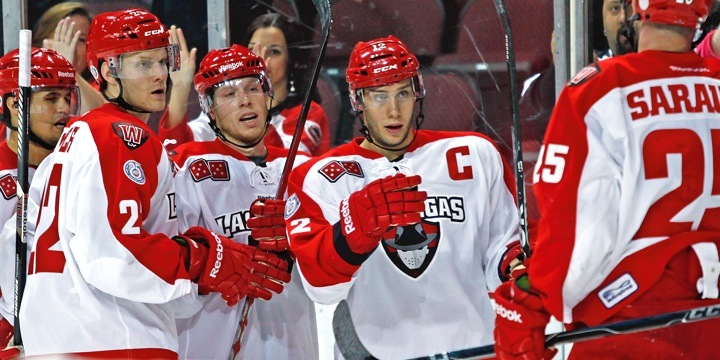
 Add to that, I count four different logos on that uniform, including the ECHL 25th anniversary patch on the right arm.
 Photo by Matt McCall