Phoenix Coyotes Getting New Name

Arena deal requires team to be called 'Arizona Coyotes'

The Phoenix Coyotes — who haven't played in the city of Phoenix since leaving the America West Arena in 2003 — will have a new name in 2013. The city of Glendale, Ariz. approved an arena management deal on Tuesday that should help keep the team in town for the foreseeable future. Among other things, that deal requires the team to be renamed the Arizona Coyotes.

At the moment, the name change is not quite official. The sale to Greg Jamison still has to be completed and there are plenty of questions surrounding that these days. But assuming that all goes through as planned, I would expect the name changed to be announced as the same press conference as the sale.

Here's the exact wording from the arena agreement (page 40):

The Team Owner shall use commercially reasonable efforts to have the name of the Team changed to the “Arizona Coyotes” as soon as is commercially feasible.

New owner has planned for name change all along

The Coyotes' coming name change isn't hot off the presses or anything. It's been talked about for years (though I haven't really gotten it on the record here until now). In fact — more recently — Jamison has been talking about changing the name to Arizona Coyotes since at least June.

According to a report from CBS Sports:

It looks as if the Phoenix Coyotes will change their name although they will have to wait a year. Jamison wants to call the team the Arizona Coyotes, joining the NHL's Arizona Cardinals and baseball's Arizona Diamondbacks as professional sports teams seeking a statewide appeal.

Could they change more than just the name?

The logical next question I have to ask is whether Jamison would take this opportunity to change more than just the name. Could the team's whole image use a makeover considering the drama it's been forced to endure in recent years?

Franchise logo history: Winnipeg Jets 1979–90 | 1990–96 | Phoenix Coyotes 1996–2003

If so, it would be the franchise's fifth logo in 34 years (not including the WHA). The Winnipeg Jets joined the NHL in 1979 and changed logos 11 years later in 1990. The team then relocated to Arizona in 1996, a move which required a new logo to go with a new name. The Coyotes' current look was introduced in 2003, just seven years after that relocation.

What do you think? Keep the logos and swap out Phoenix for Arizona? Or go back to the drawing board and hopefully find something that could stick for decades to come?

St. Charles Chill Unveil Logos

St. Charles Chill primary logo, designed by Alex Flick

New logos the product of a design contest

The Central Hockey League will have a new team a year from now. Its name — St. Charles Chill — was announced at a press conference back on Aug. 1. Now the team has a set of logos, which were the winning entries in a design contest that opened last month.

The new marks were unveiled via the Chill's official Facebook page. The press release announced Alex Flick of aFLICKdesign as the winning logo designer.

St. Charles Chill secondary logo

Logo designer gets tickets for life

According to the release, Flick will never miss a Chill game because he couldn't get tickets.

As the winner of the contest, Mr. Flick will receive four (4) tickets for life for the St. Charles Chill. He will also be a part of the opening day festivities for the Chill in October.

When asked how it felt to win Mr. Flick responded, “I feel very lucky to not only hear about the contest, but to also know that my work got people excited. I love hockey, and I've been interested in the design of hockey uniforms since I started learning graphic design, so to see my work be the identity of a hockey team/organization is exciting. I can't wait to see it in person.”

St. Charles Chill alternate logo (shoulder patch)

Chill received 50 entries in design contest

From the release:

Mr. Flick’s design was chosen out of over 50 entries that were submitted to the Chill.

“We were overwhelmed by the number of responses and the quality of work that we received,” states President/General Manager Nicole Kupaks. “It was a hard decision, but we feel Mr. Flick’s design represents the image of our team well and will be embraced by the community.”

Designer also submitted original entry to Icethetics

Last month, I mentioned the Chill's design contest here on the blog. I also said that if any designers wanted to send their entries my way as well I'd be happy to post them here. Only one designer took me up on that. It was Alex Flick. Here's his original submission.

Original logo submissions for St. Charles Chill by Alex Flick

Only one other Chill logo submission came my way and that was after the winning logos were unveiled on Tuesday. Look for it in an upcoming post on the Concepts page.

St. Charles Chill were previously Laredo Bucks

Want a brief history of the team? The St. Charles Chill are not an expansion team. On May 1, 2012, the CHL's Laredo Bucks announced the team was shutting down immediately. The club was subsequently sold over the summer and the new owner opted to relocate to St. Charles, Missouri.

The Bucks were founded in 2002 and played 10 seasons in Laredo, Texas. They had NHL affiliation agreements with the Florida Panthers and Phoenix Coyotes during their tenure.

All that's left now is to get your reaction. What do you think of the Chill's new logos?

Speculating on Dallas' Future Rebrand

Assuming the NHL ever plays another game, the Dallas Stars will have a whole new look when they take the ice for the 2013-14 season. This much we know. What we don't know is what that will look like.

The Dallas Morning News has posted a few stories on the subject over the last couple of weeks. Thought it might be worth sharing them here so we all know what to expect.

Red, white & blue mockups from Stars' website

Rendering from Dallas Stars (official website) via Dallas Morning News

On Nov. 13, they posted these mockups credited to the Dallas Stars' official website. I haven't been able to find a link to where they were featured on the Stars' site, but it's my understanding that TV color analyst Daryl Reaugh — who writes a blog on the site — is behind the designs which may be about a year old.

I'll be straight with you. They're ugly. Really ugly.

I, for one, have no desire to see the Stars in anything but green and gold. But that's not up to me.

Stars owner answers questions about coming redesign

The day after those mockups were posted, beat writer Mike Heika talked to Stars owner Tom Gaglardi about what's coming. There's a lot of great information in his report. Here are some excerpts.

Gaglardi wants logo crest, not wordmark

"I’d like to wear our logo on our chest. That’s something that appeals to me. I think it’s the classic way to go, and I like classic things. We are one of the original 12 teams, and I do think that carries with it some history and weight, and that’s also something I believe we should consider when looking at a possible change.

"I just want a jersey that’s a classic hockey jersey. I want a jersey that looks like it could have been worn for 40 years. That’s kind of how I see things.

"I think the current jerseys are attractive. I really don’t have a problem with the style or the look. I don’t like just the wordmark "DALLAS" on there. I don’t think that’s really unique or clever, but the actually jersey to me is a good looking jersey."

I think Gaglardi just made up "Original 12," but at least it sounds like he looks at hockey uniforms the same way a lot of us do. That's a great thing to see in an NHL owner.

Stars considering a color scheme change

Gaglardi confirmed the team is looking at changing team colors, but didn’t want to go beyond that. He cautioned that the discussions change every day, and that there is a lot of positive on both sides (changing colors or remaining green, gold, black and white).

Process started in April; must be done by end of December

In talking to others in the organization, they confirm that a decision will need to be made by the end of December if the team wants to wear new colors for the 2013-14 season. They emphasized there is a little wiggle room with Reebok and the NHL, but that they have about six weeks to get this done.

You may recall that when the Lightning redesigned their uniforms (a process that would've been wrapped up by December 2010), they unveiled them right away (January 2011) to avoid any leaks. If the Stars follow this precedent, we might not have to wait too long to see what the final result is.

Throwbacks kept in mind even if colors change

On the good side, there appears to be some thought that if they do go in a new direction with color, they still can recall old throwbacks and wear them — and they seem to be comfortable with the possibility of having more than just two "kits," and could actually push the NHL to consider more specialty uniforms.

That's an interesting notion. Heika goes on to talk about the variety of alternate uniforms seen in the NCAA.

Stars not necessarily interested in fan input

On the bad side, there appears to be no appetite for fan input. They already have a lot of differing opinions, and the people making the decisions all are aware of what the fans think. They either interact with season ticket holders or they view fan blogs and websites.

As such, they will likely reveal these the same way they did the Mooterus and the current uniforms. You will be told when the decision is made, and that will be it. That’s not unusual in the world of pro sports.

I’m a fan of allowing possibly five different looks and letting fans vote down to two or three on the website. The buzz created would be fantastic, especially at a dead time like this. That would also allow the team to have the final say, but the fans to eliminate what they feel are the worst ideas.

That's a great idea, but as Heika points out, not all that realistic. But I have hope Gaglardi will find a way to hit the mark. He wants the same thing we all do. A sharp look for a team with a long history.

ECHL Unveils 2013 All-Star Jerseys

ECHL's 2013 All-Star Game jerseys unveiled Nov. 21

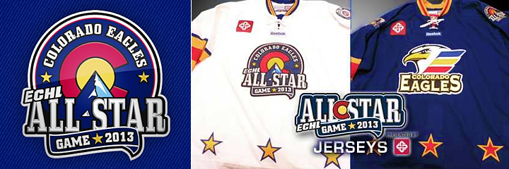
Last Wednesday, the day before Thanksgiving in the U.S., the ECHL unveiled the uniforms that will be worn at the 2013 ECHL All-Star Game. The jerseys were revealed at the Budweiser Events Center in Loveland, Colo. — home of the host Colorado Eagles — during the first intermission of their game against the Florida Everblades.

Game features Colorado Eagles vs. ECHL All-Stars

The ECHL is continuing with a new format introduced at the last All-Star event in 2011 (the ECHL did not hold one in 2012), where the host team faces off against the top players from across the league. If that seems a little one-sided, you're not wrong.

The Bakersfield Condors lost to the All-Stars 9-3 in 2011. Currently, the Eagles are third in their division (of four teams) with a record of 8-7-1-2 — which is to say they're mediocre. So it's not like the league's best team is taking on the all-star roster. That said, it's easier to sell All-Star Game tickets in Loveland when the locals can cheer on their own team.

Photo by John Babitz

Four jerseys designed for All-Star Week events

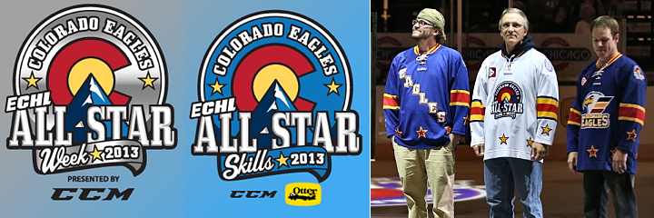
Reebok has designed a total of four different sweaters for the ECHL's All-Star Week festivities, one set for the big game and another for the Skills Competition. The Eagles, who normally wear black, will sport a blue jersey with a few stars around the waist. The All-Stars will wear white with the event logo on the front. All jerseys will have the ECHL's 25th anniversary logo on one shoulder.

For the Skills Competition, the Eagles jersey will have the team name written diagonally down the front. The All-Stars will wear the same white jersey but with their own team's crest on the front. And if all these jerseys feel reminiscent of the NHL's old Colorado Rockies, that's sort of the point.

Uniform designs an homage to NHL's old Colorado Rockies

From the Eagles' press release:

With the strong Colorado theme, it made sense for the jerseys to also pay homage to Colorado's rich hockey history. As such, the jerseys worn by both teams will include the main colors from the state's flag (red, blue and yellow) and are strikingly similar to the jerseys worn by the National Hockey League's former Colorado Rockies franchise, which played in Denver from 1976 through 1982 (before moving to New Jersey as the current day Devils). The ECHL's championship trophy, the Kelly Cup, was named after Patrick Kelly, who coached the Colorado Rockies in 1977-78.

If you want to get your hands on one of the jerseys, here's how:

Replicas of each, except the All-Star team Skills event jerseys, will be available exclusively at the Eagles' holiday store in the Foothills Mall in Ft. Collins, Colo. through Dec. 30. After the new year, the aforementioned jerseys will be available online. Game-worn jerseys from both events will be available via auction from The MeiGray Group; details will be announced in January.

This news came just two days before the NHL announced the cancellation of its 2013 All-Star Game in Columbus. Seeing the unique format the ECHL uses, what do you think of the NHL doing something similar in the future? What sort of format would you like to see?

Icethetics Gets Another New Look

Welcome to the redesigned Icethetics.info! What do you think?

Every so often, I get tired of looking at my own blog. And I get an itch to flex my creative muscle. So every year around this time, Icethetics gets a whole new look. This year is no different in that regard. After a few weeks of toying with different ideas, I finally settled on a design I'm happy with. Hope you guys enjoy it as well.

Along with the new look comes new features to be rolled out over the coming weeks. I'm adding member accounts so that you can register and post comments without moderation and track changes to your favorite sections of Icethetics. (For example, get an email every time new concept art is posted.)

I'll be adding some all new sections to the site (details to come) and I'm also considering trying out a message board. (How long it lives will be determined by you guys.) Let me know what you think and drop me a line if you have any suggestions.

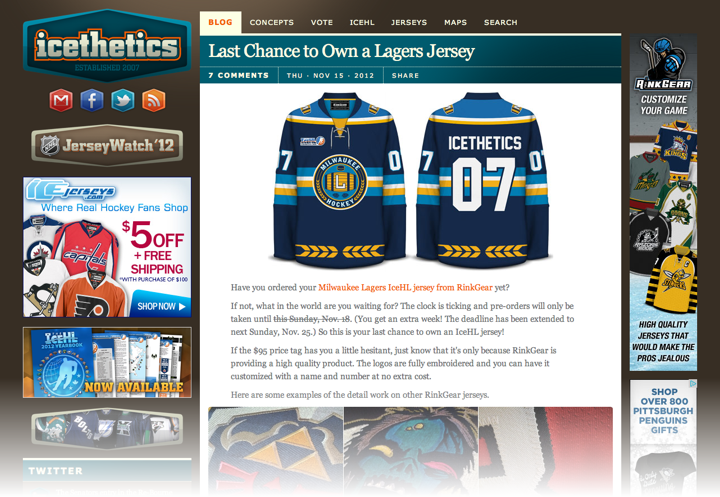
And lastly, for the sake of posterity, here's what the site looked like before today.