Did NHL14 Leak New Flames Third?

Photos from Matthew Mahoney

Video game appears to show never-before-seen jersey

Regular readers know how I feel about using video games as a legitimate source for news. It's not that EA's NHL franchise is typically inaccurate — it's not — but the frequency of errors is still a little high for my liking. (For example, they incorrectly listed the Minnesota Wild's green jersey as their home uniform this season.)

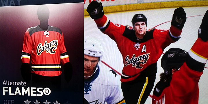
That being said, one reader stumbled upon something I'm comfortable posting here. Apparently, the Calgary Flames' new alternate sweater has been spotted in NHL14, according to Matthew Mahoney. I'll explain in a moment why I'm not immediately dismissing this. But first, another look.

Photo from Matthew Mahoney

Check out the squared off shoulder yoke. It's one of the new styles Reebok unleashed on the NHL this year. We saw it on the new road jerseys for the Wild and Hurricanes. Makes sense that one of the new thirds would feature it.

Photo from Matthew MahoneyThe crest feels a bit inspired by the Buffalo Sabres' recently retired third jersey — the royal blue one. But it's the shoulder patch that throw me a bit.

This is an artistic style outside the scope of anything we've seen from the Flames in recent years. Perhaps it shows they're moving in a new direction?

Remember five years ago?

You may recall that in September 2008, Flames president Ken King spilled to a reporter some vague details about a new third jersey in the works

He specifically mentioned working on a new shoulder patch. Could this be a remnant from that process? The jersey discussed in that report never saw the light of day as the Flames opted instead for a throwback sweater a year later.

It's very possible that this and other elements from the design developed five years ago carried through to this new look.

They kept the secret pretty well

One thing worth noting is that the Flames didn't breathe a word about a new sweater all summer. It only showed up in the JerseyWatch series because Reebok told retailers to be ready for it last January.

It then, of course, showed up "locked" in NHL14 when the game was released last month. So I have to assume that if it's showing up at this point, it's either a legitimate leak or it's fake.

These shots from Mahoney of the game are clearly photos taken of a screen as opposed to straight screen shots which could be more easily manipulated.

But given the sweater's appearance on the jersey selection screen and within the game itself, I'm comfortable saying I'm convinced it's the real deal. But you might be wondering how it appeared for Mahoney when most users are seeing a greyed-out jersey. Here's what he told me via Twitter earlier today.

If it's true, what do you think? Did the Flames make the right call by dropping the long-rumored black option? Is this a good look to add to the NHL?

Share your thoughts while we wait for something official from the Flames. My hunch is that the wait could be a while. Teams that don't release a new third jersey in the summer tend to hold off until right before Thanksgiving so as to maximize holiday sales. Think there will be a lot of these under Christmas trees in Calgary this year?

Islanders Will Go Black and White

CEO confirms new third jersey planned for Brooklyn

On Wednesday, Chris Botta — who writes a lot on the New York Islanders — tweeted some very interesting quotes from Isles CEO Brett Yormark on the future of the club's branding. Specifically, what happens when the Isles move to Brooklyn in the next couple years?

First, remember all that talk about the Isles going full-on black-and-white like their NBA cousin, the Nets? Well Yormark heard all the disapproval of that idea.

What a relief. But if you're one of the people who hates the idea of the Islanders wearing a monochromatic uniform in Brooklyn, stop reading here. Consider your day made.

For the rest of us, there's this news.

Yormark told Botta that the third jersey will change when the team moves. It's one of those bittersweet things for most readers, I would imagine. Many of you can't stand the black third the team currently wears. You'll be glad to know that's disappearing. On the other hand, they'll still have a black third jersey of sorts.

So what's worse? Black/blue/orange/grey or black/white? Guess we'll find out in the next year or two.

Canada's Olympic Jersey Set Leaks

Photo from Reddit user "justacanuck88"

Photo from retail store appears to show all three

Exactly two weeks before the planned unveiling date, a photo of Canada's three new Olympic jerseys has surfaced online. The photo above was posted to Reddit by "justacanuck88" who wrote, "The new Canadian Olympic Jersey's [sic] just came in. What do you think?"

I'm packing for my trip, so I have to post and run. In the meantime, answer the guy's question in the comments. What do you think? I'm saving my commentary for Oct. 8 when the jerseys are officially released.

12 Preseason Letters to NHL Teams

I'm about to step away from Icethetics for quick vacation to the Big Apple. So I put together this blog post to hold everybody over until I get back. And as an homage to Jimmy Fallon — whose show my wife and I hope to catch while in NYC — I've prepared preseason thank-you notes to 12 NHL teams.

Dear Anaheim Ducks,

Thank you for celebrating your 20th anniversary by making all your players wear an ugly patch. They'll never think twice about it. But I will die a little inside every time I see it.

Dear Viktor Fasth,

Thank you for this kickass mask. I eagerly await watching you wear it on October 13.

Dear Boston Bruins,

Thank you for turning 90 in style. Some people may not appreciate your simplistic anniversary logo, but I admire how it blends brilliantly into your brand and bears the six stars that signify your Stanley Cup championships. Here's to another six Cups and the next 90 years.

Dear Buffalo Sabres,

Thank you for proving to the conspiracy theorists that your new third jersey isn't a hoax by including it in your new media guide this year. And don't listen to all the haters. You have to have a little fun with your third jersey, or else what's the point? So let's give it a year or two and then try something else. Also, thanks for putting the captains' patches on the shoulder instead of the chest. Gives everybody a little something to freak out over.

Dear Carolina Hurricanes,

Thank you for looking just as generic as I expected in your new jerseys. It means I don't have to eat my words. Also, thank you for playing a red/white scrimmage so I only had to look up one photo.

Dear Dallas Stars,

Thank you for looking positively stunning in your new uniforms. It's about as good as a hockey team can possibly look. Like I told the Hurricanes, I appreciate not having to eat my words. In particular, thank you for bringing more green to the NHL. I'm forever grateful.

Dear Detroit Red Wings,

Thank you for wearing straight nameplates during the preseason. It's a huge burden off your equipment staff, who don't have to worry about cutting custom arches for more than 60 guys, two-thirds of whom won't even be with the team in a week. Also, it helps keep my email and Twitter stream filled with questions about why you're changing your uniform. Just like every September.

Dear Los Angeles Kings,

Thank you for changing the wordmark your players wear on their helmets. Sure, it may seem like the most innocuous thing in the world, but to some, you might as well have changed your colors to pink.

Dear Minnesota Wild,

Thanks for rocking those ravishing new road jerseys. Wouldn't change a thing.

Dear Montréal Canadiens,

Thank you for adding accent marks to your jersey nameplates. I'm sure Daniel Brière and other French speakers can appreciate it better than I can. But mainly, thanks for not posting any preseason game photos to your website. I really like having to scour dozens of video clips to find a clear, legible shot of this most minor of uniform changes.

Dear Nashville Predators,

Thank you for changing your socks and pants. You know what I always say: If there's room for blue, there's room for gold. (Admission: I've never said that before.)

Dear New York Islanders,

Thank you for wearing your special Brooklyn patch during your special Brooklyn game. I know it won't be long now before Brooklyn becomes your permanent home and you wear a permanent Brooklyn patch. Until then, I'll treasure this special Brooklyn patch from this special Brooklyn game. Brooklyn forever. Brooklyn.

Dear San Jose Sharks,

Thank you for going on that diet this summer. The weight you lost really shows. Really.

Sincerely,

Chris from Icethetics

IceHL Yearbook Coming Soon!

Third edition to be released Tuesday, Sept. 24

Thought I'd take a quick break from the NHL beat today to talk about Icethetics. After months of work, the IceHL 2013 Yearbook is nearing release. The digital version will be available to download on Tues., Sept. 24. Normally, I'd keep news like this to the IceHL Blog, but the yearbook is big enough that I think it warrants a brief mention up front.

For those unfamiliar with the project, the IceHL is a fantasy hockey league created here at Icethetics by the community. Back in 2008, we selected cities, team names and designed logos — all by popular vote — creating our ideal league from the ground up. In the last five years it has continued to grow. And for the last two, I've encapsulated all things IceHL in a digital yearbook.

If you want to learn more about the project and can't wait until Tuesday, you can download the IceHL 2012 Yearbook now. (That page also has a link to the 2011 yearbook — the inaugural edition.)

There are also plans to make the 2013 yearbook available in print — so you can own a piece of Icethetics history! The price will probably be about $25. That's not set by me but rather the printing company. I'll have more details on Tuesday. However, the PDF version will always remain a free download.

While we're talking IceHL, if you play fantasy hockey on ESPN, you may have noticed an update in the way the game is branded.

ESPN Fantasy Hockey implemented a new logo over the summer. You can see it on the IceHL EAST League Office page. Same with the IceHL WEST League Office. Of course you can see it anywhere on ESPN's fantasy website, but I just wanted to squeeze in a plug for the IceHL fantasy leagues.

There's also this simplified version of the logo that appears in the banner of the Fantasy Hockey site. It brings a new aesthetic to ESPN's fantasy sports, which makes me think the other fantasy games are in for branding overhauls as well. For now, though, it appears hockey is the only sport with the new logo treatment.

In case you can't remember what the old Fantasy Hockey logo looked like, here you go.

I'd say the new look is certainly an upgrade. What do you think of it? Let's be honest, it's fantasy hockey on ESPN, so do you really care?