Minor Jersey Mayhem

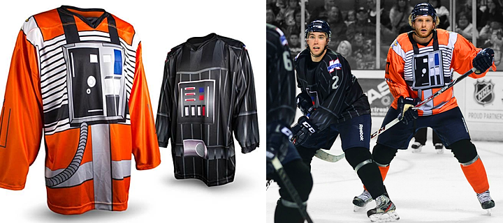
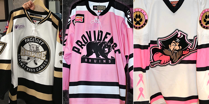
This is a big weekend for specialty jerseys around the minor leagues. Let's start in the AHL!
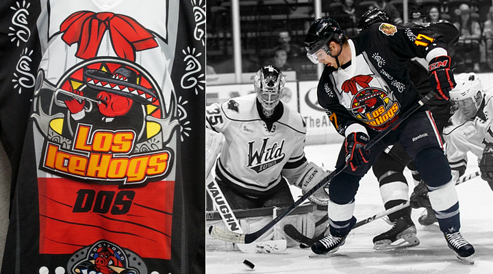
Game photo from Rockford IceHogs (via Flickr)

Rockford celebrates Los IceHogs Dos!

How can we not start here? The Rockford IceHogs donned these numbers for Los IceHogs Dos this weekend. If you missed "Uno," check out this post from last year. They are really something.

I talked with IceHogs' communications director Mike Peck who said the team partnered with the Latino Leadership Coalition in Rockford for the event. In fact, they inspired the jersey design.

"They really wanted to highlight the strong musical aspect of the Hispanic/Latino culture," said Peck.

The IceHogs wore this uniform on Friday night and auctioned them off afterward with "proceeds being donated to La Voz Latina, an organization dedicated to serving the Rockford region’s Hispanic community through education, workshops and youth programming," according to the press release.

The great thing about these specialty jersey nights around the minors is that these teams are always raising money for charity. So no matter how silly the team may look on the ice, at least it's for a good cause.
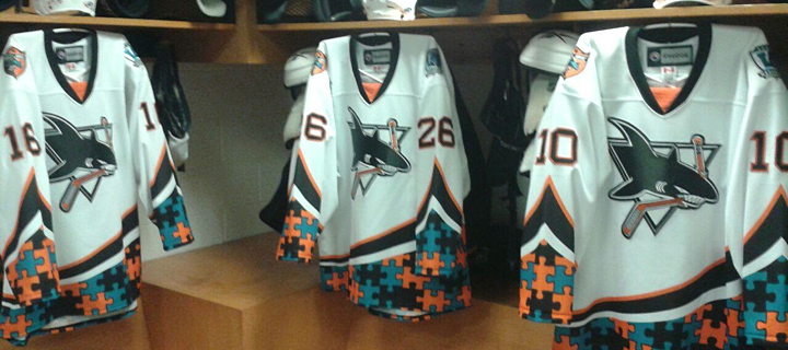
Photo from Worcester Sharks (via Facebook)

Worcester raises autism awareness

The Worcester Sharks wore these jerseys on Friday and Saturday to benefit The Autism Resource Center of Central Massachusetts. The puzzle piece pattern is the standard symbol of autism awareness.

Photos from Texas Stars

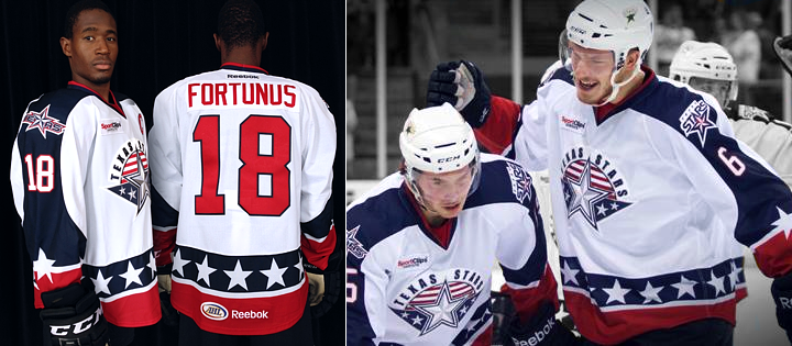
Texas dons player-designed stars and stripes

This Veterans Day weekend was marked by a number of patriotic or military-themed jerseys. The Texas Stars called it Stars & Stripes Military Appreciation Weekend and wore these jerseys on Friday and Saturday. The subsequent jersey auction is benefiting the Texas Stars Foundation.

The cool part of this uniform is who designed it. Remember Taylor Vause? He played for the Swift Current Broncos a couple seasons and ago and was responsible for designing some fo the team's specialty jerseys. He's continued that hobby since graduating to the pros.

Vause spent most of last season with the Stars but is currently with the club's ECHL affiliate, the Idaho Steelheads. So unfortunately, while he designed this jersey, he didn't get to wear it this weekend.
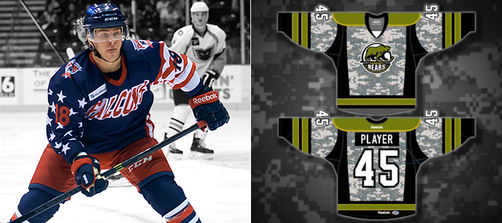
Images from Springfield Falcons and Hershey Bears

Falcons and Bears go patriotic for Veterans Day

The Springfield Falcons and Hershey Bears honored military veterans in different ways this weekend. The Falcons wore the Hometown Heroes Night jerseys above while being shut out 3-0 on Friday. (This is the only photo I've been able to find of the jersey so far.)

The Bears, on the other hand, are going the camouflage route with tonight's set. I have yet to see any photos of the actual jersey, but the rendering above was posted to their Facebook page on Thursday.

Bakersfield can't stop making odd jerseys

And finally, we wrap up in the ECHL where this is happening tonight.
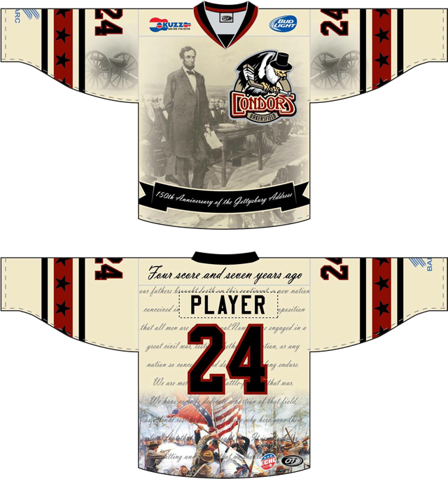
Image from Bakersfield Condors (via Facebook)

Had to make it huge so you could truly appreciate it. The Bakersfield Condors are always trying to go outside by the box with specialty jerseys. And I really don't know what to say about this one. Perhaps I could address the irony of the sponsor being Dignity Health. Because that's just what the players won't have after they wear these for three hours.

If you can't get enough, the Condors have a photo gallery on Pinterest.

I know there are some I've missed so I'll have a follow-up to this post likely later this evening. In the meantime, what do you think of these? Any favorites in the bunch?

IceCaps Unveil Third Jersey

New look designed by a fan of the St. John's club in 2011

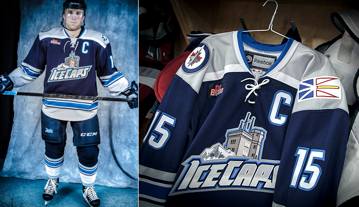
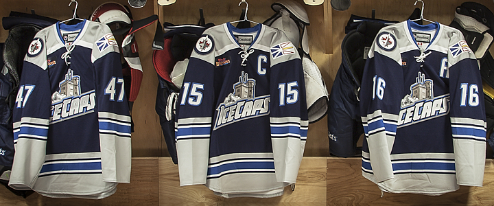
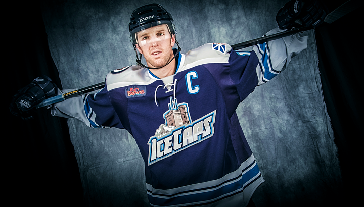
As promised, the AHL's St. John's IceCaps unveiled their first ever third jersey on Friday night — complete with the brand new crest seen above. The team had been previewing the new look with daily teaser photos on Instagram since Oct. 28.

The coolest part of this new jersey is how it came about. That story follows these photos.

Photos from St. John's IceCaps

Check out this excerpt from the team's press release:

The jersey was designed by Troy Birmingham, a graphic artist from St. John’s, who approached the team with his concept when the club was formed in 2011. It was the first time Birmingham had designed a logo for a sports team.

To all you concept artists, I guess sometimes it does pay off to approach a team with your design. Great to see the IceCaps taking advice from their fan base on this jersey design.

Photo from St. John's IceCaps

For specifics on how Birmingham's design came about, here's another chunk of the release:

He explains his inspiration: “The primary logo was meant to represent the province as a whole, so for the third jersey I wanted a logo that was a bit more specific to the city, that’s why I used Cabot Tower,” said Mr. Birmingham.

“The font was meant to represent ice-grey gradient, power and motion and I included a stylized iceberg. I included the small outline of Newfoundland and Labrador to tie the alternate logo to the primary logo and have a connection with the original logo.

“For the jersey itself, I wanted to keep a similar colour scheme to the primary jersey but I wanted a traditional look and feel. It kind of reminds me of an old jersey from the 1970′s with the square shoulders.”

The IceCaps debuted the new look for their game against the Manchester Monarchs on Friday where they won 5-2. They'll face the Monarchs again tonight where the same sweaters.

Photos from St. John's IceCaps (via Facebook)

The new looks is fantastic — just what the IceCaps needed to infuse a bit of their own identity. For the last two years they've simply been wearing the jerseys of their NHL affiliate, the Jets. So it's nice to see them go their own way a bit here.

That's the positive. I also have a couple of negatives. The provincial flag on the shoulder is a bad trend. It started with the Calgary Flames in 2007 and the launch of their Reebok Edge jerseys. We then saw Abbotsford of the AHL follow suit.

I can only speak for myself, but I really don't want to see this become a regular thing. The way I see it, throwing a flag on your jersey is a lazy way of connecting to the locals. If your own trademarked logos can't do that job, come up with new logos that do.

Photo from St. John's IceCaps

I'm also not crazy about the crest. I like the tie-in to the city of St. John's certainly, but I'm just not sure it's a well-executed design. The text is the focal point and it has my least favorite feature in the world — a gradient.

But those are just minor issues in the overall picture. The jersey's colors and striping are cool and unique and I really like the square shoulder yokes here. In action, they look great!

St. John's to host 2014 AHL All-Star Classic

While we're on the subject of St. John's, N.L., I should point out that they're hosting the 2014 AHL All-Star Classic. The logo for the event was released back in September along with the announcement of a brand new format.

Instead of pitting two teams of AHL stars against one another, a single team of AHLers will face off against Färjestad BK from the Swedish Hockey League — known as the Swedish Elite League (or Elitserien) until this year. According to the AHL, it's the first time a Swedish club will compete in North America.

That game will take place on Wed., Feb. 12 and Canadians will be able to watch live on Sportsnet.

I'll leave you now with a look at Färjestad's logo. Pretty standard stuff for a European hockey team.

IceCaps Tease New Third Jersey

AHL club has been sharing sneak peeks on Instagram

The AHL's St. John's IceCaps will officially unveil their new third jersey tomorrow. But for the last week and a half they've been teasing us with photos on Instagram.

On Oct. 28, the IceCaps started sharing one photo a day of the new sweater via social media. I haven't been keeping up with tweeting them all — primarily since they didn't make it seem like this third will be that much different from their primary jerseys — but I have collected them all here for those interested.

Photos from St. John's IceCaps (via Instagram)

Perhaps most interesting is the use of the Newfoundland and Labrador flag, which appears to be a shoulder patch — following a trend started by the Calgary Flames, then picked up by the AHL's Abbotsford Heat.

Also, I'm curious about the colors. It feels like a cream/vintage white type of color, but I can't tell if that's just the Instagram filters doing that. I'm sure we'll find out tomorrow when it's officially unveiled.

UPDATE 7:06 PM: The last teaser came this morning and looks like a new crest for the front of the jersey.

Finland Unveils Olympic Jerseys

Photo from MTV.fi

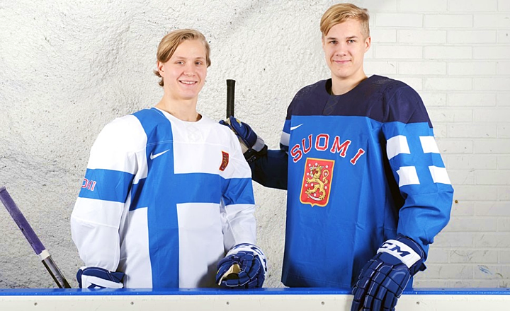
Finland gets mix of traditional and modern jerseys

After taking a look last night at the new Olympic jerseys for Slovakia and Sweden, Finland has joined the party this morning. Their new Nike-designed jerseys were unveiled today. Photos of the new uniforms were shared by MTV.fi.

The blue jersey has the coat of arms crest you would expect — with the glossy outline of a lion planted on the shoulders. The white one is essentially the Finnish flag. Both are par for the course as Nike jerseys go. By that I mean the early response has been decidedly mixed. Most either love it or hate it.

Photos from MTV.fi

What's your immediate take on these? Love or hate how Finland will look in Sochi?

Seven down, five to go. Who's left? Norway, Austria, Switzerland, Latvia and Slovenia.

Slovak, Swedish Jerseys Revealed

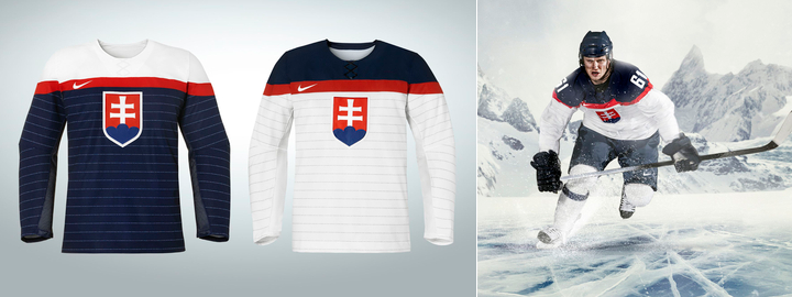
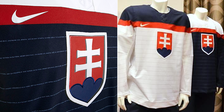
Images from Slovak Ice Hockey Federation

Slovak national anthem forms Olympic jersey pinstripes

Earlier today, the Slovak Ice Hockey Federation unveiled the jerseys Slovakia will be wearing at the 2014 Olympics in Sochi this winter. If they look a little familiar, you're not imagining it. The white jersey, at least, is very similar the new U.S. look — unveiled by Nike in August.

What sets them apart, however, is the pinstripes. And those aren't just any pinstripes. Look closely.

Photo (right) from @Tomas_Kmec

Those stripes are actually formed by the words to the Slovak national anthem. It's a very clever feature introduced by Nike. I've been impressed by the variety of ways in which the designers have managed to make each national team jersey unique in some way — while simultaneously disappointed at some of the unnecessary similarities. But more on that another time.

If you want to see more of the jerseys, it looks like a couple of Slovak radio DJs showed them off in a YouTube video. Check it out.

By the way, I plan to write up full reviews of all the Olympic jerseys once they're each released. A lot of you are asking me what I think of them, and it's hard to say without seeing the whole lot of them.

I'm still hoping for an official press release from Nike, actually, which came with great photos for the U.S., Russian, Canadian and Czech jerseys. But haven't seen one yet for Slovakia. (UPDATE (11/6): I spoke a few hours too soon. Here it is!) That brings us to Sweden.

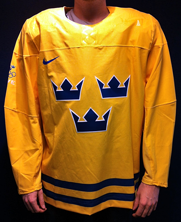
Sweden is all kinds of rebellious about Olympic jerseys

Photo from Tre Kronor (via Facebook)On Oct. 25, Tre Kronor — the Swedish men's ice hockey team — shared this photo (right) of their country's new Olympic jersey on their Facebook page.

But like Slovakia, the unveiling didn't accompany any official word from Nike (that I could track down). So there's still a blue jersey out there that we haven't seen yet.

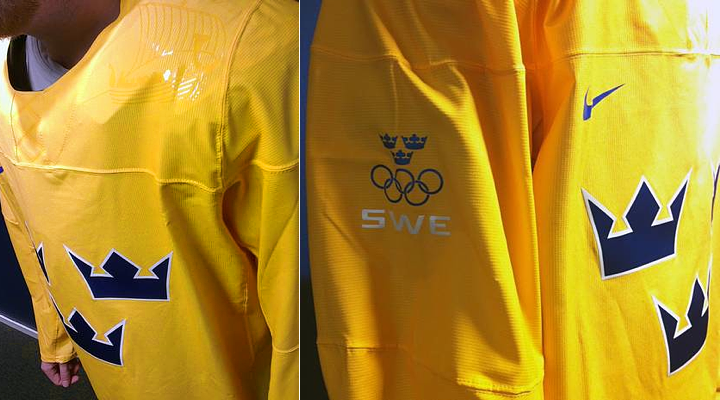
The Swedish tabloid Aftonbladet also revealed additional photos which they called "exclusive." (Scroll down to see those.)

The photos give us a better look at the detail on the shoulders — which includes a glossy version of the ship seen in the Swedish Ice Hockey Federation's official logo.

But here's the really interesting thing about them. The Aftonbladet article quoted federation's marketing manager, Tomas Bjernudd, as saying they had to fight Nike over proposed sweeping design changes.

Apparently, there was pressure from Nike to change a lot. Bjernudd didn't get into specific details, but said they had to stand their ground as far as keeping the classic three crowns on the front of the jersey.

Could you imagine what they'd be wearing if this guy didn't get in Nike's way? Good for him and the Swedish Ice Hockey Federation.

Photos from Aftonbladet

Though it hasn't been unveiled yet, I have to assume the blue one is exactly the same as this with the yellow swapped for blue and vice versa.

So what do you think of these jerseys? We've now seen jerseys for the U.S., Russia, Canada, Czech Republic, Slovakia and Sweden. That leaves Finland, Slovenia, Norway, Austria, Switzerland and Latvia as the other countries participating in the 2014 Olympics.